Rightfit marketing design research
A study of rightfit.so, a hiring platform built around "proof of work". It answers one question: how do you build a landing page and a brand with the same craft?
- Captured: 2026-11-21, Chromium, 1440 × 900 viewport, light theme. The marketing pages ship light only. The app shell has dark tokens, but every marketing page wraps its content in a
.light scope.
- 21 pages captured as full-page screenshots, out of 71 public URLs. The Public pages doc lists every URL.
- Mobile: 390 × 844 full-page captures of home, hire and changelog, plus the open mobile menu.
- Every number comes from the live DOM:
getComputedStyle, CSS custom properties, @keyframes rules, and per-frame sampling of a scroll reveal. Values read from pixels are marked "≈".
- Local research only. Not committed.

The site in one paragraph
Rightfit looks like an engineering notebook printed on blueprint paper. Off-white paper (#fcfcfc), black ink, one gray (#646464) and one blue (#2b7fff). Every section sits inside a 1152px framed column with visible 1px rules. Small dots mark the corners where rules cross, like registration marks. Ideas are drawn as thin isometric line illustrations. Product explanations are labelled "FIG 0.1", "FIG 0.2" like a patent drawing.
Three things carry the energy against that sober system:
- A blue orb with two eyes. The AI agent mascot, with 30+ emotion animations.
- A rainbow "chroma" sweep across button labels on hover.
- A live, cursor-driven product demo in the hero.
Read in this order
| # |
File |
What it answers |
| — |
Public pages |
All 71 public URLs, grouped: marketing, AI-agent landing pages, stories, blog, changelog, jobs, legal |
| 01 |
Design principles |
The 10 decisions behind every page, and why |
| 02 |
Color system |
Paper, ink, one gray, the blue ramp, status chips, chroma rainbow, orb palettes, contrast ratios, tokens |
| 03 |
Typography |
Inter variable with cv01/ss03/zero, weights 300–600 incl. 510, the full measured scale, two-tone headings, mobile sizes |
| 04 |
Layout, grid and spacing |
The framed 1152px column, rules and corner dots, label rows, bento-by-gap, sticky scrollspy, radii |
| 05 |
Hero patterns |
7 hero types: split display + live demo, centered scanline hero, split quote, article header, job header, split calendar on image, plain changelog |
| 06 |
Section patterns |
20 blocks: logo grid, two-tone statement, iso bento, chat card, sticky FIG story, timeline panel, folder-ring FAQ, orb CTA … |
| 07 |
Copywriting and voice |
"Proof, not paper", two-tone statements, label rows, lowercase FAQ, dual-audience CTAs, SEO and AI-search pages |
| 08 |
Components |
Header, mega menu, mobile drawer, buttons, chips, cards, inputs, job rows, footer, ask-AI row |
| 09 |
Art direction |
Blueprint look, isometric line art, FIG drawings, scanline gradients, orb mascot, photos, logo |
| 10 |
Brand assets and graphics |
Every graphic type with a crop, how it is made, how to rebuild it |
| 11 |
Motion and interaction |
Measured reveal, hover, chroma sweep, orb emotions, checkpoints, marquee, reduced motion |
| 12 |
Glossary |
The words to use, plus a paste-ready design brief |
| 13 |
Build recipe |
Tokens, starter CSS/HTML for every signature piece, review checklist |
Per-page deep dives
| Page |
URL |
Template |
Height |
Doc |
| Home |
/ |
marketing long-form |
11,420px |
pages/home.md |
| Hire (companies) |
/hire |
marketing |
4,011px |
pages/hire.md |
| About |
/about |
marketing |
3,575px |
pages/about.md |
| AI agents |
/agents |
product |
4,313px |
pages/agents.md |
| Agent / city landing pages |
/agents/* |
SEO template |
4,848–5,501px |
pages/agent-landing-template.md |
| Friends (referrals) |
/friends |
marketing |
6,662px |
pages/friends.md |
| Testimonials |
/testimonials |
proof |
2,536px |
pages/testimonials.md |
| Customer stories + story template |
/customer-stories, /customer-stories/* |
index + article |
1,737 / 2,914–3,432px |
pages/customer-stories.md |
| Blog index |
/blog |
index |
2,504px |
pages/blog.md |
| Blog post template |
/blog/* |
article |
2,206–5,955px |
pages/blog-post-template.md |
| Changelog |
/changelog |
log |
7,830px |
pages/changelog.md |
| Open roles + job template |
/openroles, /openroles/* |
directory + detail |
1,870 / 2,450–2,550px |
pages/open-roles.md |
| Community groups |
/community-groups |
marketing |
1,948px |
pages/community-groups.md |
| Contact |
/contact |
utility |
1,466px |
pages/contact.md |
| Legal |
/legal/privacy, /legal/terms |
long text |
7,364px |
pages/legal.md |
| Header + footer |
all |
— |
— |
pages/_shared-header-footer.md |
Stack (from the DOM)
- Next.js with Turbopack chunks (
meta[name=generator] = "Next.js").
- Tailwind CSS v4. Colors compute to
lab() / oklab(), and rounded-full computes to 3.35544e+07px.
- shadcn/ui conventions:
focus-visible:ring-[3px] ring-ring/50, aria-invalid:*, CSS variables --background, --muted-foreground, --radius: .625rem.
- Radix primitives (
accordion-down / accordion-up keyframes use --radix-accordion-content-height).
- Scroll reveals use JavaScript inline styles (
style="opacity:1; transform:none"). This matches the Motion (Framer Motion) library.
- Cal.com inline embed for booking. GTM and PostHog scripts (
web-vitals, exception-autocapture, dead-clicks-autocapture).
Robots note
robots.txt allows User-agent: * and sets Content-Signal: search=yes, ai-train=no, use=reference. This study is reference use, done with a normal browser session. No content is used for training.
Public pages
Every public page on rightfit.so: 71 URLs, from /sitemap.xml (59 URLs) plus header/footer links that the sitemap leaves out (12 URLs: /agents/*, /customer-stories/*, /friends). All returned HTTP 200 on 2026-11-21.
Not public: robots.txt disallows the app routes (/chat, /inbox, /jobs, /settings, /pricing and others) and /login is the sign-in. /pricing is disallowed and is not a marketing page. The changelog is one long page with no per-entry URLs.
Marketing (7)
AI agents (SEO landing pages) (8)
Customer stories (3)
Blog (12)
Changelog (1)
Open roles (job listings) (38)
Legal (2)
01 · Design principles
Ten decisions explain almost every pixel on rightfit.so. Each one has the evidence and the reason.
1. One idea, said everywhere: "proof of work"
- The H1 is "The proof of work hiring platform for startups." The CTA band repeats it: "Hiring based on proof of work."
- Section meta labels say "PROOF OF WORK". FAQ answers say "proof of work. you are judged on what you have built". The blog's anchor post is "What is Proof of Work?".
- Why: A hiring marketplace has two audiences and a crowded category. One repeated phrase gives both sides the same mental model. It also becomes the search term the company owns. A whole blog post and the AI-search links ("What is Rightfit and how does proof of work hiring work?") are built to rank for it.
2. Look like an engineering document, not an ad
- Visible 1px rules frame a 1152px column from header to footer. 4px dots sit where the rules cross (
bg-foreground/70).
- Every section opens with a label row: a bordered chip on the left ("WHY RIGHTFIT"), a meta label on the right ("PROOF OF WORK").
- Diagrams are captioned "FIG 0.1" to "FIG 0.5", with uppercase leader-line callouts.
- Why: The buyers are startup founders and engineers. A layout that looks like a spec sheet tells them "built by people like you". It also shows the brand promise. The page itself looks like proof of work, with its construction lines left visible.
3. Paper, ink, one gray, one blue
- Page
#fcfcfc, text #000, secondary text #646464, hairlines #e8e8e8. The only brand hue is the blue ramp around #2b7fff.
- Color appears in three places only: the blue atmosphere (hero, CTA band, orb, line art), status chips in the product mock, and the rainbow chroma sweep on hover.
- Why: Restraint makes the few colored things read as signals. The blue means "Rightfit / the agent". Green, amber and indigo mean job status. The rainbow means "this is clickable".
4. Two-tone headlines carry the hierarchy
- Section headlines are one
<h2>, 36/49.5 · 500. The first sentence is #000, and the rest continues in #646464: "Companies message you first. Vetted companies find your work and start the conversation…"
- The same device works at 24px inside the sticky story ("Proof, not paper. Upload your resume once…").
- Why: It merges headline and subhead into one readable sentence. The black part works as a headline when skimmed. The gray part explains when read. It saves a type level and about 40px of vertical space per section.
5. Show the product working, not a screenshot
- The hero is a real coded mock (1152 × 660) in a macOS window. A fake cursor drives it: Profile → Applications (drags a kanban card) → Chat, about 2.5s per screen (≈).
- The DM card shows a full chat that ends in a green "Interview scheduled" chip. The "build once" panel shows a timeline from "Profile built Apr 1" to "Offer Apr 12".
- Why: The product's claim is speed ("days, not weeks"). A moving demo proves speed better than a still image. Coded UI also stays sharp at any DPI and can be localized.
6. Draw ideas instead of photographing them
- Abstract benefits (community, verified, global, speed) get isometric line drawings: 0.9px strokes in
#bedbff and #2b7fff, with fills matched to the paper.
- The only photos are real people's faces in testimonials and a founder portrait, plus dramatic image backgrounds on contact and the changelog.
- Why: Stock photos of "hiring" look the same everywhere. Line art in one blue fits the blueprint idea and costs nothing to keep consistent. Real faces are kept for the one place where trust needs a human: testimonials.
7. Give the AI a face, but only one
- Each AI agent is a gradient orb with two white "eyes" (
||). The home CTA and /agents use the blue orb. /agents adds violet, green and amber orbs for the interview, resume and offer agents.
- The CSS ships 30+ emotion keyframes (
orb-bob, orb-blink, orb-celebrate-dance, orb-error-shake …).
- Why: "AI agent" is abstract and slightly threatening in hiring. A soft orb with eyes reads as friendly and alive. Using one shape in four colors makes four agents feel like one family.
8. Two audiences, two buttons, always together
- Every hero and CTA pairs a white "Hire with Rightfit" with a black "Get started →".
- The header repeats both.
- Why: A two-sided marketplace must route each visitor in one click. The black button (higher weight) is for candidates, the larger volume. The quieter white one is for companies, who also get a dedicated
/hire page with a booking calendar.
9. Delight lives in hover and idle, not in layout
- Buttons get a rainbow sweep through their label text on hover (
chroma-expand-bidirectional-repeat, 2s).
- Logos go from grayscale to color (300ms). The FAQ is a slowly rotating ring of folder icons. The orb bobs.
- Why: The static layout stays calm and readable for long-form scanning. Playfulness appears only when the visitor acts or lingers. Every animated rule also has a
prefers-reduced-motion override.
10. Every content type gets the same frame
- Blog, customer stories, job listings, the changelog and legal pages all reuse the same header, framed column, chips, 16/26 article body and footer.
- City and agent landing pages (
/agents/hiring-in-bengaluru …) reuse the home modules: label row, two-tone H2, FIG panel, stats row, folder FAQ, orb CTA.
- Why: A small team can ship many SEO pages without new design work. Visitors who land deep on a job post still meet the same brand, so trust carries across pages.
02 · Color system
All values come from computed styles and the CSS custom properties on :root, .light. Tailwind v4 outputs lab() / oklab(). Every value is converted to sRGB hex here (D50→D65 Bradford, then sRGB gamma). Contrast is WCAG 2.x, measured against the surface each text actually sits on.
1. Neutrals: paper and ink
| Token |
Hex |
Role |
Count on home |
--background / --gray-100 |
#fcfcfc |
Page, header, footer, framed column |
41 surfaces |
--card / --popover |
#ffffff |
Raised cards, testimonial tiles, white button, menu panel |
27 |
--secondary / --gray-200 |
#f6f6f6 |
Changelog version chip, job tag chips |
— |
--muted / --gray-300 |
#f0f0f0 |
Nav-pill hover, icon tiles. Used at 40% as bg-muted/40 ≈ #f7f7f7 for feature cards and FIG panels |
8 + 16 at 40% |
--border / --input / --gray-400 |
#e8e8e8 |
Every 1px rule, card border, chip border |
68 borders |
--gray-500 … 1000 |
#e0e0e0 #d9d9d9 #cecece #bbb #8d8d8d #838383 |
Defined but rare on marketing pages |
— |
--muted-foreground / --gray-1100 |
#646464 |
Secondary text, gray half of two-tone headings, labels |
188 text nodes |
--foreground / --primary / --gray-1200 |
#000000 |
Headlines, body, black button |
82 text nodes |
| Button text on white |
#1c1d1f |
"Hire with Rightfit" label |
— |
Faint text is #646464 with alpha, as Tailwind /40 … /80. It is used for inactive scrollspy items, inactive FIG layer names and the copyright line:
| Alpha |
Rendered on #fcfcfc |
Contrast |
Used for |
| 0.8 |
#828282 |
3.75 : 1 |
"© 2026 Rightfit" |
| 0.6 |
#a1a1a1 |
2.52 : 1 |
— |
| 0.5 |
#b0b0b0 |
2.11 : 1 |
Inactive sticky-nav items ("Track applications") |
| 0.4 |
#bfbfbf |
1.79 : 1 |
Inactive FIG layer labels ("PROJECTS") |
Why only one gray: Hierarchy comes from black vs #646464, then from opacity. There is no third or fourth text gray. Faint states are states, so they sit deliberately below 3:1. They mean "not selected", and the selected item next to them is black.
2. Contrast of the main pairs
| Foreground |
Background |
Ratio |
Passes |
#000 |
#fcfcfc |
20.47 : 1 |
AAA |
#646464 |
#fcfcfc |
5.77 : 1 |
AA body |
#646464 |
#ffffff |
5.92 : 1 |
AA |
#646464 |
#dbeafe (blue CTA band) |
4.85 : 1 |
AA |
#fff |
#000 (primary button) |
21 : 1 |
AAA |
#1c1d1f |
#fff (secondary button) |
16.87 : 1 |
AAA |
#2b7fff |
#fff |
3.76 : 1 |
Large text / UI only |
#fff |
#155dfc (chat bubble) |
5.25 : 1 |
AA |
3. The blue ramp: the only brand hue
The site defines its own --site-blue-* ramp. It matches Tailwind v4 blue.
| Token |
Hex |
Where |
--site-blue-50 |
#eff6ff |
DM card gradient top |
--site-blue-100 |
#dbeafe |
Gradient bottoms, orb edge, CTA band |
--site-blue-200 |
#bedbff |
Secondary line-art stroke (159 SVG paths), chat-bubble border |
--site-blue-300 |
#90c5ff (renders #8ec5ff) |
Gradient mid, orb ring |
--site-blue-400 |
#54a2ff |
Orb mid ring |
--site-blue-500 = --emphasis |
#3080ff token, renders #2b7fff |
Primary line-art stroke (121 paths), status dots, gradient core |
--site-blue-600 |
#155dfc |
Sent chat bubbles, active FIG layer stroke, glow rgba(21,93,252,.2) 0 0 16px |
--site-blue-700 |
#1447e6 |
Orb core |
--site-blue-800 |
#193cb8 |
— |
--site-blue-950 |
#162456 |
— |
Hero atmosphere (behind the hero and section heroes, opacity: .4):
radial-gradient(90% 80% at 50% 100%, #dbeafe 0%, #8ec5ff 45%, #2b7fff 100%);
/* plus a 1px white scanline every 8px */
repeating-linear-gradient(90deg, rgb(255 255 255 / .78) 0 1px, transparent 1px 8px);
/* plus a paper-colored fade from the top */
radial-gradient(70% 106.667% at 50% 0%, #fcfcfc 32%, transparent 64%);
Why blue: Blue is the color of trust and of blueprints. It is also the default color of "AI assistant" in most products, so the orb reads as an assistant without explanation.
4. Status colors (product mock, job list)
Taken from the job-board mock and /openroles. They follow the same Tailwind v4 100/200/800 pattern each time: bg 100, border 200, text 800.
| Chip |
Background |
Border |
Text |
Contrast |
| Full-time |
#d0fae5 emerald-100 |
#a4f4cf emerald-200 |
#006045 emerald-800 |
6.7 : 1 |
| Contract |
#fef3c6 amber-100 |
#fee685 amber-200 |
#973c00 amber-800 |
6.36 : 1 |
| Featured |
#e0e7ff indigo-100 |
#c6d2ff indigo-200 |
#372aac indigo-800 |
8.16 : 1 |
System tokens (defined, used in app UI): --success #22c55e, --warning #f59e0b, --info #06b6d4, --destructive #e5484d, --iris #6366f1, --lavender #8b5cf6.
5. Chroma rainbow (hover only)
#c679c4 (orchid) → #fa3d1d (vermilion) → #ffb005 (amber) → #e1e1fe (lavender-white) → #0358f7 (electric blue)
- It appears only inside button labels on hover (
.chroma-text-out-animate), in the .rainbow-line loader, and in a QR ripple effect.
- Why: One loud color moment, at the moment of intent. Because the rest of the page is monochrome, the sweep is noticed every time.
6. Agent orb palettes
Each orb is a radial-gradient(circle closest-side, core 0%, … edge 100%):
| Agent |
Core |
45% |
80% |
Edge |
| Career (blue) |
#1447e6 |
#2b7fff |
#8ec5ff |
#dbeafe |
| Interview (violet) |
#6d4fd8 |
#8f6ff0 |
#c9b6fb |
#efe9ff |
| Resume (green) |
#1f8a4c |
#3ec777 |
#a3ecc3 |
#e9fcf1 |
| Offer (amber) |
#d8531f |
#f7ab3e |
#ffd873 |
#fff2cf |
The large home orb uses 7 stops: #1447e6 0%, #155dfc 24%, #2b7fff 44%, #51a2ff 62%, #8ec5ff 80%, #bedbff 96%, #dbeafe 100%. An inner highlight (after: radial white at top-left 12%/8%) and an inset blue shadow (rgba(43,127,255,.35) 0 -4px 6px inset) make it look like a glass sphere.
7. Other fixed colors
- macOS window dots in the hero mock:
#ff5f57, #febc2e, #28c840.
- Y Combinator badge: the orange YC square, the only non-blue brand color on the page. It is borrowed trust.
- Changelog plates:
#f0f0f0 with a border oklab(.93 / .6) (≈ #e9e9e9 at 60%) and a layered shadow rgba(11,13,24,.06) 0 0 0 1px, … 0 16px 28px rgba(11,13,24,.04).
8. Dark tokens exist but are not used on marketing
.dark defines --background #000, --foreground #eee, --card #191919, --border #2a2a2a and lighter accents (--success #4ade80 …). The <html> element has class="dark" and color-scheme: dark, but the marketing wrapper is class="light …".
- Why: The app is dark-first. The marketing site wants the "paper" feel, so it overrides locally. The contact page still embeds the Cal.com calendar in dark mode (
theme=dark), which gives a deliberate dark block on a light page.
03 · Typography
1. Family
| Item |
Value |
Source |
| Family |
Inter (variable, weight axis 100–900) |
@font-face { font-family: Inter; font-weight: 100 900; font-display: swap }, 7 unicode-range subsets self-hosted as woff2 by next/font |
| Fallback |
"Inter Fallback" = local("Arial") with size-adjust: 107.12%, ascent-override: 90.44%, descent-override: 22.52%, line-gap-override: 0% |
Metric-matched, so swapping fonts causes no layout shift |
| OpenType features |
font-feature-settings: "cv01", "ss03", "zero" on body |
cv01 = open digit one, ss03 = round quotes/comma, zero = slashed zero |
| Smoothing |
-webkit-font-smoothing: antialiased |
— |
| Families on the page |
Inter only (1,823 of 1,823 text nodes) |
The FAQ question uses the class font-mono, but it still renders Inter |
Where to get it: Inter by Rasmus Andersson, SIL Open Font License, free (rsms.me/inter, Google Fonts). Use the variable file so that weight 510 is available.
Why Inter with these features: Inter is neutral and built for UI, so it matches the product's app UI inside the coded hero mock. The zero feature (slashed zero) and cv01 make numbers like "90%+", "$2,000" and "5 to 10 days" look technical and unambiguous. That fits the engineer audience and the blueprint look.
2. Weights in use
| Weight |
Where |
Why |
| 300 |
Big testimonial quote H4 (24/32, +0.6px) |
A light weight feels like a spoken voice, different from the brand's own claims |
| 400 |
Body, labels, nav links |
— |
| 500 |
Statement H2s, page H1s, card titles, stats |
The main headline weight. Medium, not bold, for a calm voice |
| 510 |
Home H1, CTA H2, buttons, footer column heads, story/post H1 |
A variable-font value between 500 and 600. It gives slightly more presence with no visible jump to "bold" |
| 590 |
Contact H1, footer wordmark "Rightfit" |
≈ semibold, for small display text |
| 600 |
Changelog H1/H2, legal H2s, blog bold lead-ins |
Utility pages use a plainer, bolder hierarchy |
3. The measured scale (desktop, 1440px)
size / line-height · weight · letter-spacing · color
Display and headings
| Role |
Value |
Example |
| Home H1 |
60 / 75 · 510 · -1.32px (-0.022em) · #000 |
"The proof of work hiring platform for startups." |
| Page H1, centered hero |
48 / 60 · 500 · -2.4px (-0.05em) |
"Human-centered AI agents", "Rightfit Journal", "Open roles" |
| Article H1 (post, story) |
48 / 60 · 510 · -1.056px (-0.022em) (post) · 48 / 48 · 510 · -0.576px (-0.012em) (story) |
"What is Proof of Work? The Future of Hiring" |
| Job H1 |
48 / 48 · 500 · -2.4px |
"Backend Engineer" |
| CTA H2 |
48 / 48 · 510 · -0.576px (-0.012em) |
"Hiring based on proof of work." |
| Changelog H1 |
48 / 48 · 600 · -1.2px (-0.025em) |
"Changelog" |
| Section statement H2 (two-tone) |
36 / 49.5 · 500 · -0.9px (-0.025em), black + #646464 |
"The future of hiring is proof of work. We are building…" |
| Stats number |
36 / 40 · 500 · -0.9px |
"90 days", "$2,000", "15k+" |
| Community H2 |
36 / 40 · 510 · -0.432px |
"Find your group" |
| Contact H1 |
36 / 40 · 590 · -0.792px |
"Talk to the Rightfit team." |
| About founder name |
36 / 40 · 510 · +0.9px |
"Sumit" (positive tracking: a signature feel) |
| Legal H2 |
30 / 36 · 600 · -0.36px |
"Consent" |
| About animated line |
30 / 45 · 500 · -0.75px |
"Show your work, prove your craft…" |
| Sticky story statement (two-tone) |
24 / 33 · 500 · -0.6px |
"Proof, not paper. Upload your resume once…" |
| Story H2 |
24 / 32 · 500 · -0.6px |
"A short list built from real work" |
| FAQ center line |
24 / 30 · 500 · -0.6px |
"Good to know. Hover a folder to read its answer." |
| Changelog entry H2 |
24 / 30 · 600 · normal · black 90% |
"Make your profile yours" |
| Quote H4 |
24 / 32 · 300 · +0.6px |
"Anyone can say they're good at something…" |
| Card title (blog) |
20 / 27.5 · 500 · -0.5px |
"The Startup Hiring Guide" |
| Post H2 |
20 / 25 · 510 · -0.5px |
"The Problem with Resumes" |
| Job H2 |
20 / 28 · 500 · -0.5px |
"Responsibilities" |
| Hire blockquote |
20 / 32.5 · 400 |
founder quote |
| Feature title |
18 / 28 · 500 · -0.45px |
"Always scanning for your next role" |
| Testimonial quote |
18 / 28 · 400 · -0.45px |
"I love this approach by Rightfit…" |
| Hire stat label |
18 / 28 · 510 |
"5 to 10 days" |
Body and UI
| Role |
Value |
| Hero lead |
16 / 24 · 400 · #646464, right-aligned on desktop |
| Body |
16 / 24 · 400 |
| Article body (blog, story) |
16 / 26 · 400 · black at 80% (oklab(0 0 0 / .8) ≈ #323232 on paper, 12.3 : 1). Line-height 1.625 |
| Legal body |
16 / 28 · 400 |
| Changelog lead |
18 / 28 · 400 · #646464 |
| Card body |
14 / 20 · 400 · #646464 (604 nodes, the most common style) |
| Relaxed small |
14 / 22.75 · 400 (FAQ answers, about copy) |
| Nav link (label) |
14 / 20 · 510 · #646464 (inside a 32px pill button whose own box reports 16/24) |
| Button |
14 / 20 · 510 · -0.154px (-0.011em) |
| Small button (header) |
12 / 16 · 510 · -0.132px |
| Meta caption |
12 / 16 · 400 · #646464 (205 nodes) |
| Date, version |
12 / 16 · 500 |
Labels (the "document" voice)
| Role |
Value |
| Section chip |
11 / 16 · 500 · 1.1px (0.1em) · UPPERCASE · #646464, 1px #e8e8e8 border, radius 8, padding 0 6px |
| Right-side meta label |
11 / 16 · 400 · 1.1px · UPPERCASE |
| Card kicker chip |
11 / 16 · 400 · 1.1px · UPPERCASE, padding 2px 8px |
| FIG caption |
11 / 16 · 400 · 1.1px ("FIG 0.1") |
| FIG callout / layer name |
11 / 16 · 400 · 0.55px (0.05em) · UPPERCASE |
| Footer column head |
12 / 16 · 510 · 0.6px (0.05em) · UPPERCASE |
| FAQ question |
12 / 16 · 500 · UPPERCASE · #000 |
| FAQ answer |
14 / 22.75 · 400 · #646464 · lowercase (text-transform: lowercase) |
| "TRUSTED BY" |
14 / 20 · 400 · 0.7px · UPPERCASE |
4. Rules behind the scale
- Negative tracking grows with size. -0.011em at 14px, -0.025em at 24–36px, -0.022em to -0.05em at 48–60px. Large Inter looks loose without it.
- Positive tracking only on tiny uppercase. 0.05em to 0.1em at 11–12px, so caps stay legible. The two exceptions are the founder name and the light quote, which use +0.6/+0.9px on purpose for an editorial feel.
- Line height opens up in long text. 1.0 for the CTA H2, 1.25 for the H1, 1.375 for statements, 1.625 for article body, 1.75 for legal.
- Two-tone instead of a subhead. Statement H2s use two
<span> colors inside one <h2> (text-foreground then text-muted-foreground). No separate paragraph sits under section headlines.
text-wrap: balance on H1, H2 and leads (text-balance), and lg:text-pretty on the hero lead. Lines break evenly with no orphans.- Lowercase FAQ answers are a voice choice. They read like a quick reply in chat, not a policy statement.
5. Responsive sizes (from the Tailwind classes on each element)
| Element |
Mobile (<640) |
sm 640 |
md 768 |
lg 1024+ |
| Home H1 |
30px (text-3xl) |
30 |
48 (md:text-5xl) |
60 (lg:text-6xl) |
| Statement H2 |
24px (text-2xl) |
30 (sm:text-3xl) |
36 (md:text-4xl) |
36 |
| CTA H2 |
30 |
30 |
36 |
48 |
| Hero lead alignment |
centered |
centered |
right (md:text-right) |
right |
The 390px capture confirms this: the H1 is centered at ≈30px and wraps to 2 lines. The lead is centered and both buttons sit side by side.

04 · Layout, grid and spacing
1. The framed column

- Container:
max-width: 1152px (max-w-6xl), centered. At 1440px it runs x = 144 → 1296. Smaller steps: max-w-[95%] → xs:max-w-sm → sm:max-w-2xl (672) → md:max-w-4xl (896) → lg:max-w-6xl (1152).
- Vertical rules: a 1px
#e8e8e8 line at both container edges runs through every section from the hero to the footer. The column reads as one long sheet.
- Horizontal rules: each section ends with a full-width 1px
#e8e8e8 line (border-b border-border), which crosses the vertical rules.
- Corner dots: at every crossing sits a 4 × 4px dot,
rounded-full bg-foreground/70, offset -2.5px so that it centers on the rule. These are the "registration marks".
- Why: The frame turns a long scroll into a sequence of panels on one sheet. Each section is clearly separate, yet the page still feels like one document. The dots are the detail that makes it look drafted rather than templated.
2. Header
position: fixed; top: 0; z-index: 9999; height: 57px (56 + 1px bottom border #e8e8e8), background #fcfcfc, no blur, no shadow.- Three zones: logo mark at x=144 (20 × 20 SVG), centered nav (Products ↓, Resources ↓, Blog) around x 577–863, right buttons "Hire with Rightfit" + "Get started →" ending at x=1296.
3. Section anatomy (the repeating module)
┌──────────────────────── 1152 ────────────────────────┐
│ [CHIP LABEL]                         RIGHT META LABEL │  ← label row: 20px chip, ≈ 61px row, 1px rule below
├───────────────────────────────────────────────────────┤
│  padding 56px top / 40px sides (py-14 px-10)          │
│  Two-tone statement H2, max-width 896px               │
│  padding 56px bottom                                  │
├───────────────────────────────────────────────────────┤
│  Content: bento grid / cards / FIG panel / list       │
└───────────────────────────────────────────────────────┘ ● corner dots
Measured on home:
| Section | Label row y | H2 y | H2 padding |
|---|---|---|---|
| Why Rightfit | 1449 | 1570 | 56px 40px |
| Messages | 2650 | 2749 | 56px 40px |
| For candidates | 3916 | 3962 | 64px 40px (with bottom rule) |
| Build once | ≈7276 | 7373 | 56px 40px |
| Testimonials | 8494 | 8593 | 56px 40px |
| FAQ | 9629 | — | 64px 40px |
| CTA | — | 10523 | 48px 40px |
- Text inside the frame starts at x=185, which is 144 + 1px rule + 40px padding.
- Label row: the chip has 20px height,
padding: 0 6px, radius 8px. The right label is 11px, 1.1px tracking.
4. Grids
| Grid |
Columns |
Gap |
Where |
| Logo grid |
4 × 287.5px, 2 rows of 112px |
1px via gap-px on a #e8e8e8 background |
Home under hero |
| Iso bento |
4 × 287.5px (lg:grid-cols-4, sm:grid-cols-2, mobile 1) |
1px gap on bg-border |
Home "Why Rightfit" |
| Chat + iso |
527 + 527 |
16px |
Home "Messages" |
| Icon trio |
3 × 346 |
16px |
Home under messages |
| Sticky story |
382 (sticky nav) + 767 (content) |
0, rule between |
Home "For candidates" |
| Icon quad |
4 × 255.5 |
16px |
Home "Build once" |
| Testimonials |
449 (≈42%) + rest as a 2 × 2 |
16px |
Home |
| Blog cards |
3 × 346 |
16px |
/blog |
| Agents |
2 × 535 |
— |
/agents |
| Footer |
brand column + 5 link columns at x = 480, 648, 816, 984, 1152 (168px pitch, 144px wide) |
— |
All pages |
Hairline-by-gap: the bento uses display: grid; gap: 1px; background: var(--border), and each cell has background: var(--background). The 1px gaps show the border color, so there are no double borders and no border math.
5. Sticky scrollspy
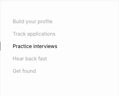
- The left column
<ul> is position: sticky; top: 96px; padding: 48px 0, 382px wide, with five items at 16/24, padding: 6px 40px.
- The active item is black, with a 1px black bar on the left. Inactive items are
#646464 at 50%. Color transitions over 300ms.
- The right column stacks a two-tone 24px statement, then a FIG panel (
bg-muted/40, padding: 32px 40px 24px, 419px tall), for 5 steps.
- Why: A long feature tour stays oriented. The visitor always sees the five steps and where they are, which is the same "track every application" promise the product makes.
6. Spacing scale (measured gaps)
flex gap frequency on home: 12px (43), 6px (34), 4px (29), 8px (20), 10px (16), 16px (10), 2px (9), 20px (5), 24px (4), 32px (2), 40px (1), 48px (1).
- Component internals use 4–12px. Card grids use 16px. Section padding is 48 / 56 / 64px. Large H1 offsets run 200px+.
- Hero: H1 top at y=272, which is 215px below the header. Mock top at 478. Mock height 660. Hero background ends at 1202.
7. Radius scale
--radius: .625rem (10px) is the shadcn base. The computed radii are:
| Radius |
Count (home) |
Used for |
| full (pill) |
58 |
Every button, nav-link hover, dots, orbs, avatars |
| 8px |
22 |
Section chips, story logo images, small tiles |
| 12px |
31 |
Menu items, icon tiles, social buttons, photos |
| 16px |
25 |
Changelog plates, version chip, job tags, inputs |
| 20px |
29 |
Cards (rounded-2xl): DM card, small cards, testimonial card, YC badge |
| 32px |
blog/stories/community |
Large link cards (rounded-[2rem]) |
| 6px / 4px |
few |
Mock UI details |
Why pills + soft cards inside a square frame: the outer frame is all right angles and drafting lines, and everything you touch is rounded. The contrast separates "the document" from "the objects on it".
8. Responsive behaviour (390px)
- The frame stays. Vertical rules sit at ≈10px from the edges and the corner dots remain.
- The hero mock is hidden (
hidden md:block). On mobile, the hero is H1 + lead + two buttons over the blue scanline glow.
- The logo grid becomes 2 columns × 4 rows. The bento becomes 1 column, with each illustration above its text.
- The sticky scrollspy disappears. Each step gets its own uppercase eyebrow ("BUILD YOUR PROFILE") above the statement, and the FIG panels stack.
- The folder-ring FAQ (
hidden lg:block) is replaced by a plain list ("Frequently asked questions…", lg:hidden).
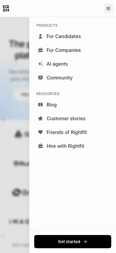
- The header shows the logo and a 36px hamburger button. It opens a right-side drawer (≈290px) with icon rows and a full-width black "Get started →" fixed at the bottom. The page behind it blurs.
05 · Hero patterns
21 captured pages use 7 hero types. All captures are 1440 × 900, so the fold is at y=900.
H1 · Split display + live product demo
Page: home
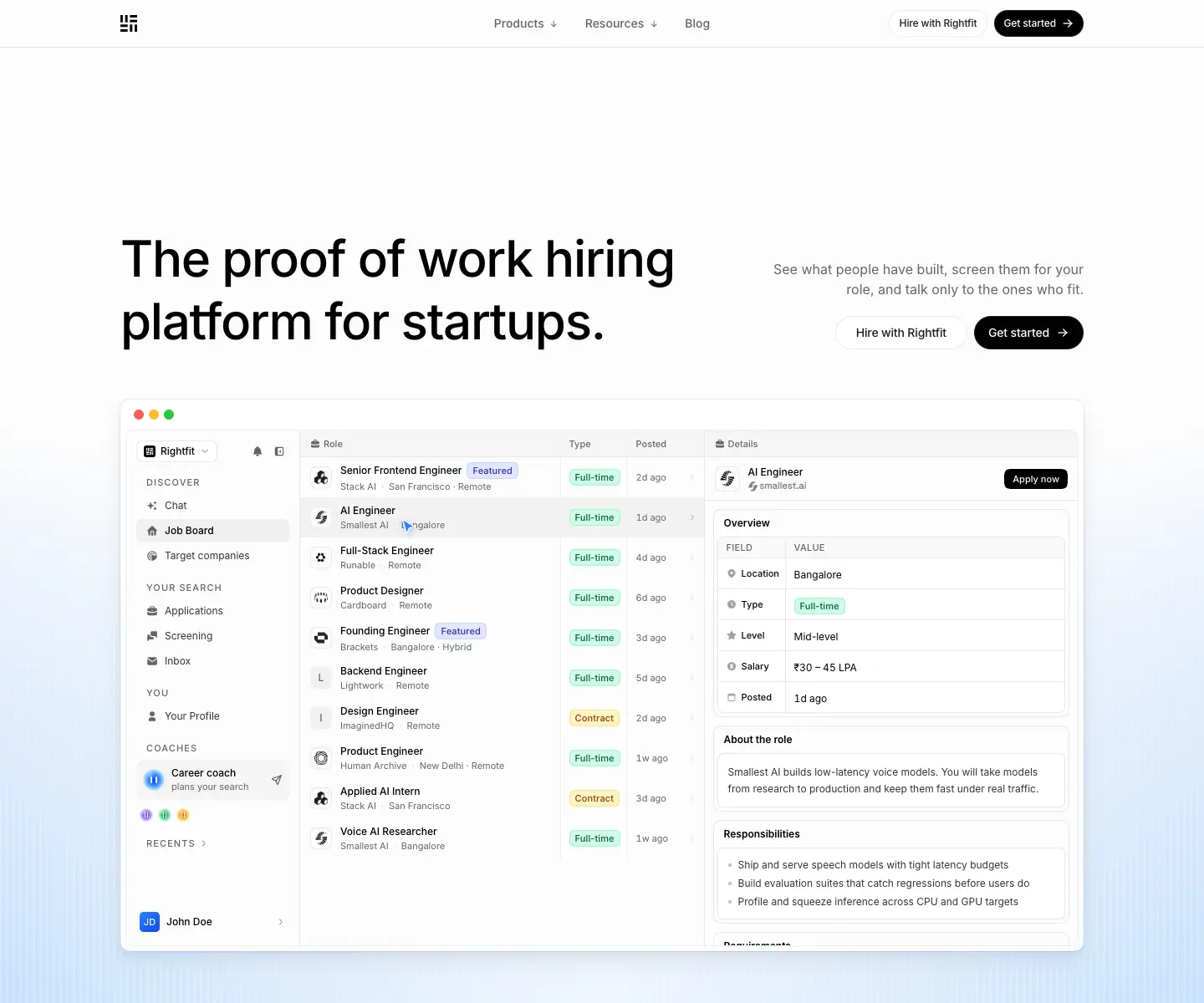
Structure
- H1 on the left: 60/75 · 510 · -0.022em, two lines, 720px wide, top at y=272.
md:min-w-[60%].
- On the right, aligned to the H1 baseline area: a lead (16/24,
#646464, right-aligned, 384px wide), then two buttons ("Hire with Rightfit" white, "Get started →" black), 40px tall, 8px apart.
- Below them, at y=478, a 1152 × 660 coded product mock in a macOS window (traffic lights
#ff5f57 #febc2e #28c840, 1px border, radius ≈16). It overlaps the fold. A fake cursor drives it through Profile → Applications kanban (drags a card) → Chat → Job board, ≈2.5s per screen.
- Background: blue radial glow from the bottom, at 40% opacity, with 1px white scanlines every 8px. A paper-colored radial fades it out toward the top.
Why it works
- The split puts the promise (left) and the action (right) on the same line. The reader's eye moves H1 → buttons without scrolling.
- The mock starts above the fold and is cut by it, so the visitor scrolls to see the rest.
- The moving cursor proves "it works" in seconds and makes the product the hero.
Recipe
- Header 57px fixed. H1 starts ≈215px below the header.
display:flex; align-items:end; justify-content:space-between for the H1 and right block. Right block max-width: 384px; text-align: right.- Mock:
max-width: 1152px; height: 660px; margin-top: 56px (mt-14). Hide it under 768px.
H2 · Centered chip + H1 over scanline glow
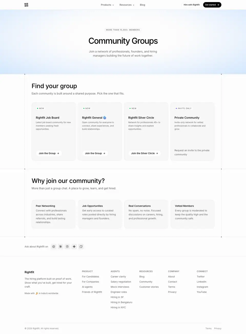
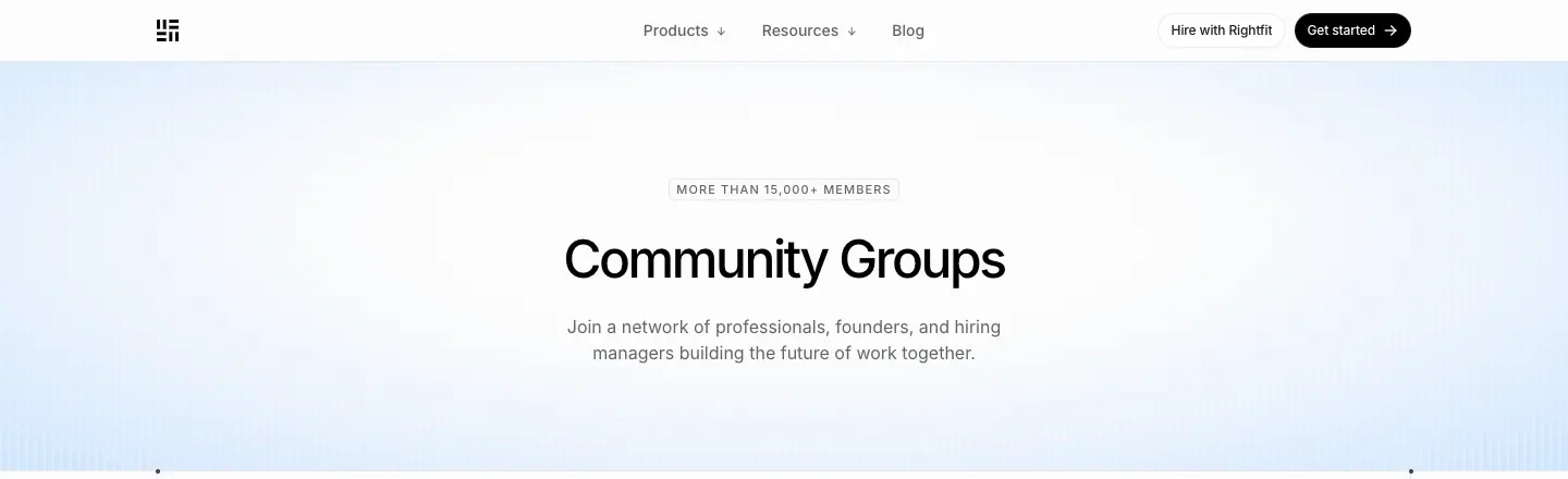
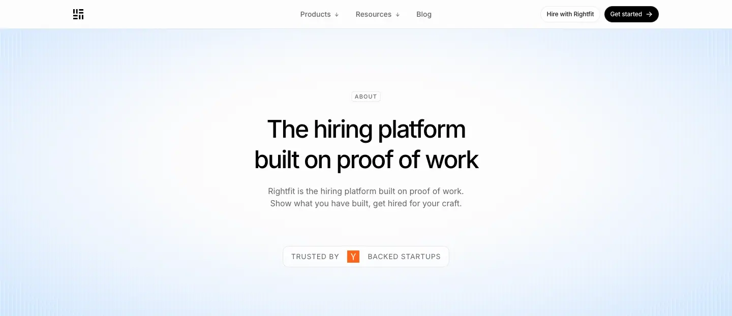
Pages: about, agents, agent landing pages, blog, customer stories, testimonials, community groups, open roles, friends, legal
| about |
blog |
 |
 |
Structure
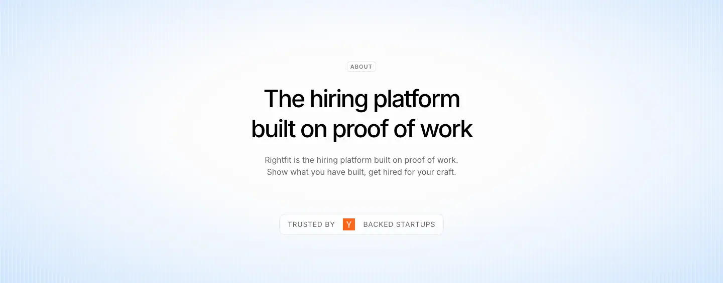
- Section chip centered ("ABOUT", "JOURNAL", "CUSTOMER STORIES"). H1 48/60 · 500 · -0.05em, centered,
text-balance, 2 lines max.
- Lead 16/24
#646464, centered, ≈430px wide.
- One element below the lead: a black pill CTA ("Get started", "Talk to us"), the "TRUSTED BY [Y] BACKED STARTUPS" badge, or a small agent orb label ("● Career agent").
- Background: the same blue glow + scanlines, ≈400–560px tall, ending in a hard edge where the framed column starts. Corner dots mark that edge.
Why it works
- It is a calm, repeatable header that any page can use. Only the chip word and the H1 change.
- The scanline glow is the brand's "sky". It makes every page instantly recognisable as Rightfit, even without a logo.
Recipe
- H1 top ≈ y=208. Chip 44px above the H1. Lead 16px below.
- Background block:
position:absolute; inset:0, three layered gradients (see 02 · Color), opacity:.4 on the blue layers.
H3 · Split H1 + testimonial card
Page: hire
Structure
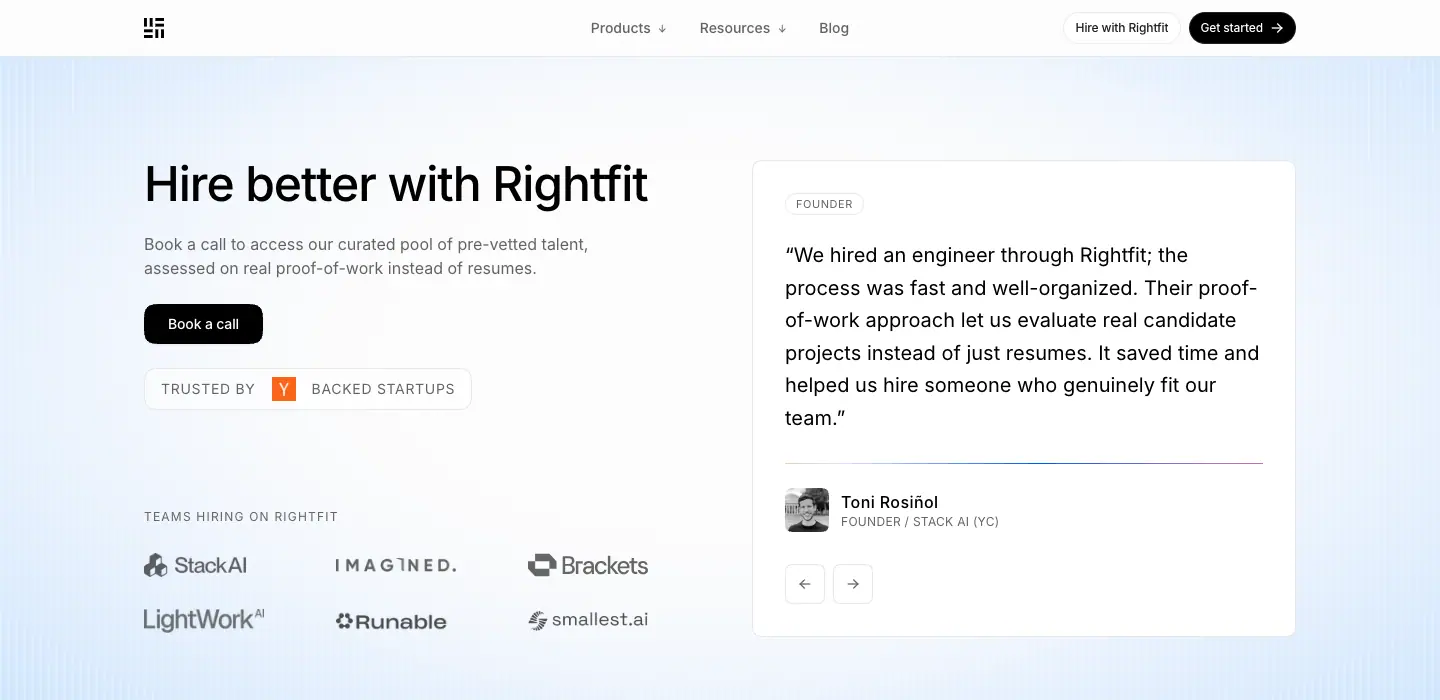
- Left: H1 "Hire better with Rightfit" 48/48 · 510, a short lead, one black "Book a call" button, then "TEAMS HIRING ON RIGHTFIT" and a 2 × 3 grayscale logo grid.
- Right: a white quote card. "FOUNDER" kicker (11px, 0.55px tracking), a 20/32.5 blockquote, avatar, name, "FOUNDER / STACK AI (YC)", and small arrows for a carousel.
- Over the same blue glow, which here extends ≈700px.
Why it works: Companies buy on proof from peers. The hero puts a named founder's quote next to the promise before any feature list.
H4 · Article header (blog post, customer story)
Pages: /blog/*, /customer-stories/*
| post |
story |
 |
 |
Structure
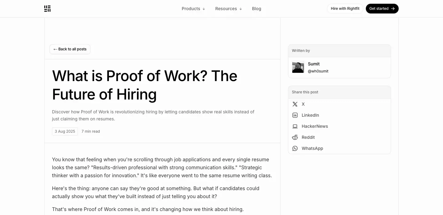
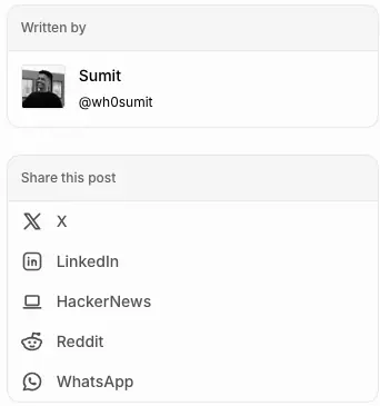
- Blog: a two-column frame. The left content column is ≈575px with a 1px rule on its right. It holds "← Back to all posts" (bordered pill), H1 48/60 · 510 left-aligned, a 14px gray description, and meta chips ("3 Aug 2025" bordered, "7 min read"). The right sidebar (≈250px) has a "Written by" card (avatar, name, @handle) and a "Share this post" card (X, LinkedIn, HackerNews, Reddit, WhatsApp).
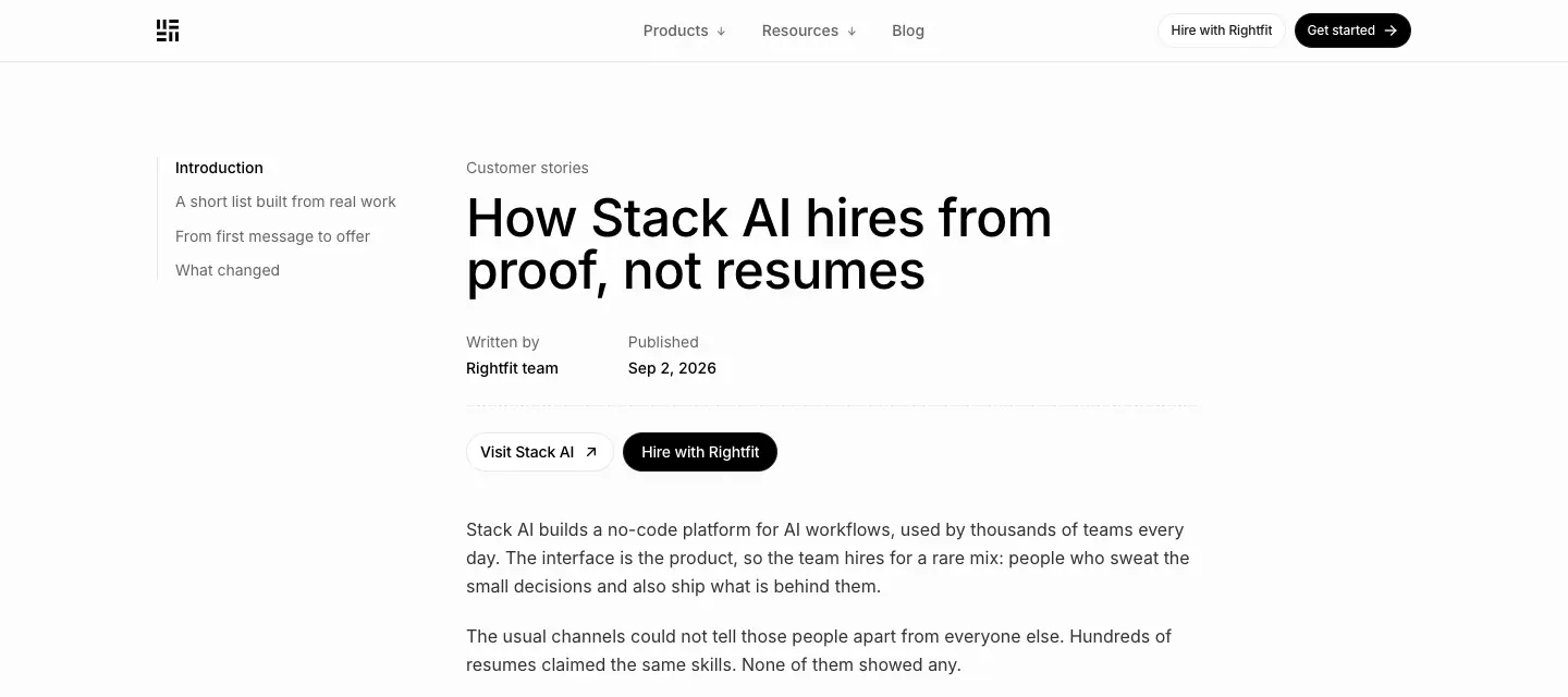
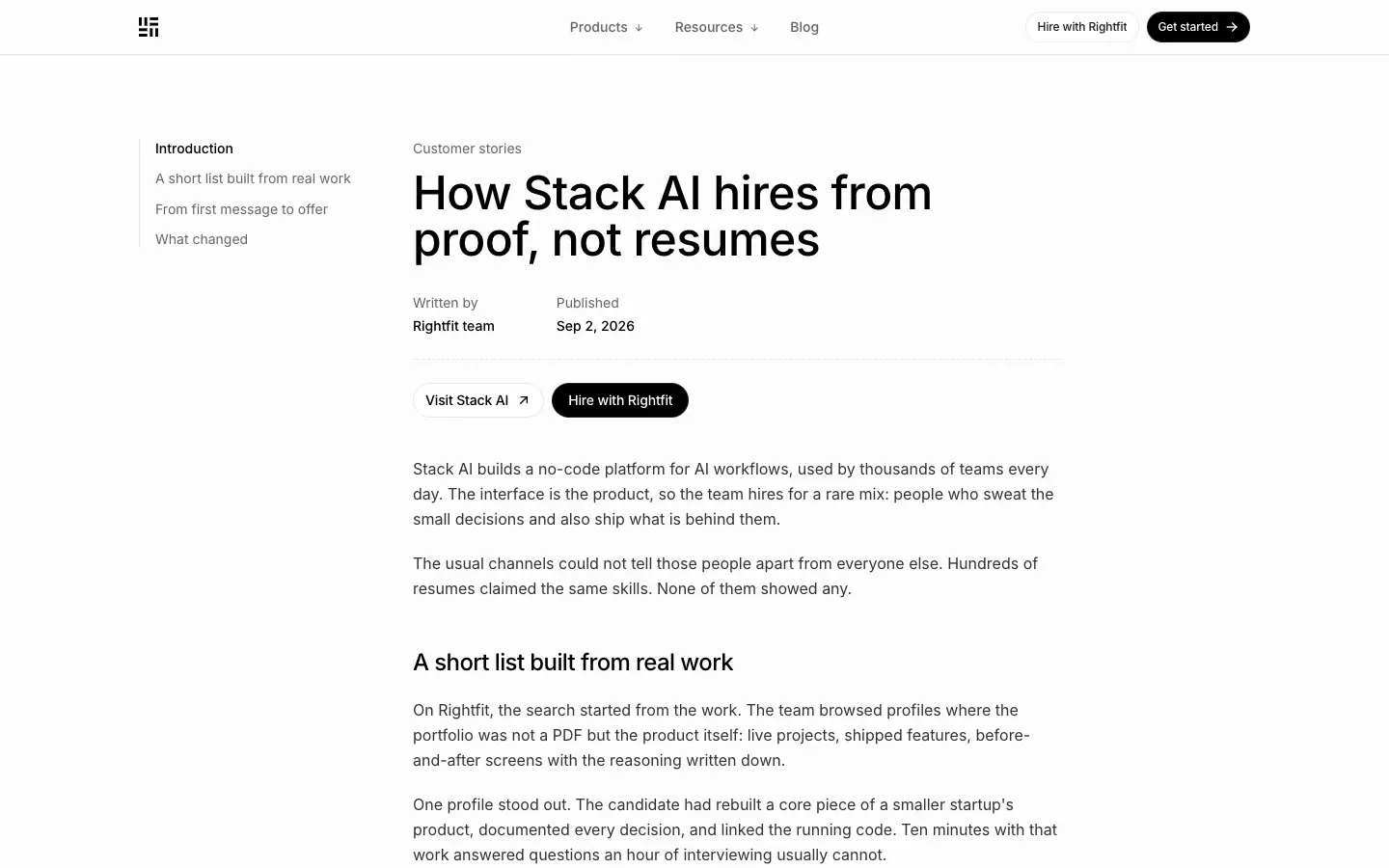
- Story: a left table-of-contents rail ("Introduction", section names) at x=144. The center column starts at x=428 with a "Customer story" eyebrow, H1 48/48 · 510, "Written by / Published" meta, and "Visit Stack AI ↗" + "Hire with Rightfit" buttons.
- No glow. A plain paper background, so reading starts immediately.
Why it works: Long-form pages drop the atmosphere and put the text first. The sidebar keeps author trust and sharing visible without breaking the reading column.
H5 · Job header with side card
Pages: /openroles/*
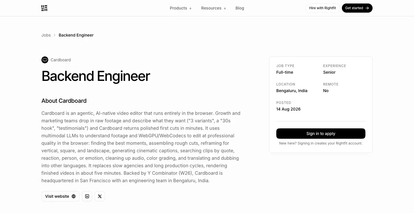
- Breadcrumb "Jobs › Backend Engineer". Company favicon + name, H1 48/48 · 500 · -0.05em, then "About Cardboard" (20/28 H2) and the description.
- On the right, a white card (360 × 335, radius 16, padding 24, 1px border) with a 2 × 2 grid of facts (JOB TYPE / EXPERIENCE / LOCATION / REMOTE / POSTED in 12px uppercase labels), a full-width black "Sign in to apply" pill (310 × 36), and a 12px note.
- Why: A job post is a decision page. All facts sit in one card next to the description, and the one action is impossible to miss.
H6 · Split utility over an image backdrop
Page: contact
- A full-bleed photographic/painterly backdrop (orange-red forms on dark, 1440 × 900
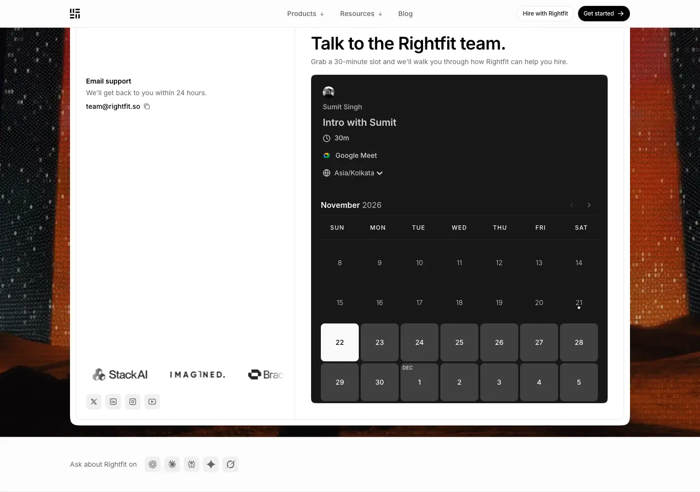
<img>) behind a white rounded panel (radius 28). The panel splits into an "Email support" column with a logo marquee and social buttons on the left, and "Talk to the Rightfit team." (36/40 · 590) + a dark Cal.com booking calendar on the right.
- Why: The only page where the visitor must act, not read. The dramatic image signals "a different kind of page" and frames the panel like a desk on a backdrop.
H7 · Plain document title
Page: changelog
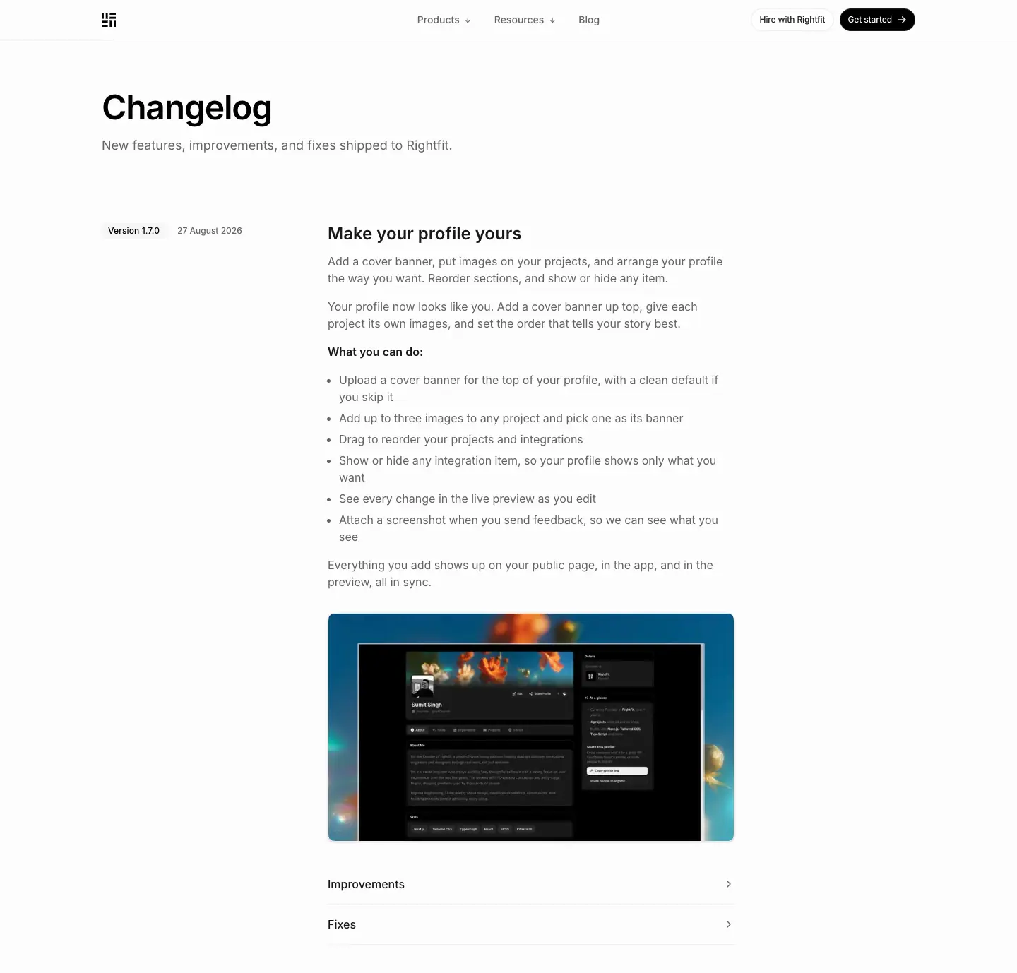
- H1 "Changelog" 48/48 · 600 · -0.025em at x=144, y=128. Lead 18/28
#646464. No glow, no chip, no frame lines at the top.
- Why: A changelog is a record. It looks like a plain document so that the entries, not the header, carry the page.
06 · Section patterns
The site is built from about 20 reusable blocks. Most of them sit inside the framed column and start with a label row (chip left, meta label right, 1px rule below). That shared opening is what makes so many different blocks feel like one system.
S1 · Linked logo grid
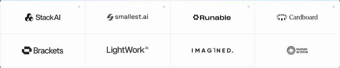
- 4 × 2 grid, 287.5 × 112px cells, 1px rules via
gap-px. Logos are 28px tall (h-7, max-w-[140px]) and grayscale(1). On hover they return to color over 300ms (group-hover:grayscale-0).
- Linked cells show a tiny
↗ at the top-right (12px, #646464). Each logo links to the customer's site.
- Why: A grid, not a marquee: every logo gets equal weight and stays still to read. The grid continues the framed-column lines straight out of the hero.
S2 · Label row + two-tone statement
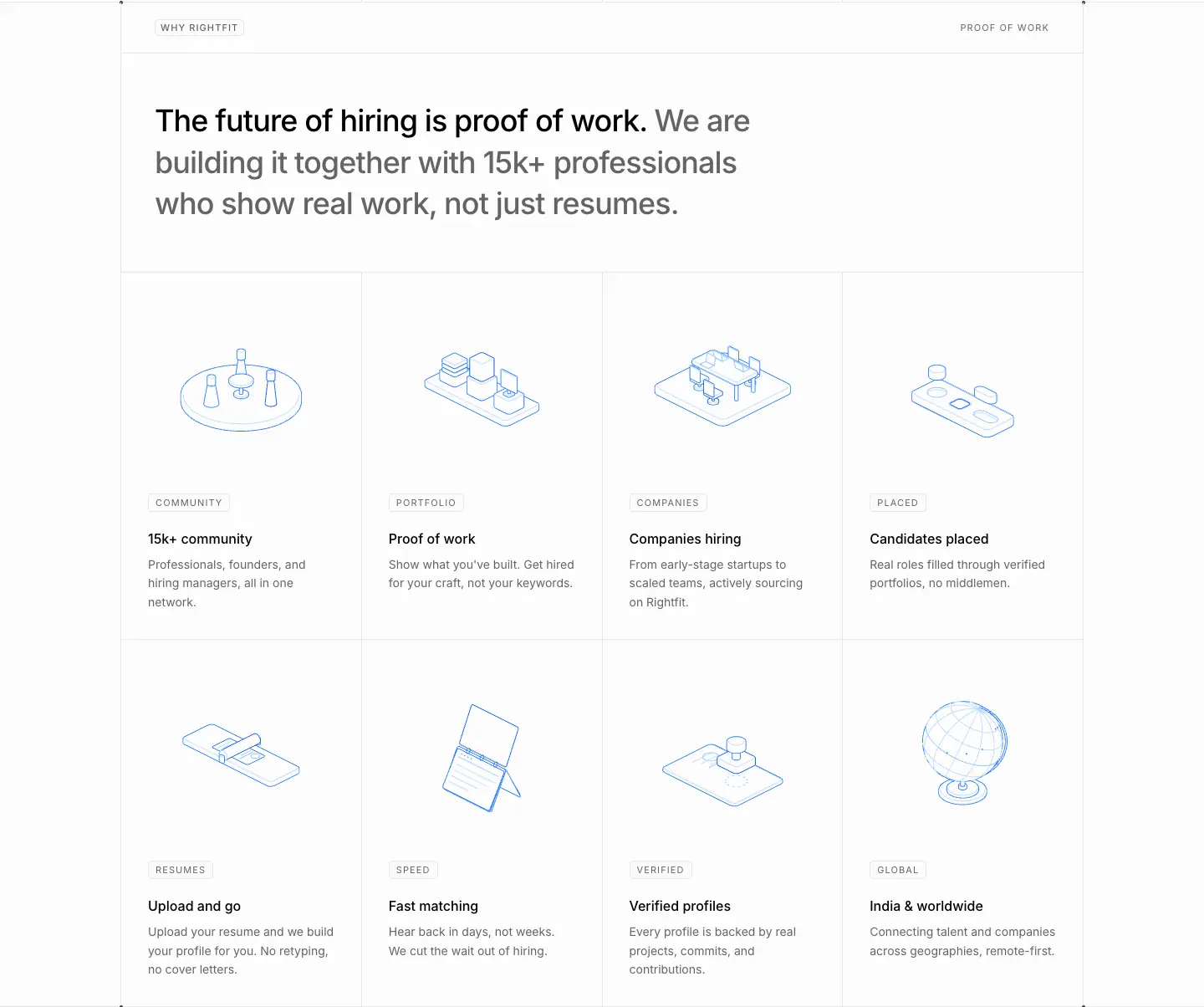
- Chip ("WHY RIGHTFIT") left, meta ("PROOF OF WORK") right. Then 56px padding, and an H2 at 36/49.5 · 500 in
#000 + #646464, max-width: 896px.
- Why: This is the section "title page". It states the thesis in one sentence before any visual.
S3 · Isometric bento (4 × 2)
- 8 cells, each 287.5 × 439. A 0.9px isometric illustration sits in the top ≈60%. Below it: a kicker chip (11px, 1.1px tracking, padding 2px 8px), a title at 16/24 · 500, and a 14/20 gray description. Cell padding is 32px.
- Kickers are one-word category labels: COMMUNITY, PORTFOLIO, COMPANIES, PLACED, RESUMES, SPEED, VERIFIED, GLOBAL.
- Why: It explains eight benefits with one visual system. The equal cells and no "hero cell" match the even, factual tone.
S4 · Chat card + illustration card
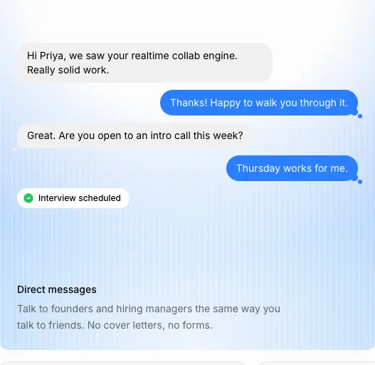
- Two 527 × 512 cards, radius 20, 16px apart.
- The left card holds a full chat: gray received bubbles (
#f0f0f0), blue sent bubbles (#155dfc, white text, with a small tail dot), and a white "✓ Interview scheduled" pill. It sits on a blue gradient (#eff6ff → #dbeafe) with scanlines. Title + description sit at the bottom.
- The right card is plain paper with a large isometric line drawing and its title at the bottom.
- Why: The chat tells a 4-message story that ends in the outcome (an interview), so the benefit is shown, not claimed.
S5 · Icon trio + proof footer row

- 3 cards (346 × 198, radius 20,
bg-muted/40, 1px border, padding 24). A 32px white icon tile sits on top, then a 14px · 500 title and a 14/20 gray line.
- Under the cards: a row of 3 round customer logos + "Stack AI, Smallest AI and Runable hire on Rightfit." and a black CTA on the right.
- Why: Small claims get small cards. Every section ends with social proof and a button, so the visitor can act at the moment of conviction.
S6 · Sticky scrollspy + FIG story
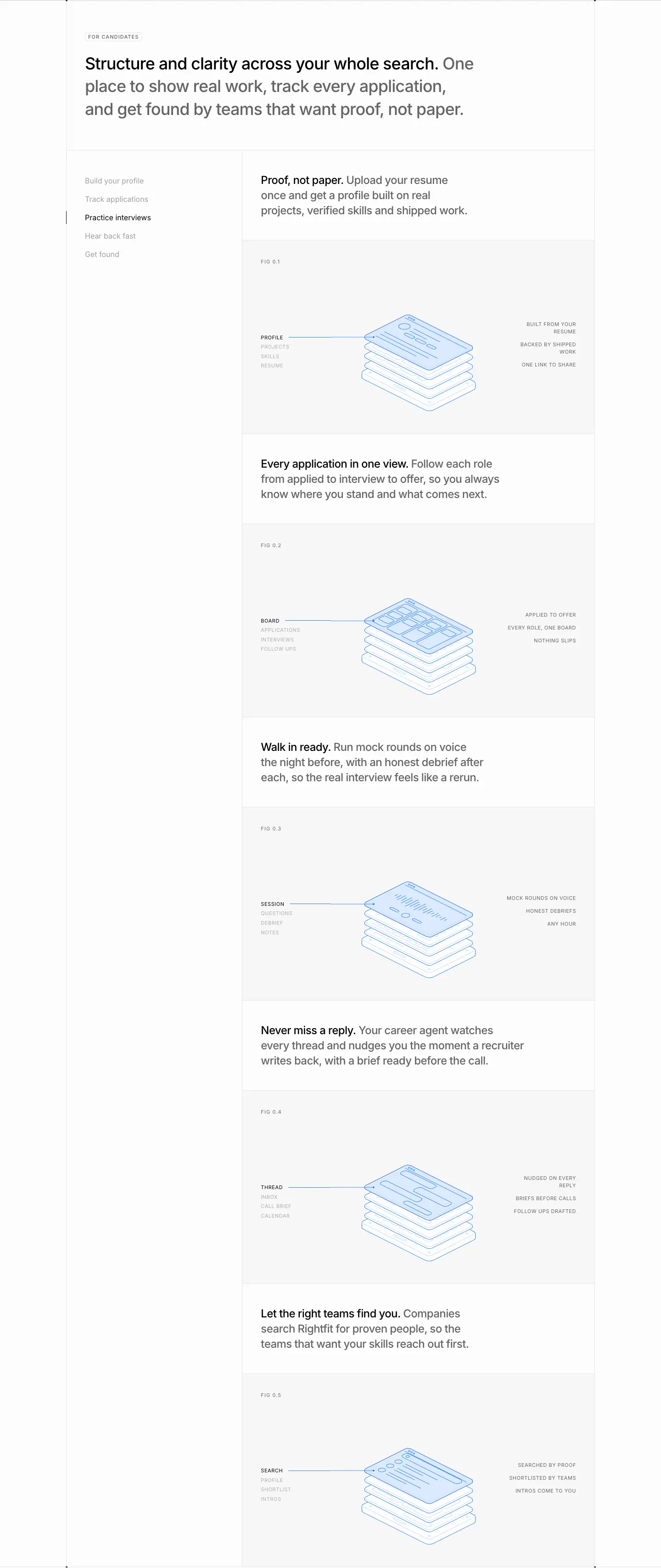
- Left: a sticky list of 5 steps (see 04 · Layout). Right: per step, a 24/33 two-tone statement, then a FIG panel.
- Why: The candidate journey has 5 stages. The layout makes the visitor track them, like the product does.
S7 · FIG exploded-layer drawing
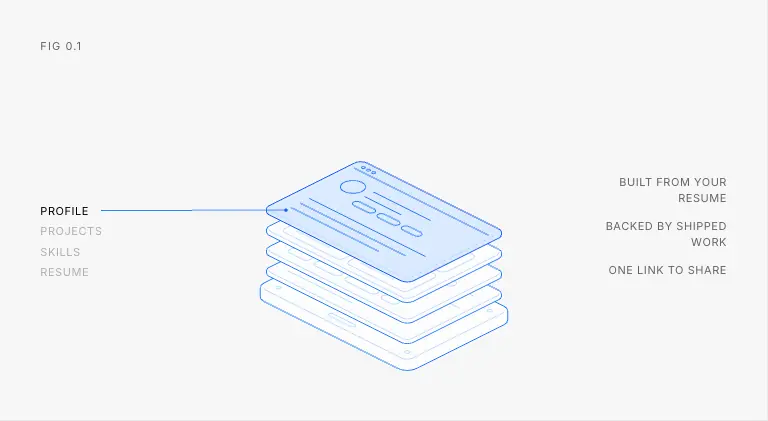
- Panel
bg-muted/40, padding 32 40 24. "FIG 0.1" caption at the top-left (11px, 1.1px tracking).
- Center: 5 stacked isometric plates. The top plate is filled blue-100 with a
#155dfc stroke and shows UI lines. The plates below are outline-only #bedbff.
- Left: a layer list (PROFILE black = active, then PROJECTS, SKILLS, RESUME at 40% gray) with a leader line to the top plate. Right: three uppercase benefit callouts, right-aligned.
- Why: An exploded view says "here is how it's built", which is literally proof of work. The active layer is a clickable tab (
<button>) that changes the highlighted plate.
S8 · Timeline panel + icon quad
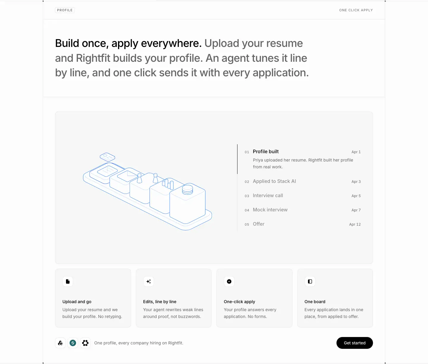
- A large panel (radius 20,
bg-muted/40). On the left, an isometric drawing of 5 connected blocks (a pipeline). On the right, a 5-step timeline: "01 Profile built – Apr 1" (black, with a gray sub-line and a 1px black left bar) and 02–05 in gray with dates (Applied to Stack AI Apr 3, Interview call Apr 5, Mock interview Apr 7, Offer Apr 12).
- Below: 4 icon cards (255.5px) and the proof footer row.
- Why: Concrete dates turn "fast" into "11 days from profile to offer". The checkpoint animations (
checkpoint-in, checkpoint-draw, checkpoint-pop) step through the timeline.
S9 · Testimonial split
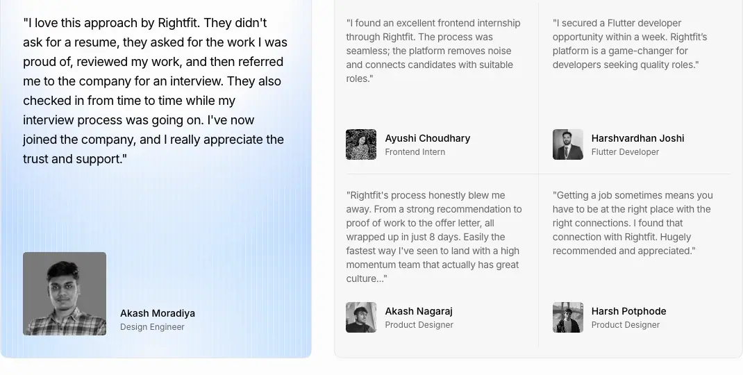
- A strip of grayscale logos on top. Left: a tall card (449 × 530, radius 20) with a blue-gradient bottom, an 18/28 quote, a black-and-white portrait (≈120px) and name/role. Right: a 2 × 2 grid of short quotes (13px), each with a small B/W avatar, name and role.
- Footer: "TRUSTED BY [Y] BACKED STARTUPS" badge (radius 20,
bg-card/60) + a "Read more testimonials →" outline button.
- Why: One long story for depth, four short ones for breadth. The black-and-white photos keep faces from breaking the blue/gray palette.
S10 · Folder-ring FAQ
- Desktop only (
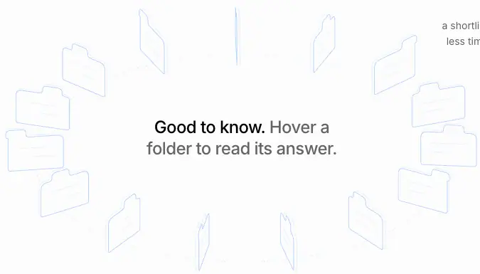
hidden lg:block). 16 folder outlines (≈0.9px blue strokes) stand on an elliptical dotted orbit around the center line "Good to know. Hover a folder to read its answer." (24/30). The ring rotates slowly. Hovering a folder reveals its answer.
- Three numbered Q&As sit in the corners: "01" (11px), the question (12px uppercase, 500, black) and a lowercase 14/22.75 gray answer. "Read More →" at the bottom-right. The header row says "FAQ … 15 QUESTIONS".
- Mobile: a normal list.
- Why: FAQ is usually the dullest block. Here it becomes a toy, so people actually read three answers. The lowercase answers keep it casual.
S11 · Orb CTA band
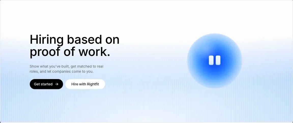
- Full frame width, 481px tall. The blue scanline gradient rises from the bottom. Left: CTA H2 48/48 · 510 ("Hiring based on proof of work."), a 14px gray line, and the two buttons. Right: the 220px blue orb with two white eyes.
- Why: It ends every page on the brand's face (the orb) and its one sentence, with both audience buttons.
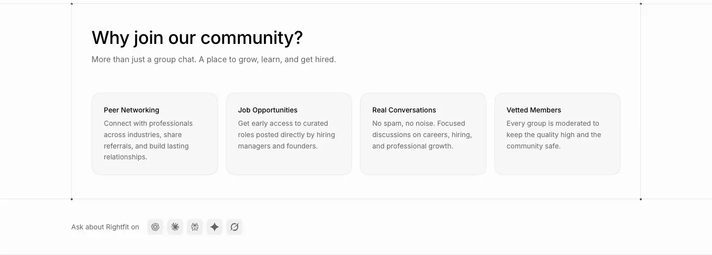
S12 · "Ask about Rightfit on" row
- 14px gray label + 5 icon buttons (32 × 32, radius 12,
#f0f0f0) linking to ChatGPT, Claude, Perplexity, Gemini and Grok, pre-filled with "What is Rightfit and how does proof of work hiring work?".
- Why: It is generative-engine optimisation. It sends visitors to AI assistants with a question the brand is sure to win, and it signals "we are an AI-native company".
S13 · Stats row
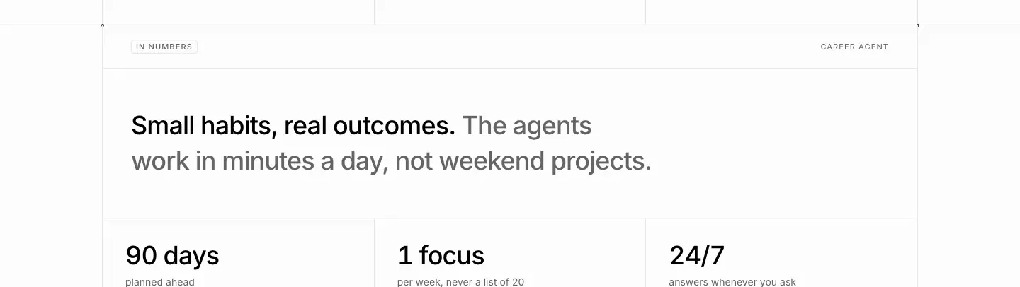
- A label row ("IN NUMBERS"), a two-tone statement, then 3 columns divided by rules. Each has a big number (36/40 · 500: "90 days", "1 focus", "24/7"; "15k+", "100+", "8 days") and an 11px uppercase gray caption.
- Why: Numbers are the fastest proof. Three is the maximum, so each one is read.
S14 · Agent spotlight
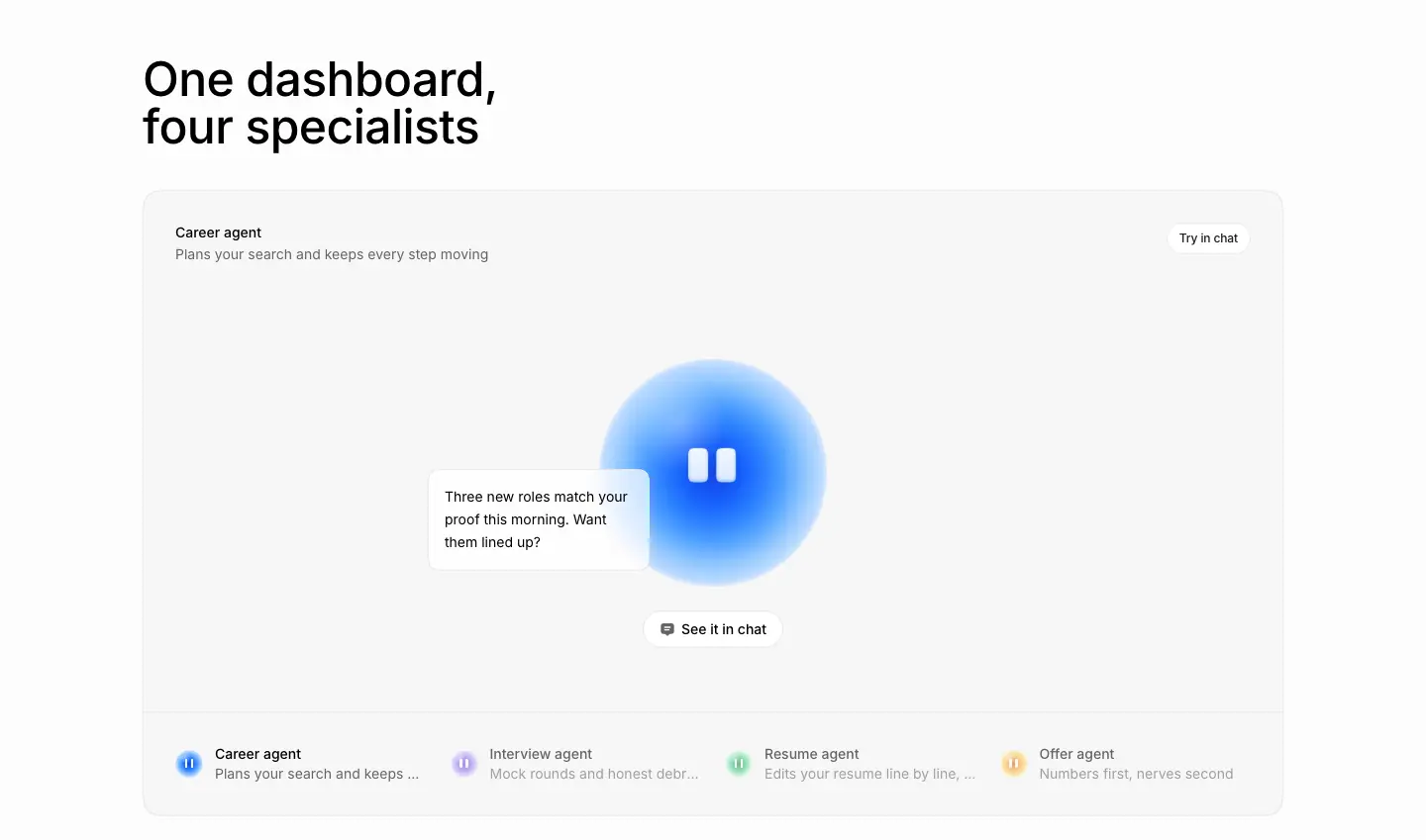
- A big rounded panel (radius 20). Top: the agent name + description and a "Try in chat" pill. Center: the large orb with a white speech-bubble card ("Three new roles match your proof this morning. Want them lined up?") and a "See it in chat" pill. Bottom: 4 agent tabs, each with a small colored orb, name and truncated line. The inactive ones are at reduced opacity.
- Why: It shows the agent talking, so "AI agent" becomes a concrete helper with a voice.
S15 · Capability matrix
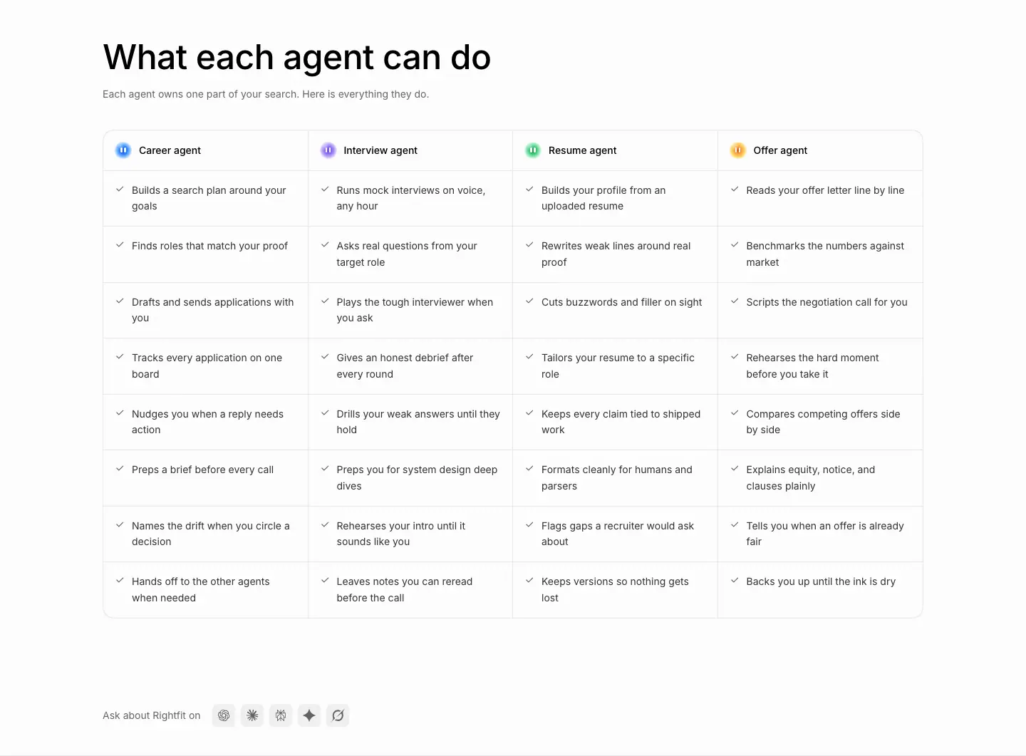
- 4 columns, one per agent (colored orb + name). Each has 8 rows of
✓ + 14px text, with 1px row rules, inside a radius-20 bordered panel.
- Why: A dense, scannable comparison for the visitor who wants everything, after the emotional spotlight.
S16 · Link-row grid ("More ways the agents help")
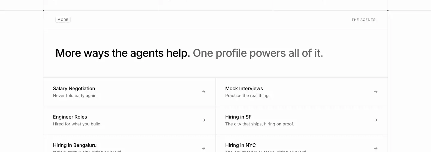
- A 2-column list of rows inside the frame. Each row has a 14px · 500 title, a 12px gray line and a
→ on the right, with 1px rules.
- Why: Internal links between the SEO landing pages, styled as quiet navigation, not as ads.
S17 · Company directory
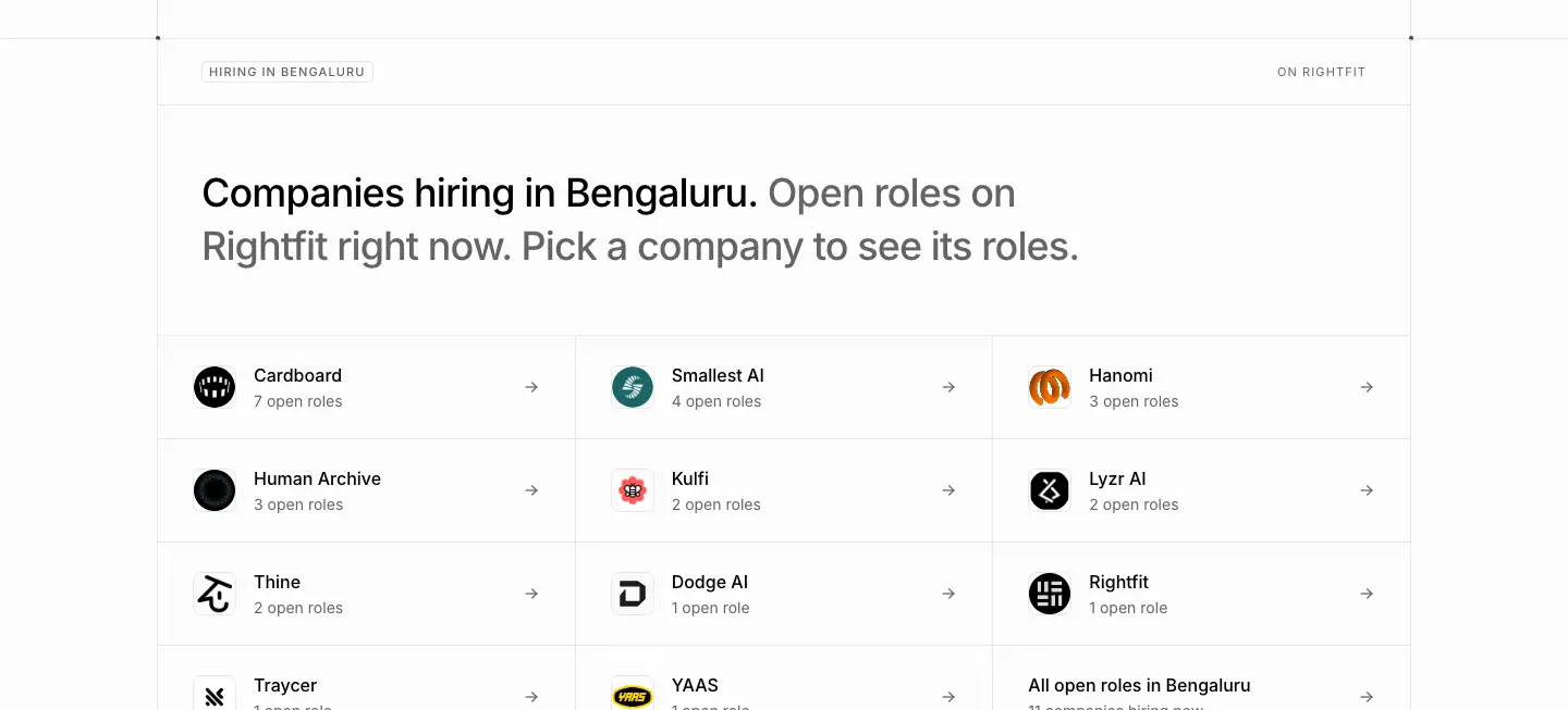
- A 3-column grid of rows: company logo in a 32px circle, name, "7 open roles",
→. The last cell is "All open roles in Bengaluru".
- Why: City pages need real local data to rank and to convert. The grid turns the database into a landing page.
S18 · Payout calculator cards
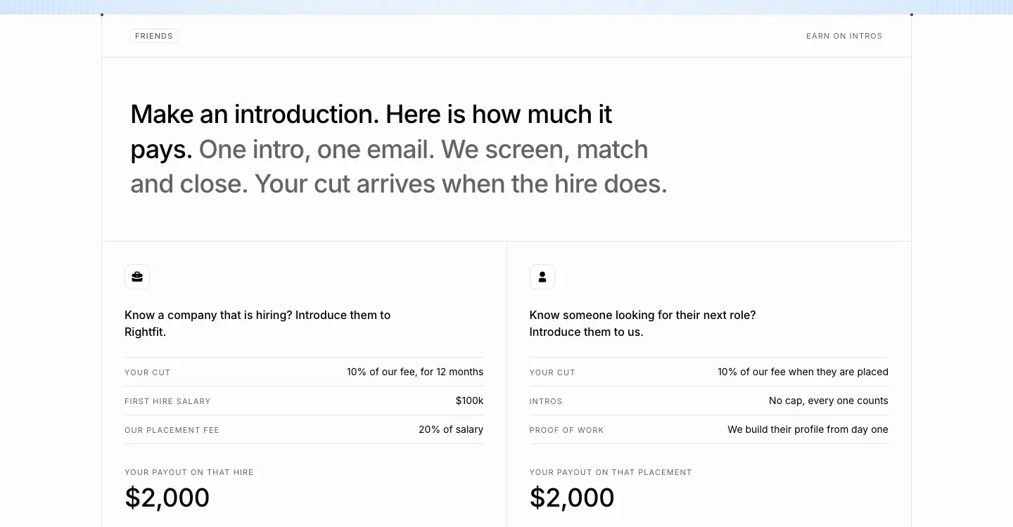
- Two cards ("Know a company that is hiring?" / "Know someone looking for their next role?"). Each is a label-value table (YOUR CUT – 10% of our fee, FIRST HIRE SALARY – $100k …) ending in "YOUR PAYOUT ON THAT HIRE" and $2,000 at 36px.
- Why: Referral programs fail on vague rewards. Showing the arithmetic makes the $2,000 believable.
S19 · Email mock ("One CC")
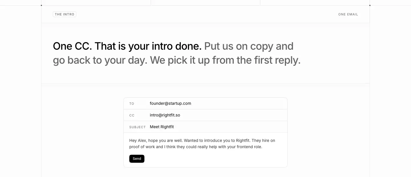
- A small white email composer: TO / CC / SUBJECT rows with 11px uppercase labels, body text and a black "Send" button.
- Why: It shows that the whole referral action is one email, which is the claim of the headline.
S20 · Link cards (blog, stories, community)
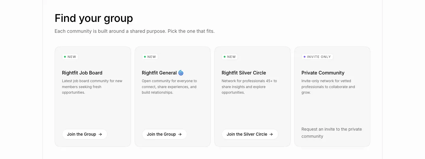
- Cards of 346 × 346 (blog) or 259 × 340 (community), radius 32,
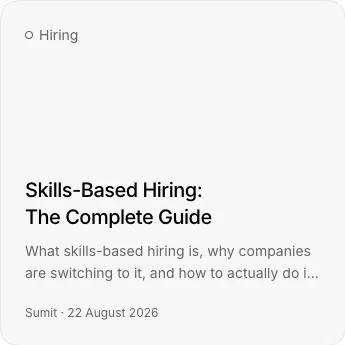
bg-muted/40, 1px border, padding 24. A small category label with a ring dot ("○ Hiring") at the top, a large empty middle, and the title (20/27.5 · 500) + 2-line gray excerpt + "Sumit · 22 August 2026" at the bottom.
- Why: No thumbnails. The empty space makes the grid calm and avoids stock imagery. The title is the visual. The large radius tells "content card" apart from "feature card" (radius 20).
Supporting blocks
- Founder quote (about): a B/W portrait (≈150px, radius 8), a 24/32 · 300 quote, the name at 36px +0.9px tracking, "FOUNDER / RIGHTFIT" and a line linking to the blog and X.
- Animated word chips (about): "Show your work, prove your craft, get hired by startups in days." Key words sit in pill chips that invert (black chip, white text) as they animate.
- Changelog entry: see pages/changelog.md.
- Job list rows: see pages/open-roles.md.
07 · Copywriting and voice
1. Voice in one line
Plain, short, slightly defiant, written for builders. It sounds like a founder talking to an engineer: "Application hell is real. We're ending it."
2. The core vocabulary
| Word / phrase |
Where it appears |
Purpose |
| "proof of work" / "proof" |
In the H1, CTA, meta labels, FAQ, 3+ blog titles, story titles ("hires from proof, not resumes") |
The owned category term |
| "resume" (as the enemy) |
"not just resumes", "Proof, not paper.", "Upload your resume once" |
The thing being replaced. Named, so the contrast is clear |
| "real" |
"real work", "real projects, real code, and real results", "real roles" |
Trust |
| "days, not weeks" |
"Hear back in days, not weeks.", "5 to 10 days", "8 days" |
Speed claim, always quantified |
| "agent" |
Career / Interview / Resume / Offer agent |
AI framed as a person with a job |
3. Headline formulas
- Category claim (H1): "The [category] platform for [audience]." → "The proof of work hiring platform for startups."
- Two-tone statement (H2): Short claim. + Gray explanation that names the mechanism.
- "The future of hiring is proof of work. We are building it together with 15k+ professionals who show real work, not just resumes."
- "Companies message you first. Vetted companies find your work and start the conversation."
- "A plan, not a pep talk. The plan starts from your own work and real market data…"
- "X, not Y" antithesis: "Proof, not paper." / "A plan, not a pep talk." / "from proof, not resumes" / "Hear back in days, not weeks." It is the brand's signature rhythm.
- Imperative micro-headlines (24px): "Walk in ready." "Never miss a reply." "Let the right teams find you." "Build once, apply everywhere."
- Money and numbers up front: "An intro to Rightfit could pay you $2,000." "One CC. That is your intro done."
- Problem first (about): "Application hell is real. We're ending it." Then a 4-paragraph story with one hard number: "One company got 8,569 applications in four days for a single role."
4. Labels: the document voice
- Section chips are categories, never sentences: WHY RIGHTFIT · MESSAGES · FOR CANDIDATES · PROFILE · TESTIMONIALS · FAQ · IN NUMBERS · HOW IT WORKS · MORE.
- Right-side meta labels add a second keyword: PROOF OF WORK · INBOX · ONE CLICK APPLY · FROM CANDIDATES · 15 QUESTIONS · CAREER AGENT · ON RIGHTFIT.
- Figure captions: "FIG 0.1" to "FIG 0.5", "FIG 1.0 · CAREER CLARITY".
- Callouts: 2–4 uppercase words: BUILT FROM YOUR RESUME · BACKED BY SHIPPED WORK · ONE LINK TO SHARE · NUDGED ON EVERY REPLY.
- Why: The labels let a skimmer get the whole page from uppercase words alone. They also keep the technical-drawing feel consistent.
5. Body copy rules
- Sentences of 6–14 words. Fragments are allowed: "No retyping, no cover letters." "No calls, no forms, no chasing."
- Second person ("you", "your"), present tense. Companies are "teams" or "startups", candidates are "professionals" or "people".
- Card descriptions are one line, starting with the benefit: "Hear back in days, not weeks. We cut the wait out of hiring."
- FAQ answers are lowercase: "we put real work first, so teams skip the noise and talk to people who can do the job." It reads like a chat reply. The CSS enforces it (
text-transform: lowercase).
6. Calls to action
| CTA |
Where |
Audience |
| Get started → |
Header, hero, every CTA band, mobile drawer |
Candidates (primary, black) |
| Hire with Rightfit |
Header, hero, after sections |
Companies (secondary, white) |
| Book a call |
/hire |
Companies |
| Sign in to apply |
Job pages |
Candidates |
| Become a friend / See how it pays |
/friends |
Referrers |
| Join the Group → |
/community-groups |
Community |
| Read More → / Read more testimonials → |
FAQ, testimonials |
Depth |
| Try in chat / See it in chat |
/agents |
Agent trial |
- Only "Get started" has an arrow inside the black button. The arrow marks the main path.
- CTAs are 2–3 words, verb first, never "Learn more".
7. Proof copy
- Named customer logos (Stack AI, Smallest AI, Runable, Cardboard, Brackets, LightWork AI, Imagined, Human Archive), linked to their sites.
- "TRUSTED BY [Y] BACKED STARTUPS". YC is shown as the logo square, not as words.
- Named testimonials with role labels ("Frontend Intern", "Flutter Developer", "Product Designer"). These are candidate voices, deliberately junior and specific.
- Numbers: 15k+ professionals, 100+ companies, 90%+, 5 to 10 days, 8 days.
8. SEO and AI-search architecture
- Programmatic landing pages:
/agents/career-clarity, /agents/salary-negotiation, /agents/mock-interviews, /agents/engineer-roles, /agents/hiring-in-san-francisco, /agents/hiring-in-bengaluru, /agents/hiring-in-new-york. They share one template; the H1 and FIG change: "Know your next move.", "Hiring in Bengaluru."
- City copy uses local detail: "From Koramangala to HSR, Bengaluru teams on Rightfit read your work before they read your resume."
- Open roles are individual, indexable pages with structured meta descriptions: "On-site Full-Time role at Cardboard, Bengaluru, India. Skills: TypeScript, Go, Rust. Apply on Rightfit."
- "Ask about Rightfit on" links to 5 AI assistants with a pre-filled question.
- Blog posts target definitions and guides: "What is Proof of Work?", "Skills-Based Hiring: The Complete Guide", "The Startup Hiring Guide", "India's Tech Job Market 2025".
9. Copy checklist (to reuse the voice)
- [ ] Does the H1 name the category you want to own?
- [ ] Does every section H2 start with a black claim of 3–7 words and continue in gray?
- [ ] Is there at least one "X, not Y" line per page?
- [ ] Is every speed or size claim a number?
- [ ] Are labels uppercase nouns, never sentences?
- [ ] Does every CTA band offer both audiences their button?
- [ ] Are FAQ answers short enough to read in one breath?
08 · Components
All values measured on the live site at 1440px. Raw data: data/home.components.json, data/home.buttons.json.
1. Header

| Part |
Value |
| Bar |
fixed, top 0, z-index: 9999, 1440 × 57, bg #fcfcfc, bottom border 1px #e8e8e8. No blur, no shadow |
| Logo |
20 × 20 SVG monogram (logo-shape-black.svg) at x=144 |
| Nav links |
"Products ↓", "Resources ↓", "Blog". Label 14px · 510 · #646464, height 32, padding 0 14px, pill radius. Hover: bg #f0f0f0, text #000, 150ms cubic-bezier(.4,0,.2,1) |
| Open state |
The trigger keeps a pill fill (or a 1px outline in the Resources capture) and the arrow flips ↓ → ↑ (transform 140ms cubic-bezier(.33,1,.68,1)) |
| Right |
"Hire with Rightfit" (white, small) + "Get started →" (black, small): 32px tall, 12px · 510, padding 0 10px |
Why: A plain bar on paper with no glass effect, because the frame lines already provide structure. Both audience CTAs stay visible at all times.
2. Mega menu
| Products |
Resources |
 |
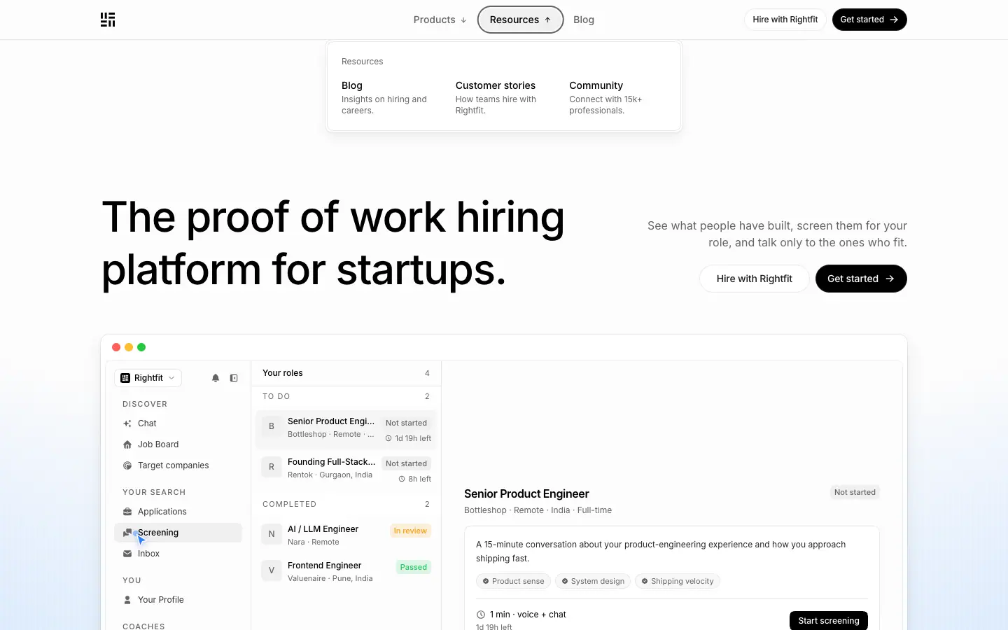 |
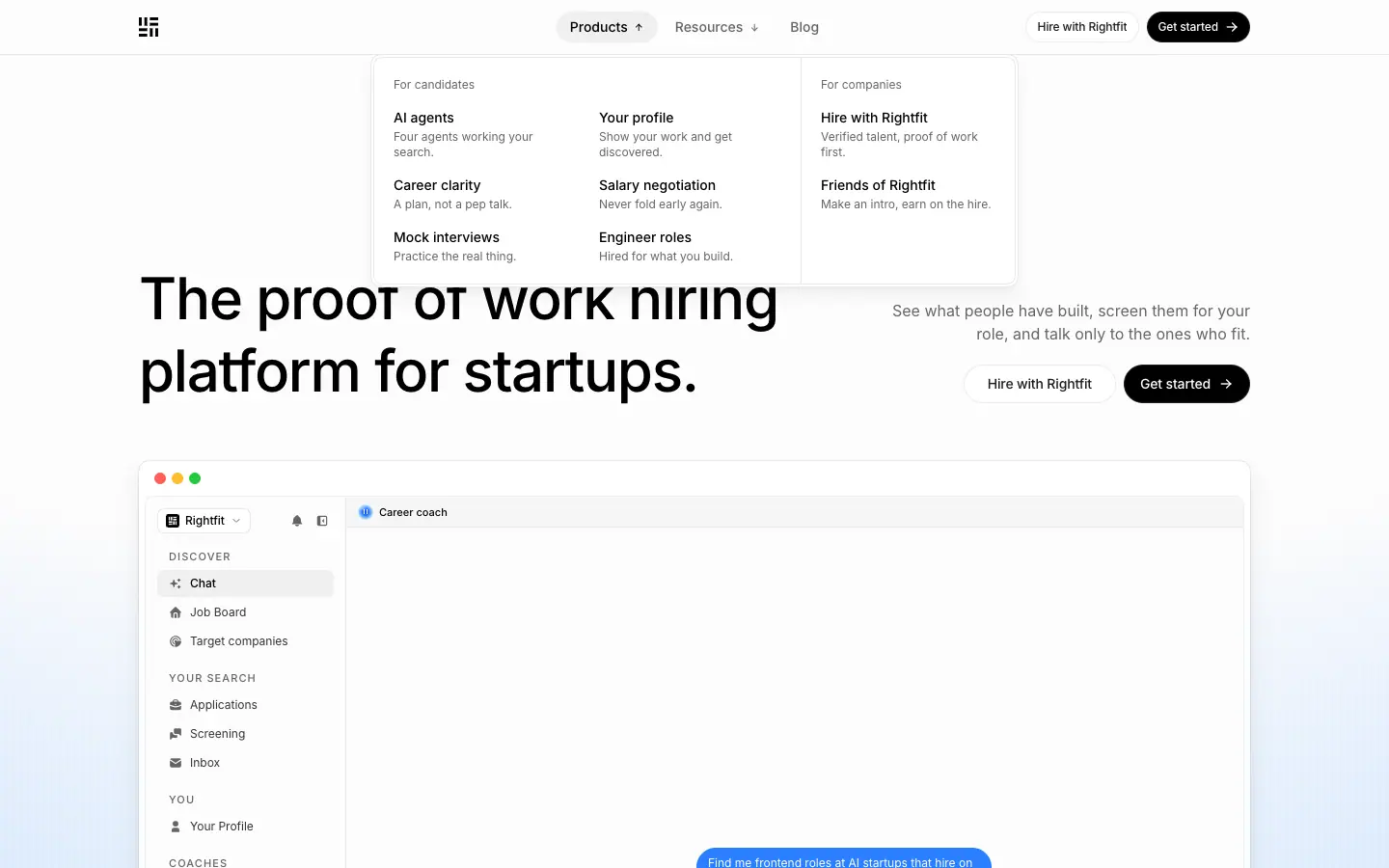
- A white panel (≈667px wide for Products), 1px
#e8e8e8 border, radius ≈16, soft shadow, opening below the header.
- Products has 2 groups divided by a 1px vertical rule: For candidates (AI agents, Your profile, Career clarity, Salary negotiation, Mock interviews, Engineer roles) and For companies (Hire with Rightfit, Friends of Rightfit).
- Items: title 16px
#000 + description 14px #646464 ("Four agents working your search."). Item padding 8px 12px, radius 12, hover bg-muted/50.
- Group labels are 13–14px gray, sentence case ("For candidates"), not uppercase.
- Why: Each item's one-line description does the selling inside the menu, so visitors choose the right page on the first click.
3. Mobile drawer
- Hamburger: a 36 × 36 button with a
#f0f0f0 fill. The drawer slides in from the right (≈290px wide), the page behind blurs, and the header stays.
- Uppercase group labels (PRODUCTS, RESOURCES: 12px, 0.6px tracking) and rows of icon + 16px label (filled icons: person, briefcase, sparkle, chat, book, star, heart).
- A full-width black "Get started →" pill pinned to the bottom of the drawer.
4. Buttons

| Variant |
Measured |
| Primary (black) |
bg #000, text #fff, 14/20 · 510 · -0.154px, height 40, padding 10px 16px (24px without icon), radius full, border 1px rgba(255,255,255,.12), trailing → icon, gap 8 |
| Secondary (white) |
bg #fff, text #1c1d1f, border 1px rgba(0,0,0,.08), height 40, padding 10px 24px, radius full |
| Outline (utility) |
bg #fcfcfc, 1px #e8e8e8, radius 20, padding 8px 12px (h 36) or 10px 16px (h 40), shadow 0 1px 2px rgba(0,0,0,.05) ("Read More →", "Read more testimonials →", "Visit website ↗") |
| Small header |
height 32, 12px · 510 · -0.132px, padding 0 10px |
| Full-width apply |
310 × 36 black, radius 20, padding 8px 16px ("Sign in to apply") |
| Icon button |
32 × 32, radius 12, bg #f0f0f0 (ask-AI row, social links), 36 × 36 outline for share/back |
- All buttons:
transition: all 200ms cubic-bezier(.4,0,.2,1), transform-gpu. Focus: focus-visible:ring-[3px] ring-ring/50 (--ring: #646464).
- Chroma hover: the label is a
<span class="chroma-text-out chroma-text-out-animate"> with background-clip: text and two 300%-wide rainbow gradients. On hover the background position animates (chroma-expand-bidirectional-repeat, 2s, cubic-bezier(.25,.46,.45,.94), infinite), so a rainbow band sweeps through the letters. The frames above show "Get started" mid-sweep (purple → blue) and then at rest.
- Why: Pill shape = "press me". Black/white = two audiences. The rainbow is the brand's only loud color, used as a reward for intent.
5. Chips and badges
| Chip |
Measured |
| Section chip |
11/16 · 500 · 1.1px · uppercase · #646464, 1px #e8e8e8, radius 8, padding 0 6px, height 20. On hero chips the bg is rgba(253,253,253,.7) |
| Card kicker |
11/16 · 400 · 1.1px, 1px border, radius 8, padding 2px 8px, height 22 |
| Category dot label |
"○ Hiring". A 6px ring dot + 14px gray text, no border (blog cards) |
| Version chip |
#f6f6f6, radius 16, padding 0 8px, height 22, 12px · 500 ("Version 1.7.0") |
| Status chip |
emerald / amber / indigo 100-bg + 200-border + 800-text, radius 16, padding 0 6px, height 20 ("Full-time", "Contract", "Featured") |
| Level chip |
transparent, 1px #e8e8e8, radius 16 ("Intermediate", "Lead") |
| Skill tag |
#f6f6f6, 1px #e8e8e8, radius 16, padding 4px 12px, height 30 ("TypeScript") |
| NEW / INVITE ONLY |
white, 1px border, radius 8, with a green or gray status dot |
| Testimonial role |
"Candidate". 1px border, radius 16, padding 0 6px |
| Trusted-by badge |
radius 20, bg-card/60, 1px border, padding 8px 16px. "TRUSTED BY" 14px · 0.7px tracking + YC square + "BACKED STARTUPS" |

6. Cards
| Card |
Radius |
Bg |
Border |
Padding |
| Feature (small) |
20 |
bg-muted/40 ≈ #f7f7f7 |
1px #e8e8e8 |
24 |
| Feature (visual) |
20 |
#fcfcfc or blue gradient |
none / 1px |
0, content at the bottom with 32px inset |
| Testimonial (large) |
20 |
#fcfcfc + blue gradient at the bottom |
1px |
32 |
| Link card (blog/story) |
32 |
bg-muted/40 |
1px |
24 |
| Community card |
32 |
bg-muted/40 |
1px |
24 |
| FIG / agent panel |
20 |
bg-muted/40 |
1px |
32 40 24 |
| Job fact card |
16 |
#fff |
1px |
24 |
| Changelog plate |
16 |
#f0f0f0 |
1px rgba(233,233,233,.6) |
0, image inside |
| Mega-menu panel |
20 |
#fff |
1px |
2 (inner 16) |
- Elevation is almost never a shadow. Cards separate by a 1px border + a 3% tint. Only the changelog plates, the hero mock and the menu panel get layered shadows:
0 0 0 1px rgba(11,13,24,.06), 0 1px 2px rgba(11,13,24,.024), 0 3px 6px rgba(11,13,24,.03), 0 8px 14px rgba(11,13,24,.035), 0 16px 28px rgba(11,13,24,.04).
7. Inputs (open roles)
- Search fields: 368 × 36, radius 16, 1px
#e8e8e8, padding 4px 10px 4px 36px (leading icon), placeholder "e.g. Designer", "e.g. Bangalore or San Francisco".
- Each field has a 14px label above it ("Role", "Location", "Startup").
8. Job row
- Company logo (36px, radius 8, bordered), role title 14px · 500, "Company · Posted 15 Sept 2026" 12px gray. Then right-aligned columns: status chip (Full-time), level chip, location with a pin icon, and an "Apply today →" pill (115 × 32, radius 12, 1px border).
- Rows are separated by 1px rules. A "Load more" ghost button sits at the end.
9. Footer
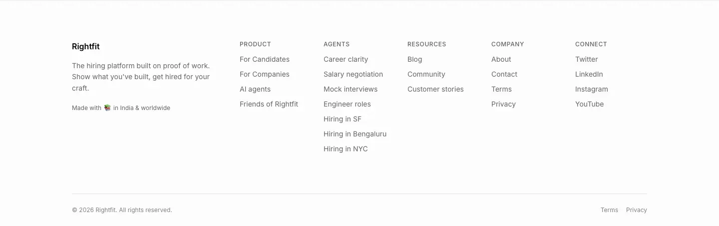
- Top border 1px. Brand column: "Rightfit" (16 · 590), a 14px gray two-line mission, and "Made with [flag/icon] in India & worldwide" (12px).
- 5 link columns: PRODUCT · AGENTS · RESOURCES · COMPANY · CONNECT. Heads are 12/16 · 510 · 0.6px uppercase gray. Links are 14px black, color transition 200ms. The AGENTS column lists all 7 SEO landing pages.
- Bottom row: "© 2026 Rightfit. All rights reserved." (12px, gray at 80%) left, "Terms · Privacy" right.
- Above the footer: the "Ask about Rightfit on" AI row.
10. Small details worth copying
- The
↗ in the corner of linked logo cells.
- 6px blue status dots (
size-1.5 rounded-full bg-emphasis) on chat bubbles and live items.
- Window traffic lights on product mocks.
→ arrows inside primary CTAs only.- Tooltip-like speech bubbles beside orbs: white, radius 12, 1px border, 14/20 text.
09 · Art direction
1. The concept: a hiring blueprint
The whole site is art-directed as a technical document drawn on blueprint paper:
| Blueprint element |
How Rightfit renders it |
| Paper |
#fcfcfc off-white, never pure white for the page |
| Drafting frame |
1px #e8e8e8 rules around a 1152px column, running the full page |
| Registration marks |
4px dots where rules cross |
| Blue ink |
Every illustration is drawn in 0.9px blue lines: #bedbff for construction, #2b7fff / #155dfc for emphasis |
| Figure numbers |
"FIG 0.1 … 0.5", "FIG 1.0 · CAREER CLARITY" |
| Leader lines + callouts |
Thin lines from parts of a drawing to uppercase 11px labels |
| Cyanotype glow |
A blue radial gradient with 1px white scanlines every 8px, the "blueprint sky" |
Why: The product asks candidates to show how they built things. A brand that shows its own construction lines makes the same point visually, and it reads as credible to engineers and founders.
2. Illustration style: isometric line art
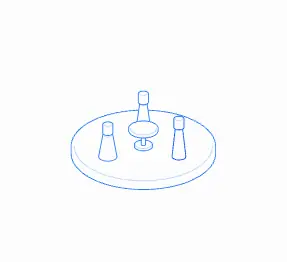
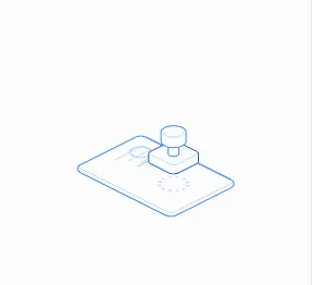

- Projection: true isometric (≈30° axes). Every object sits on a thick rounded base plate, like a model on a display stand.
- Strokes:
stroke-width: 0.9px. Two line colors: #bedbff (159 paths on home) for secondary edges and #2b7fff (121 paths) for primary edges. Fills are the paper color (#fcfcfc), so lines behind are hidden. That gives a clean "hidden-line" drawing, not a wireframe.
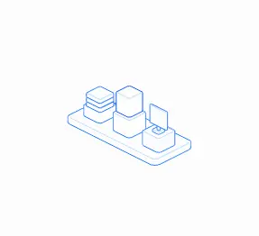
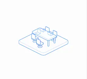
- Subjects are metaphors, not scenes: a round table with chess pieces (community), stacked boxes with a screen (portfolio), a meeting table with chairs (companies), a plate with slots (placed), a sliding tray (resumes), an open laptop (speed), a stamp on a plate (verified), a globe on a stand (global).
- No people, no hands, no faces in illustrations. People appear only as real photos.
- Interaction: SVG
stroke and fill transition over 260ms cubic-bezier(.5,0,.1,1) (347 elements). Active parts turn darker blue and filled when hovered or selected.
- Why: Isometric objects feel like "things that were built". One stroke width and two blues keep 20+ drawings consistent. That also makes them cheap to extend: anyone can draw the next one in Figma with the same rules.
3. FIG drawings: exploded diagrams
- 5 identical isometric plates stacked with ≈12px offsets. The top plate is filled
#dbeafe with a #155dfc stroke and carries schematic UI (avatar circle, text bars, waveform for "session", kanban cells for "board").
- A leader line runs from the active layer name on the left to the top plate. Three right-aligned callouts list benefits.
- Variants: dial + needle (career clarity: "TARGET ROLE / NORTH ON THE DIAL"), city skyline blocks with company callouts (Bengaluru).
- Why: The exploded stack says "a profile is layers of proof: projects, skills, resume". Showing the inside is the brand promise.
4. Atmosphere: the scanline glow
- Layers (bottom to top): a blue radial from below (
#dbeafe → #8ec5ff → #2b7fff) at 40% opacity, vertical 1px white lines every 8px at 78% (also at 40% opacity), and a paper radial fading the top.
- It appears behind every hero, inside the DM card, inside the testimonial card and in the CTA band.
- Why: The scanlines add texture without imagery. They read as blueprint grid, screen pixels or rain, so the gradient never looks like a generic "AI glow".
5. The orb: mascot and agent identity
| Career (blue) |
Row of 4 agents |
 |
 |
- A sphere made from a 7-stop radial gradient. An inner highlight (white radial at the top-left) and an inset blue shadow make it glass-like. Two white rounded rectangles act as eyes. The eyes blink (
orb-blink, 320ms, scaleY(.06)).
- 4 colorways for 4 agents (blue, violet, green, amber, see 02 · Color). Small 20px orbs act as avatars in tabs, menu items and the capability matrix.
- More than 30 emotion animations: bob, sleepy-bob, wave-nod, excited-bounce, celebrate-dance, proud-glow, uncertain-sway, empath-nod, startle-pop, error-shake, rate-limit-pulse, plus confetti and sparkle effects. These are the same states the in-app agent uses.
- Why: An abstract shape avoids the uncanny valley and gender or ethnicity choices. Eyes plus motion give it character. It is the one element people remember, so it closes every page.
6. Product UI as illustration
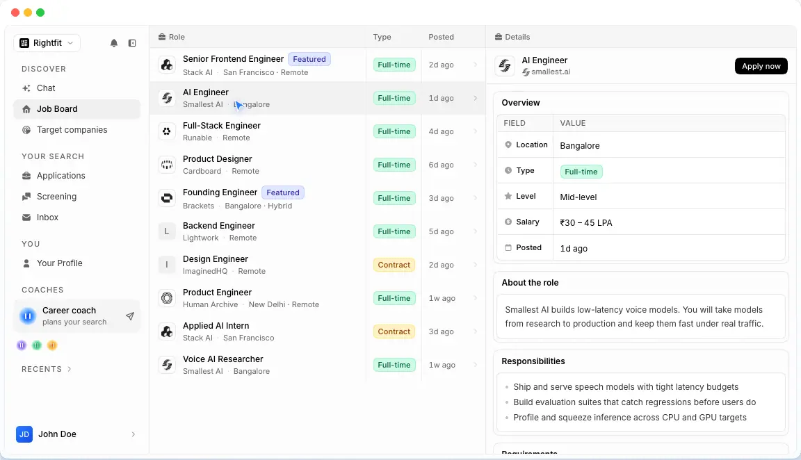
- The hero shows a high-fidelity coded mock of the app: sidebar (Discover / Your search / You / Coaches / Recents), job table, detail panel with a field/value table, status chips, and a fake cursor.
- The changelog shows real app screenshots in dark mode, placed on painterly photographic backgrounds (warm blooms on deep teal) inside 16px-radius plates with layered shadows.
- Why: On the homepage the UI is light, to match the paper. In the changelog, dark screenshots on rich imagery make each release feel like a launch moment.
7. Photography
- Testimonials and founder: real people, black and white, natural light, head-and-shoulders, radius 8–12. B/W keeps faces from fighting the blue palette and adds documentary seriousness.
- Contact backdrop: a full-bleed, saturated orange-red/black textured image behind a white panel. It is the only full-bleed photo on the site.
- Customer story: a founder video (16:9, rounded) inside the article.
- No stock photography anywhere.
8. Logos and marks

- Rightfit mark: a square monogram of horizontal and vertical bars (reads as "rf" / a grid of blocks), solid black, 20 × 20 in the header (
logo-shape-black.svg, white variant for dark backgrounds). It matches the drafting-grid idea.
- Wordmark: "Rightfit" set in Inter 590 in the footer. No custom logotype.
- Customer logos: shown in their own shapes, forced to grayscale, 28px tall, max 140px wide.
- YC: the orange square "Y" is the only foreign brand color allowed in color, because it is the trust signal.
9. Iconography
- UI icons are small (14–16px) filled or 1.5px-stroke glyphs in black or
#646464: briefcase, person, sparkle (AI), bell, chat, book, star, heart.
- Feature cards use a 32px white rounded tile with a 14px black glyph. The icons never use color.
- Arrows:
→ in CTAs, ↗ for external links, ↓/↑ for menus, › in breadcrumbs.
10. What is deliberately absent
- No dark sections on marketing pages (except the contact calendar embed).
- No gradients on text (except the hover chroma sweep).
- No glass or blur panels, no drop-shadow cards, no 3D renders, no emoji.
- No stock photos, no illustrated people.
Why: Every absent trend makes the few signature elements (frame, line art, orb, chroma) stronger.
10 · Brand assets and graphics inventory
Every distinct graphic type found on the 21 captured pages. Each entry has the crop (from the 1440px screenshots), how it is made on the live site (from the DOM), and how to rebuild it. All crops are in images/assets/.
A. Identity
A1 · Logo mark
- Made:
<img src="/logo-shape-black.svg">, 20 × 20, plus a white variant (logo-shape-white.svg) on the dark contact page. A monogram of stacked bars.
- Rebuild: draw on a 5 × 5 grid with only rectangles. Export black and white versions. Keep at least 12px clear space. Never add color.
A2 · Wordmark
- Made: plain text "Rightfit", Inter 16/24 · 590, in the footer.
- Rebuild: use the brand font at semibold. Do not draw a custom logotype.
A3 · Agent orbs (4 colorways)
- Made: a
div with border-radius: 9999px, background: radial-gradient(circle closest-side, …) (stops in 02), ::after white radial highlight at top 8% / left 12% (40% × 46%), inset shadow rgba(43,127,255,.35) 0 -4px 6px. The eyes are two white rounded rects (≈18% × 32% of the orb), with blink and emotion keyframes.
- Rebuild: see the CSS in 13 · Build recipe. Use sizes of 20px (avatar), 32px (tab), 220px (CTA) and ≈170px (spotlight).
B. Atmosphere and texture
B1 · Scanline glow (hero sky)
- Made: three stacked absolutely-positioned layers: blue radial +
repeating-linear-gradient(90deg, rgb(255 255 255/.78) 0 1px, transparent 1px 8px) (both at opacity:.4) + a paper radial on top.
- Rebuild: pure CSS, no image file. Change only the ellipse position per page.
B2 · Blue CTA band
- Made: the same scanline glow, but rising from the bottom of the band and fading at about 45% height.
B3 · Blue card gradient
- Made:
linear-gradient(#eff6ff, #dbeafe) + scanlines inside a radius-20 card. Also used at the bottom of the large testimonial card.
B4 · Contact backdrop image
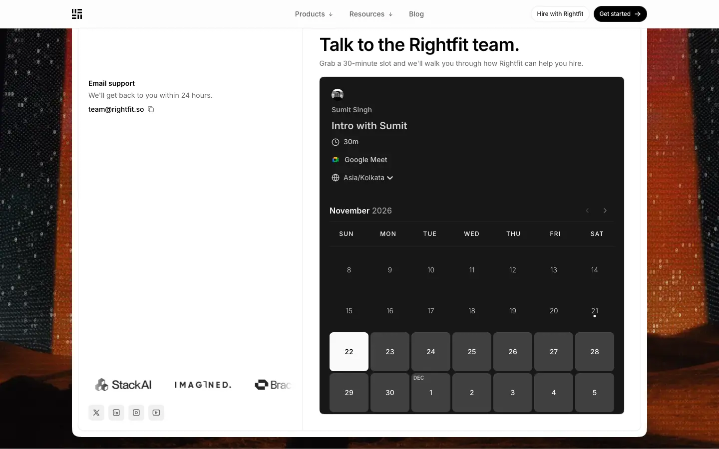
- Made: a 1440 × 900
<img> (Next image, w=1920 q=75). Abstract textured forms in saturated orange-red on near-black.
- Rebuild: one dramatic, abstract, warm image for "talk to us" moments only. It is never used behind body text.
B5 · Changelog plate backgrounds
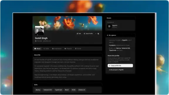
- Made: an app screenshot (dark UI) composited onto painterly/photographic artwork (warm blooms on teal, "snapshot.jpeg"), placed in a 576 × 324 plate (radius 16,
#f0f0f0, layered shadow). One entry uses a 576 × 576 <video> (easy-application.mp4).
- Rebuild: a 16:9 artboard with a background artwork and the UI screenshot centered at ≈80% width. Export WebP, or MP4 for flows.
C. Illustrations
C1 · Isometric benefit objects (8)
|
|
|
|
|
 |
 |
 |
| community |
portfolio |
companies |
placed |
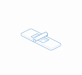 |
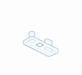
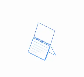 |
|
|
| resumes |
speed |
verified |
global |
- Made: inline SVG.
stroke-width: .9px, strokes #bedbff / #2b7fff, fill #fcfcfc. Hidden lines are removed by fills. Each object sits on a rounded base plate.
- Rebuild: in Figma or Illustrator with an isometric grid (30°). Use one stroke width (0.9 at 1x), two blues, fill = page color. Export SVG with
stroke and fill as attributes, so CSS can transition them.
C2 · Isometric scene in a card
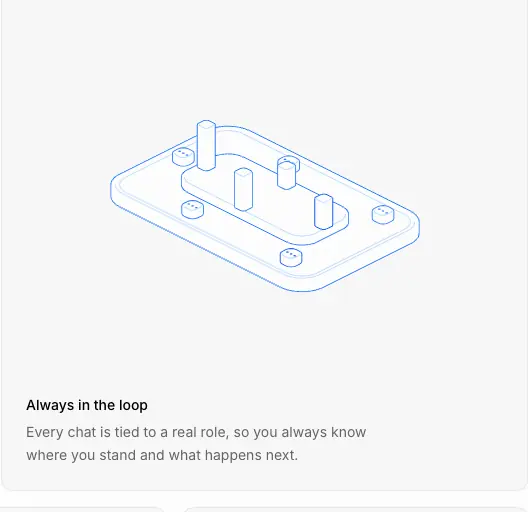
- The same style at a larger scale (a tray with pegs and a cable), centered in a paper card.
C3 · FIG exploded stacks (5 + variants)
- Made: SVG plates with a filled top plate, leader line, and HTML labels on each side (
<button> layer names, <li> callouts). Captions "FIG 0.1" etc.
- Rebuild: one master stack component. Swap the top-plate schematic (profile, kanban, waveform, thread, search). Callouts are 11px uppercase, 0.55px tracking.
C4 · Pipeline + timeline
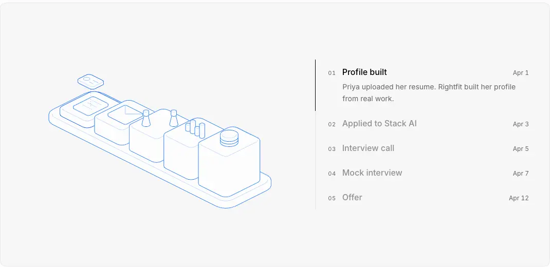
- Made: an isometric chain of 5 blocks (folders, document, pegs, cylinder) + an HTML timeline with checkpoint animations.
C5 · Folder ring
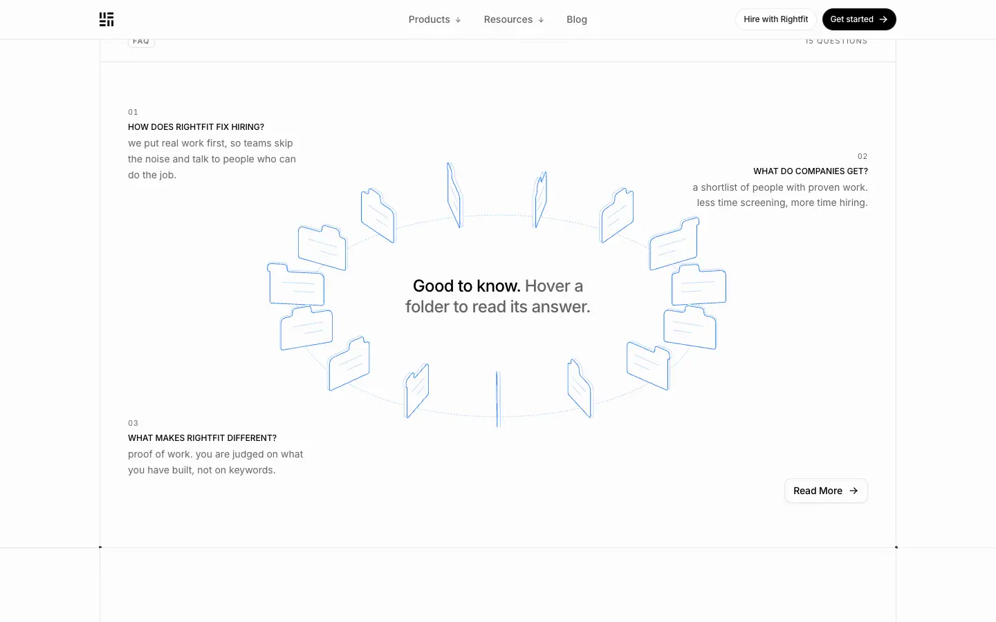
- Made: 16 folder outlines in blue strokes on a dotted ellipse, rotating continuously. The two frames, taken seconds apart, show the ring in different positions.
- Rebuild: place items on an ellipse with
transform: rotate(var(--a)) translateX(R) in 3D (rotateX(≈65deg)), animate --a linearly, and pause on hover.
D. Product UI graphics
D1 · Hero product mock (coded)
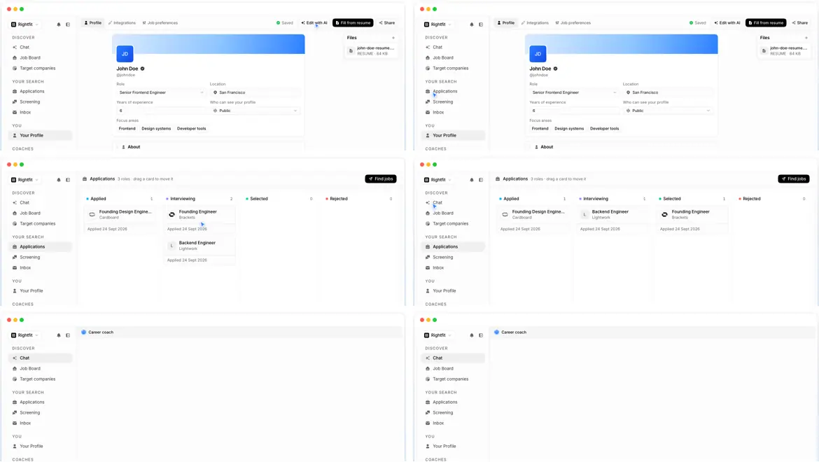
- Made: real React components in a window frame (traffic lights
#ff5f57 #febc2e #28c840). A scripted cursor moves through Profile → Applications (kanban drag) → Chat, ≈2.5s per screen.
- Rebuild: build the mock from your real component library with fake data, and drive it with a timeline (no video). Hide it under 768px.
D2 · Chat thread
- Bubbles: received
#f0f0f0 / black text, sent #155dfc / white text, radius ≈12 with a 6px blue dot "tail", and a success pill "✓ Interview scheduled".
D3 · Email composer mock
- TO / CC / SUBJECT rows with 11px uppercase labels, a 14px body and a black "Send" pill (see 06 S19).
D4 · Booking calendar (embed)
- A Cal.com inline embed,
theme=dark, month view. It is the only dark UI on a light page.
E. Photography
E1 · Testimonial portraits
- B/W, head-and-shoulders, radius 12. 62 × 64 thumbnails in grids, ≈200px in the featured quote.
E2 · Founder portrait
- B/W, radius 8, ≈150px, smiling, in an interior environment (about page).
F. Logos of others
F1 · Customer logo grid
img 28px tall, grayscale(1) → color on hover (300ms). Sources are PNG/AVIF/SVG via Next image at w=128.
F2 · YC badge
F3 · AI assistant icons
- Monochrome glyphs (ChatGPT, Claude, Perplexity, Gemini, Grok) in 32px gray tiles.
G. UI chrome as graphics
| Asset |
Crop |
| Section label row + corner dots |
|
| Sticky scrollspy |
|
| Icon card trio |
|
| About word chips |
 |
| Blog card |
|
| Changelog entry head |
 |
| Post sidebar (author + share) |
 |
| Story hero |
 |
| Chroma hover frames |
|
| Header |
|
| Footer |
|
H. Asset production rules (derived)
- Two blues and one stroke width for all line art. Paper-colored fills.
- No raster for decoration. Glows, scanlines and orbs are CSS. Raster is used only for photos, screenshots and the one contact backdrop.
- People are only photographed, in black and white. Never drawn.
- Product UI is coded or screenshotted, never redrawn as an illustration.
- Every figure gets a caption ("FIG x.y") and uppercase callouts.
- Other brands' logos are grayscale until hover. The only exception is the YC square.
11 · Motion and interaction
Sources: getComputedStyle transition/animation values on every element of home (counts in brackets), all @keyframes and .animate-* rules in the stylesheets (data/home.probe.json), and a 30ms-interval sample of one scroll reveal.
1. Scroll reveal (the main page motion)
- 67 elements below the fold start at
opacity: 0 with transform: translateY(20px) (cards, cells, rows) or translateY(24px) (section headline blocks).
- On entering the viewport they animate to
opacity: 1; transform: none. This is set as an inline style, which means a JS animation library (consistent with Motion / Framer Motion).
- Measured on a bento cell after scrolling it into view:
| t (ms after scroll) |
opacity |
translateY |
| 0–298 |
0 |
20px |
| 362 |
0.60 |
7.9px |
| 428 |
0.87 |
2.6px |
| 491 |
0.95 |
1.0px |
| 555 |
0.99 |
0.25px |
| 746 |
1 |
none |
- Reading: ≈300ms detection/delay, then ≈400–450ms of animation with a strong ease-out (60% of the distance in the first ≈60ms). This is a decelerating curve similar to
cubic-bezier(.22,1,.36,1) (≈).
- Stagger between sibling cells: not measured.
- Why: The 20px rise is short enough to feel like the page "settling", not flying in. It respects reading. Content appears where the eye already is.
2. Hover and state transitions
| Element |
Property |
Duration |
Easing |
Count |
| Nav link pill |
color, background |
150ms |
cubic-bezier(.4,0,.2,1) |
38 |
| Buttons |
all |
200ms |
cubic-bezier(.4,0,.2,1) |
10 |
| Footer / text links |
color |
200ms |
same |
44 |
| Sticky scrollspy items |
color |
300ms |
same |
34 |
| Customer logos |
all (grayscale → color) |
300ms |
same |
32 |
| Fades |
opacity |
300ms |
same |
34 |
| Chips |
color, box-shadow |
150ms |
same |
23 |
| SVG line art |
stroke / fill |
260ms |
cubic-bezier(.5,0,.1,1) |
347 / 62 |
| Accordion/menu height |
height |
110ms |
cubic-bezier(0,0,.2,1) |
5 |
| Menu arrow |
transform |
140ms |
cubic-bezier(.33,1,.68,1) |
2 |
| Orb container |
opacity, transform |
700ms |
cubic-bezier(.34,1.56,.64,1) (overshoot) |
1 |
| Pop element |
transform |
450ms |
cubic-bezier(.34,1.56,.64,1) |
1 |
Pattern: utility UI uses Tailwind's default ease (.4,0,.2,1) at 150–300ms. Illustrations use a sharper custom curve (.5,0,.1,1) at 260ms. Character elements (orb, pops) use an overshoot curve (.34,1.56,.64,1) so they feel springy and alive.
3. Chroma sweep (button hover)
.chroma-text-out { background-image: linear-gradient(90deg, transparent 0 33.33%, #c679c4 40%, #fa3d1d 45%, #ffb005 50%, #e1e1fe 55%, #0358f7 60%, var(--fg) 66.67% 100%),
                                     linear-gradient(270deg, …same…);
                   background-size: 300% 100%; background-position: 100% 0; background-clip: text; -webkit-text-fill-color: transparent; }
.chroma-text-out-animate:hover,
.chroma-text-animate-parent:hover .chroma-text-out-animate { animation: chroma-expand-bidirectional-repeat 2s cubic-bezier(.25,.46,.45,.94) infinite; }
@keyframes chroma-expand-bidirectional-repeat { 0% {background-position:100% 0,100% 0} 50% {background-position:0 0,0 0} 50.1%,100% {background-position:100% 0,100% 0} }
- A rainbow band passes through the label every 2s while hovered. The two mirrored gradients make it expand from the center outward.
- Related:
.chroma-text-loading (2s repeat sweep for loading text), .chroma-text-out-auto (4s automatic loop), .rainbow-line (2.5s linear slide for progress lines), .chroma-qr-ripple (4s mask ripple).
4. Checkpoints (timeline in "Build once")
| Animation |
Duration |
Easing |
What it does |
checkpoint-in |
480ms |
cubic-bezier(.22,1,.36,1) |
opacity 0→1, blur(3px)→0, translateY 6→0 |
checkpoint-draw |
520ms |
cubic-bezier(.22,1,.36,1) |
stroke-dashoffset 1→0 (check mark draws itself) |
checkpoint-pop |
360ms |
cubic-bezier(.34,1.56,.64,1) |
scale 0→1 with overshoot |
checkpoint-ping |
1.6s infinite |
cubic-bezier(0,0,.2,1) |
ring scales 0.8→2.4 and fades |
.checkpoint-grow / .checkpoint-move |
520ms |
cubic-bezier(.22,1,.36,1) |
progress bar height / marker move |
Why: Blur-in + draw + pop + ping is a tiny celebration for each step. It mirrors the product's "you moved forward" feedback.
5. Orb emotions
| Animation |
Duration |
Notes |
orb-bob |
2.1s ease-in-out ∞ |
idle float, translateY -6px, rotate -1.2° |
orb-sleepy-bob |
4.5s ∞ |
slow idle |
orb-blink |
320ms cubic-bezier(.45,0,.55,1) |
eyes scaleY → 0.06 |
orb-wave-nod |
900ms overshoot |
greeting |
orb-excited-bounce |
500ms ∞ |
-10px, scale 1.03 |
orb-celebrate-dance |
700ms ∞ |
bounce + tilt ±4° |
orb-proud-glow |
1.8s overshoot |
scale 1.05 |
orb-uncertain-sway |
2.2s ∞ |
rotate ±2.5° |
orb-empath-nod |
2.6s ∞ |
gentle nod |
orb-startle-pop |
500ms cubic-bezier(.22,1.6,.36,1) |
scale 1.12 |
orb-shake / orb-error-shake |
420ms ×2 / 550ms |
±7–9px |
orb-wait-pulse / orb-rate-limit-pulse |
2.4s / 2.6s ∞ |
scale 1.015 / opacity .85 |
orb-spin, orb-ring-in, orb-ring-out |
2.4s / 2s / 1.5s ∞ |
thinking rings |
orb-confetti-out, orb-sparkle-out |
1.1s / 0.7s |
celebration particles |
orb-tint-* |
0.45–2.6s |
color tints for error/proud/rate limit |
Why: The orb is a state machine with a mood for each agent state. The marketing pages reuse the app's emotion system, so the mascot behaves the same everywhere.
6. Ambient loops
- Hero product demo: a scripted cursor and screen changes, ≈2.5s per screen (≈, measured from 6 frames 2.5s apart: frames 1–2 Profile, 3–4 Applications with the cursor dragging "Founding Engineer" from Interviewing to Selected, 5–6 Chat).
- Folder ring: continuous rotation. The folder positions differ between two captures taken a few seconds apart (compare the two crops in 10 · Brand assets). Speed not measured.
- Logo marquee (contact panel):
marquee-x, duration var(--duration) = 20s, linear, infinite.
- Waveform (interview FIG):
waveform-scroll 1s linear ∞, background shifts -6px.
- Hairlines:
[data-hairline] > svg fades in, 240ms ease-out (16 instances).
7. Reduced motion
The stylesheet has @media (prefers-reduced-motion: reduce) and (prefers-reduced-motion) blocks that set animation: none / transition: none on checkpoint, chroma, invite-badge, hairline, rainbow-line and orb classes. Each animated rule has a twin with animation: auto ease 0s 1 normal none running none.
8. Unmeasured / limits
- The reveal stagger between siblings and the exact JS easing curve (the reveal was sampled, not read from code).
- Menu open/close timing beyond the 110ms height transition and the 140ms arrow rotation.
- The hover effect of individual folders in the ring (the hover capture did not show the answer popover).
- The about page word-chip animation timing.
12 · Glossary
Use these terms to describe or brief a Rightfit-style page.
| Term |
Meaning on rightfit.so |
| Framed column |
The 1152px content column with visible 1px rules on both sides, running from hero to footer |
| Registration dots / corner dots |
4px dots where vertical and horizontal rules cross |
| Hairline |
A 1px #e8e8e8 rule. Every divider is a hairline |
| Hairline-by-gap |
A grid with gap: 1px on a border-colored background, so the gaps draw the rules |
| Label row |
The top strip of a section: chip on the left, meta label on the right, hairline below |
| Section chip |
11px uppercase label in a 1px-bordered 20px box ("WHY RIGHTFIT") |
| Meta label |
The right-side uppercase keyword in the label row ("PROOF OF WORK") |
| Two-tone statement |
One H2 where the first sentence is black and the rest is gray |
| Antithesis line |
"X, not Y" copy: "Proof, not paper." |
| Kicker |
A one-word uppercase chip above a card title |
| Bento |
A grid of equal feature cells, here 4 × 2 with iso drawings |
| Isometric line art |
30° axis drawings, 0.9px strokes, two blues, paper fill |
| Hidden-line drawing |
Line art where fills hide the lines behind, so there is no see-through wireframe |
| FIG panel |
A tinted panel holding a captioned diagram ("FIG 0.1") |
| Exploded stack |
Stacked isometric plates showing the layers of a thing |
| Leader line / callout |
A thin line from a diagram part to an uppercase label |
| Scanline glow |
Blue radial gradient + 1px white vertical lines every 8px |
| Blueprint sky |
The scanline glow behind heroes and CTAs |
| Orb |
The gradient sphere with eyes that represents an AI agent |
| Agent colorway |
Blue, violet, green, amber orbs, one per agent |
| Chroma sweep |
A rainbow gradient clipped to text that sweeps through button labels on hover |
| Live demo mock |
A coded product UI with a scripted cursor, used as the hero visual |
| Scrollspy |
A sticky step list that highlights the step in view |
| Proof footer row |
Customer logos + "X, Y and Z hire on Rightfit." + CTA at the end of a section |
| Folder ring |
The rotating circle of folder icons used as an interactive FAQ |
| Dual CTA |
The black "Get started →" (candidates) + white "Hire with Rightfit" (companies) pair |
| Programmatic SEO page |
A template page generated per topic or city (/agents/hiring-in-bengaluru) |
| GEO row |
The "Ask about Rightfit on" links to AI assistants |
| Paper / ink |
#fcfcfc background / #000 text |
| Tint card |
A card with bg-muted/40 (≈#f7f7f7) + 1px border, no shadow |
Paste-ready design brief
Build a light marketing site that looks like an engineering document on blueprint paper.
Paper #fcfcfc, ink #000, one gray #646464, hairlines #e8e8e8, one brand blue ramp centred on #2b7fff (#dbeafe, #bedbff, #8ec5ff, #155dfc).
Font: Inter variable with cv01, ss03, zero. H1 60/75 weight 510, tracking -0.022em. Section headlines are two-tone 36/49.5 weight 500 (first sentence black, rest gray). Body 16/24. Labels 11px uppercase, 0.1em tracking.
Layout: a 1152px framed column with 1px side rules running the full page, full-width hairlines between sections, and 4px dots at every crossing. Each section starts with a label row (bordered chip left, uppercase meta right).
Visuals: isometric line illustrations at 0.9px in two blues with paper fills; exploded "FIG 0.x" diagrams with leader-line callouts; a blue radial glow with 1px white scanlines every 8px behind heroes and the CTA; a glossy gradient orb with two white eyes as the AI mascot; a coded product mock with a moving cursor as the hero visual. Photos only of real people, in black and white.
Components: pill buttons (black primary with →, white secondary), 20px-radius tint cards with 1px borders and no shadows, 32px-radius link cards with no thumbnails.
Motion: scroll reveal 20px rise + fade, ≈450ms strong ease-out; hover 150–300ms; a rainbow chroma sweep through button labels on hover; idle orb bobbing; reduced-motion fallbacks for all of it.
Voice: short, defiant, numeric. "X, not Y" lines. Dual CTA on every band.
13 · Build recipe
A step-by-step build for a page in this style, with starter code for every signature piece. All values are the measured ones.
Step 1 · Tokens
:root {
  /* neutrals */
  --paper: #fcfcfc;      /* --background */
  --card: #ffffff;
  --secondary: #f6f6f6;
  --muted: #f0f0f0;      /* tint cards use it at 40% */
  --rule: #e8e8e8;       /* --border */
  --ink: #000000;
  --ink-2: #646464;      /* --muted-foreground, 5.77:1 on paper */
  /* brand blue */
  --blue-50:#eff6ff; --blue-100:#dbeafe; --blue-200:#bedbff; --blue-300:#8ec5ff;
  --blue-400:#54a2ff; --blue-500:#2b7fff; --blue-600:#155dfc; --blue-700:#1447e6;
  /* chroma */
  --c1:#c679c4; --c2:#fa3d1d; --c3:#ffb005; --c4:#e1e1fe; --c5:#0358f7;
  /* type */
  --font: "Inter", "Inter Fallback", system-ui, sans-serif;
  /* radii */
  --r-chip: 8px; --r-sm: 12px; --r-md: 16px; --r-card: 20px; --r-link: 32px;
  /* motion */
  --ease-ui: cubic-bezier(.4,0,.2,1);
  --ease-art: cubic-bezier(.5,0,.1,1);
  --ease-out: cubic-bezier(.22,1,.36,1);
  --ease-spring: cubic-bezier(.34,1.56,.64,1);
  --frame: 1152px;
}
@font-face { font-family: "Inter Fallback"; src: local("Arial");
  size-adjust: 107.12%; ascent-override: 90.44%; descent-override: 22.52%; line-gap-override: 0%; }
body { background: var(--paper); color: var(--ink); font-family: var(--font);
  font-feature-settings: "cv01","ss03","zero"; -webkit-font-smoothing: antialiased; }
Step 2 · Type classes
.h-display { font-size: 60px; line-height: 75px; font-weight: 510; letter-spacing: -0.022em; text-wrap: balance; }
.h-page    { font-size: 48px; line-height: 60px; font-weight: 500; letter-spacing: -0.05em; text-wrap: balance; }
.h-cta     { font-size: 48px; line-height: 48px; font-weight: 510; letter-spacing: -0.012em; }
.statement { font-size: 36px; line-height: 1.375; font-weight: 500; letter-spacing: -0.025em; max-width: 896px; text-wrap: balance; }
.statement .rest, .story .rest { color: var(--ink-2); }
.story     { font-size: 24px; line-height: 33px; font-weight: 500; letter-spacing: -0.025em; }
.card-title{ font-size: 16px; line-height: 24px; font-weight: 500; }
.body-sm   { font-size: 14px; line-height: 20px; color: var(--ink-2); }
.chip      { font: 500 11px/16px var(--font); letter-spacing: .1em; text-transform: uppercase; color: var(--ink-2);
             border: 1px solid var(--rule); border-radius: var(--r-chip); padding: 0 6px; height: 20px; display: inline-flex; align-items: center; }
.meta      { font: 400 11px/16px var(--font); letter-spacing: .1em; text-transform: uppercase; color: var(--ink-2); }
@media (max-width: 767px) { .h-display { font-size: 30px; line-height: 1.25 } .statement { font-size: 24px } .h-cta { font-size: 30px; line-height: 1.1 } }
Step 3 · The framed column with corner dots
<section class="frame">
  <i class="dot tl"></i><i class="dot tr"></i>
  <div class="label-row"><span class="chip">Why Rightfit</span><span class="meta">Proof of work</span></div>
  <div class="pad"><h2 class="statement">The future of hiring is proof of work. <span class="rest">We are building it…</span></h2></div>
  <!-- content -->
</section>
.frame { position: relative; max-width: var(--frame); margin: 0 auto;
         border-inline: 1px solid var(--rule); border-bottom: 1px solid var(--rule); }
.dot { position: absolute; width: 4px; height: 4px; border-radius: 50%; background: rgb(0 0 0 / .7); }
.dot.tl { top: -2.5px; left: -2.5px } .dot.tr { top: -2.5px; right: -2.5px }
.label-row { display: flex; justify-content: space-between; align-items: center;
             padding: 20px 40px; border-bottom: 1px solid var(--rule); }
.pad { padding: 56px 40px; }
Section edges also need a full-bleed hairline: wrap each .frame in a full-width element with border-bottom: 1px solid var(--rule).
Step 4 · Hairline bento
.bento { display: grid; grid-template-columns: repeat(4, 1fr); gap: 1px; background: var(--rule); border-top: 1px solid var(--rule); }
.bento > * { background: var(--paper); padding: 32px; min-height: 439px; display: flex; flex-direction: column; }
.kicker { /* same as .chip */ font: 400 11px/16px var(--font); letter-spacing: .1em; text-transform: uppercase; color: var(--ink-2);
          border: 1px solid var(--rule); border-radius: var(--r-chip); padding: 2px 8px; margin-top: auto; width: fit-content; }
@media (max-width: 1023px) { .bento { grid-template-columns: repeat(2, 1fr) } }
@media (max-width: 639px)  { .bento { grid-template-columns: 1fr } }
Step 5 · Scanline glow
.sky { position: absolute; inset: 0; pointer-events: none; overflow: hidden; }
.sky::before, .sky::after { content: ""; position: absolute; inset: 0; opacity: .4; }
.sky::before { background: radial-gradient(90% 80% at 50% 100%, var(--blue-100) 0%, var(--blue-300) 45%, var(--blue-500) 100%); }
.sky::after  { background: repeating-linear-gradient(90deg, rgb(255 255 255 / .78) 0 1px, transparent 1px 8px); }
.sky > .fade { position: absolute; inset: 0; background: radial-gradient(70% 106% at 50% 0%, var(--paper) 32%, transparent 64%); }
Step 6 · Buttons with chroma sweep
<a class="btn btn-primary chroma-parent" href="/start"><span class="chroma">Get started</span> →</a>
<a class="btn btn-secondary chroma-parent" href="/hire"><span class="chroma dark">Hire with Rightfit</span></a>
.btn { display: inline-flex; align-items: center; gap: 8px; height: 40px; padding: 10px 16px; border-radius: 9999px;
       font: 510 14px/20px var(--font); letter-spacing: -0.011em; transition: all .2s var(--ease-ui); }
.btn-primary { background: #000; color: #fff; border: 1px solid rgb(255 255 255 / .12); }
.btn-secondary { background: #fff; color: #1c1d1f; border: 1px solid rgb(0 0 0 / .08); padding-inline: 24px; }
.chroma { --fg: #fff; background-image:
   linear-gradient(90deg, transparent 0 33.33%, var(--c1) 40%, var(--c2) 45%, var(--c3) 50%, var(--c4) 55%, var(--c5) 60%, var(--fg) 66.67% 100%),
   linear-gradient(270deg, transparent 0 33.33%, var(--c1) 40%, var(--c2) 45%, var(--c3) 50%, var(--c4) 55%, var(--c5) 60%, var(--fg) 66.67% 100%);
  background-size: 300% 100%; background-position: 100% 0; -webkit-background-clip: text; background-clip: text; -webkit-text-fill-color: transparent; }
.chroma.dark { --fg: #1c1d1f; }
.chroma-parent:hover .chroma { animation: chroma 2s cubic-bezier(.25,.46,.45,.94) infinite; }
@keyframes chroma { 0% { background-position: 100% 0, 100% 0 } 50% { background-position: 0 0, 0 0 } 50.1%, 100% { background-position: 100% 0, 100% 0 } }
@media (prefers-reduced-motion: reduce) { .chroma-parent:hover .chroma { animation: none } }
Step 7 · The orb
<div class="orb"><i></i><i></i></div>
.orb { position: relative; width: 220px; aspect-ratio: 1; border-radius: 50%; overflow: hidden;
  background: radial-gradient(circle closest-side, #1447e6 0%, #155dfc 24%, #2b7fff 44%, #51a2ff 62%, #8ec5ff 80%, #bedbff 96%, #dbeafe 100%);
  box-shadow: inset 0 -4px 6px rgb(43 127 255 / .35);
  display: flex; align-items: center; justify-content: center; gap: 8%;
  animation: orb-bob 2.1s ease-in-out infinite; }
.orb::after { content: ""; position: absolute; top: 8%; left: 12%; width: 46%; height: 40%; border-radius: 50%;
  background: radial-gradient(circle, rgb(255 255 255 / .55), transparent 70%); }
.orb i { width: 12%; height: 22%; border-radius: 6px; background: #fff; animation: orb-blink 4s infinite; }
@keyframes orb-bob { 0%,100% { transform: translateY(0) rotate(0) } 50% { transform: translateY(-6px) rotate(-1.2deg) } }
@keyframes orb-blink { 0%, 92%, 100% { transform: scaleY(1) } 95% { transform: scaleY(.06) } }
@media (prefers-reduced-motion: reduce) { .orb, .orb i { animation: none } }
(The eye size and the blink interval are ≈ values. The site triggers blinks from JS with a 320ms orb-blink.)
Step 8 · Isometric line-art rules (for designers)
- Isometric grid at 30°. Every object sits on a rounded base plate.
- Stroke 0.9px at 1x. Secondary edges
#bedbff, primary edges #2b7fff, active #155dfc with a #dbeafe fill.
- All fills = page color, so hidden lines disappear.
- Export as inline SVG. In CSS,
transition: stroke .26s var(--ease-art), fill .26s var(--ease-art).
Step 9 · Scroll reveal
// Motion (framer-motion) style
<motion.div initial={{ opacity: 0, y: 20 }} whileInView={{ opacity: 1, y: 0 }}
  viewport={{ once: true, amount: 0.2 }} transition={{ duration: 0.45, ease: [0.22, 1, 0.36, 1] }} />
Use y: 24 for headline blocks. Respect useReducedMotion().
Step 10 · Page skeleton (home order)
- Header (fixed, 57px) with logo, 3 nav items, dual CTA.
- Split hero: H1 + right-aligned lead + dual CTA, then the coded demo mock over the scanline sky.
- Linked logo grid (4 × 2).
- Label row + two-tone statement + iso bento (4 × 2).
- Label row + statement + chat card / iso card + icon trio + proof footer row.
- Label row + statement + sticky scrollspy with 5 FIG panels.
- Label row + statement + timeline panel + icon quad + proof footer row.
- Label row + statement + testimonial split + YC badge.
- Folder-ring FAQ (list on mobile).
- Orb CTA band.
- Ask-AI row + footer.
Review checklist
- [ ] Only
#000, #646464 (and its alphas) for text; only the blue ramp as brand color.
- [ ] Every section opens with a label row and a two-tone statement.
- [ ] Rules are 1px
#e8e8e8; corner dots present at crossings.
- [ ] No drop shadows on cards; separation by border + tint.
- [ ] All line art 0.9px, two blues, paper fill.
- [ ] Both CTAs present in hero and final band.
- [ ] Buttons 40px pills; chroma sweep only on hover.
- [ ] Reveal ≤ 24px travel, ≈450ms; reduced-motion respected.
- [ ] Mobile: mock hidden, bento 1 column, scrollspy → eyebrows, FAQ → list, drawer menu with pinned CTA.
Home · rightfit.so
- URL: https://www.rightfit.so/
<title>: Rightfit - Rethinking Hiring- Meta description: "Rightfit is the platform where companies hire verified talent and candidates find top jobs, all matched by proof of work for efficient, skill-based hiring…"
- Height: 11,420px at 1440px (16,547px at 390px).
- Template: split display hero + framed column of label-row sections.
- Data: data/home.json, data/home.probe.json, data/home.components.json
Narrative arc. The page moves from what to for whom to proof:
- Promise (H1) and the live product.
- Who already hires here (logos).
- Why proof of work (bento of 8 benefits).
- What candidates get: companies message you.
- The 5-step candidate journey (sticky FIG story).
- One profile, one click (timeline).
- Social proof (testimonials, YC).
- Objections (FAQ).
- Final dual CTA with the orb.
It is written mostly to candidates, with "Hire with Rightfit" exits for companies at every stage.
01 · Hero (y 0–1200)
Layout
- Header 57px fixed. H1 at x=144, y=272, 720 × 150, 2 lines. The right block (x 912–1296) has the lead at y=310 (384 × 48) and buttons at y=378: "Hire with Rightfit" 158 × 40 at x=999 and "Get started →" 131 × 40 at x=1165, 8px apart.
- Product mock: x=144, y=478, 1152 × 660,
z-index: 20, mt-14 (56px), hidden below md.
- Sky: the hero background layers span y 0–1202.
Typography
- H1
60/75 · 510 · -1.32px black, text-balance. Class text-3xl md:text-5xl lg:text-6xl.
- Lead
16/24 · 400 · #646464, md:text-right.
Visual: a coded app in a window with traffic lights. Sidebar (Rightfit switcher, DISCOVER: Chat, Job Board, Target companies; YOUR SEARCH: Applications, Screening, Inbox; YOU: Your Profile; COACHES: Career coach; RECENTS), job table with status chips (Full-time green, Contract amber, Featured indigo), and a detail panel (FIELD/VALUE table: Location, Type, Level, Salary ₹30–45 LPA, Posted). A fake cursor cycles the screens (see 11 · Motion).
Why it works: The promise and the CTA share one line. The product mock starts before the fold, so the first scroll is a reward. Real-looking data (salary in LPA, Bengaluru, San Francisco) speaks to both the India and US markets.
02 · Logo grid (y 1195–1432)

- 8 customers in a 4 × 2 hairline grid (287 × 112 cells). Linked cells have
↗. Grayscale → color on hover (300ms).
- Why: Proof immediately after the promise. The grid starts the framed-column lines that run through the rest of the page.
03 · Why Rightfit: statement + iso bento (y 1426–2630)
- Label row: "WHY RIGHTFIT" / "PROOF OF WORK" at y=1449.
- H2 at y=1570: "The future of hiring is proof of work. We are building it together with 15k+ professionals who show real work, not just resumes." 36/49.5 · 500 · -0.9px, max-width 896.
- Bento: 4 × 2 cells (287.5 × 439). Kickers at y=2016 and 2455. Titles 16 · 500: "15k+ community", "Proof of work", "Companies hiring", "Candidates placed", "Upload and go", "Fast matching", "Verified profiles", "India & worldwide".
- Why: The thesis comes first, then eight short proofs. The iso objects make abstract claims tangible without stock photos.
04 · Messages (y 2626–3850)
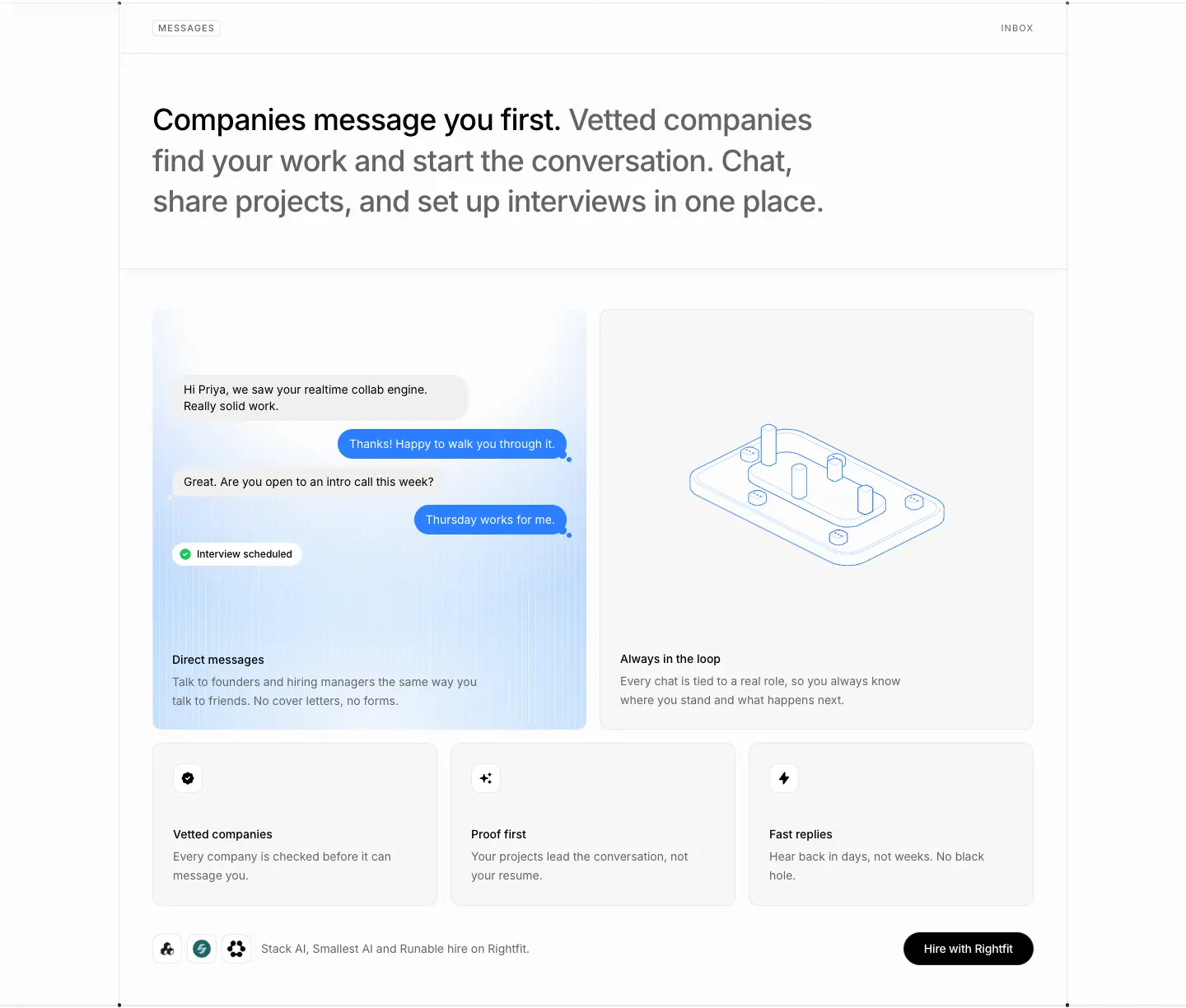
- Label row "MESSAGES" / "INBOX". H2: "Companies message you first. Vetted companies find your work and start the conversation. Chat, share projects, and set up interviews in one place."
- Two 527 × 512 cards: a blue chat card ("Hi Priya, we saw your realtime collab engine…" → "Interview scheduled") and an iso card "Always in the loop".
- Icon trio (346 × 198): Vetted companies / Proof first / Fast replies.
- Proof footer row: 3 round logos + "Stack AI, Smallest AI and Runable hire on Rightfit." + "Hire with Rightfit" black.
- Why: It reverses the usual job-hunt pain (you chase companies). The chat shows the reversed flow ending in an interview.
05 · For candidates: sticky FIG story (y 3846–7256)
- Label row "FOR CANDIDATES". H2: "Structure and clarity across your whole search. One place to show real work, track every application, and get found by teams that want proof, not paper."
- Sticky list (top 96px): Build your profile · Track applications · Practice interviews · Hear back fast · Get found.
- Five steps, each a 24/33 two-tone statement + a FIG panel:
- "Proof, not paper." → FIG 0.1 PROFILE / PROJECTS / SKILLS / RESUME
- "Every application in one view." → FIG 0.2 BOARD
- "Walk in ready." → FIG 0.3 SESSION
- "Never miss a reply." → FIG 0.4 THREAD
- "Let the right teams find you." → FIG 0.5 SEARCH
- Why: It turns 5 features into a journey the reader walks through. The sticky list keeps the whole plan visible, and the figures make each step feel engineered.
06 · Build once, apply everywhere (y 7250–8476)
- Label row "PROFILE" / "ONE CLICK APPLY". H2: "Build once, apply everywhere. Upload your resume and Rightfit builds your profile. An agent tunes it line by line, and one click sends it with every application."
- Timeline panel: an iso pipeline + 01 Profile built (Apr 1) → 05 Offer (Apr 12).
- Icon quad: Upload and go · Edits, line by line · One-click apply · One board.
- Proof footer row: "One profile, every company hiring on Rightfit." + "Get started".
- Why: Dates make the speed claim concrete. The checkpoint animations "tick" each step.
07 · Testimonials (y 8470–9615)
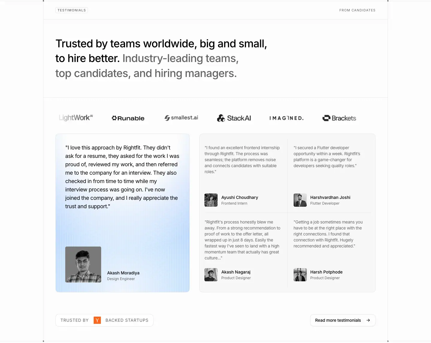
- Label row "TESTIMONIALS" / "FROM CANDIDATES". H2: "Trusted by teams worldwide, big and small, to hire better. Industry-leading teams, top candidates, and hiring managers."
- Grayscale logo strip. Large quote card (449 × 530) with a B/W portrait. A 2 × 2 grid of short quotes. "TRUSTED BY [Y] BACKED STARTUPS" + "Read more testimonials →".
- Why: Candidate quotes are specific ("in just 8 days", "within a week"), which matches the numeric voice.
08 · FAQ folder ring (y 9610–10372)
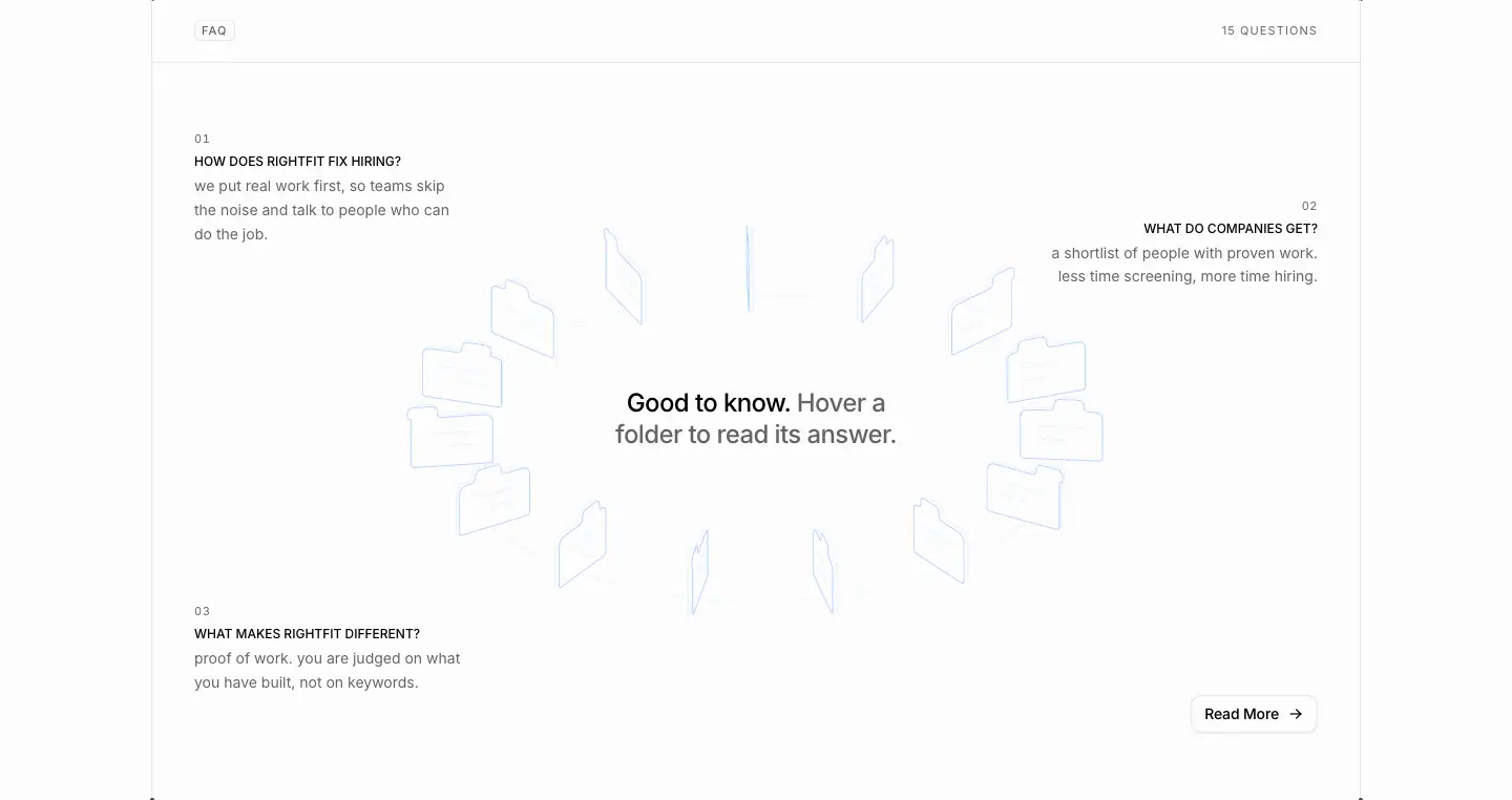
- Label row "FAQ" / "15 QUESTIONS". A rotating folder ring around "Good to know. Hover a folder to read its answer." Three Q&As in the corners (01–03), with lowercase answers. "Read More →".
- Why: It makes 15 questions explorable without a long accordion. Three answers are always visible for people who don't hover.
09 · Orb CTA (y 10366–10862)
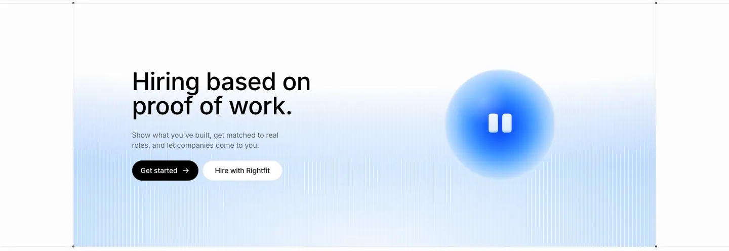
- H2 "Hiring based on proof of work." 48/48 · 510 at x=261, y=10523. A 14px gray line, "Get started →" black + "Hire with Rightfit" white. The orb is 220px at x=878.
- Why: The page closes on the thesis, both CTAs and the mascot. It is the most branded moment, placed where the decision happens.
10 · Ask-AI row + footer (y 10856–11420)
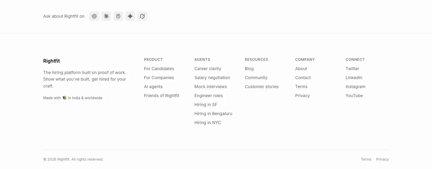
Mobile (390px)
- Hero: centered H1 ≈30px, centered lead, dual CTA, scanline sky. No mock.
- Logo grid 2 × 4. Bento 1 column. The scrollspy becomes uppercase eyebrows per step. The FAQ becomes a list. The orb CTA stacks.
Hire with Rightfit · /hire
- URL: https://www.rightfit.so/hire
<title>: Hire better with Rightfit- Meta: "Hire engineers, designers, and product talent proven by real work. Rightfit screens every candidate by proof of work, not resumes."
- Height: 4,011px. Audience: companies.
- Data: data/hire.json
Narrative arc. Promise + a founder's word → book a call right now → how it works in 4 numbers → objections (FAQ). It is short because a company buyer wants a call, not a tour.
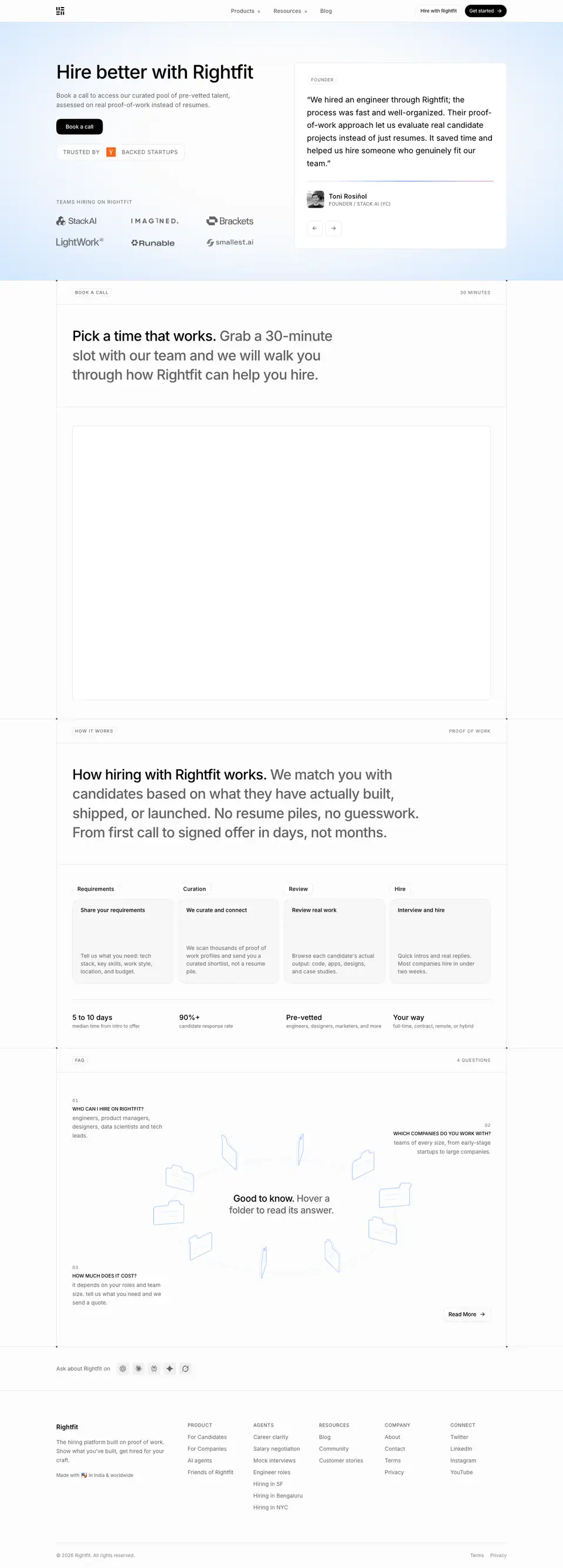
01 · Split hero with quote (y 0–700)
- H1 "Hire better with Rightfit" 48/48 · 510 · -1.056px at x=144, y=160. Lead 16/24: "Book a call to access our curated pool of pre-vetted talent, assessed on real proof-of-work instead of resumes…". One black "Book a call" pill (y=304). "TRUSTED BY [Y] BACKED STARTUPS" at y=379.
- Right: a quote card at x=785. "FOUNDER" kicker 11px · 0.55px. Blockquote 20/32.5 · 400 "We hired an engineer through Rightfit; the process was fast and well-organized…" Attribution: name 16 · 510, "FOUNDER / STACK AI (YC)" 12px · 0.3px.
- "TEAMS HIRING ON RIGHTFIT" (12px · 1.2px tracking) + a 2 × 3 logo grid under the H1.
- Why: Peer proof replaces a feature list. The founder quote does the selling.
02 · Book a call (y 700–1820)
- Label row "BOOK A CALL" / "30 MINUTES". H2 "Pick a time that works. Grab a 30-minute slot with our team and we will walk you through how Rightfit can help you hire."
- A large embedded booking area (Cal.com). It renders empty in the capture because the iframe was still loading.
- Why: The action sits in the second section. For high-intent buyers, the calendar is the page.
03 · How it works (y 1820–2680)
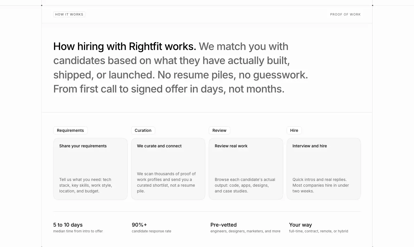
- Label row "HOW IT WORKS" / "PROOF OF WORK". H2 "How hiring with Rightfit works. We match you with candidates based on what they have actually built, shipped, or launched. No resume piles, no guesswork. From first call to signed offer in days, not months."
- 4 step cards with 14px · 500 kickers (Requirements → Curation → Review → Hire) and 14px · 510 titles: "Share your requirements", "We curate and connect", "Review real work", "Interview and hire". Descriptions: "Tell us what you need: tech stack, key skills, work style, location, and budget." … "Quick intros and real replies. Most companies hire in under two weeks."
- A 4-column stats row (18/28 · 510) with 12px gray captions: "5 to 10 days" (median time from intro to offer), "90%+" (candidate response rate), "Pre-vetted" (engineers, designers, marketers, and more), "Your way" (full-time, contract, remote, or hybrid).
- Why: Companies need process and numbers. Four steps and four facts answer "how long, how good, how much effort".
04 · FAQ (y 2680–3560)
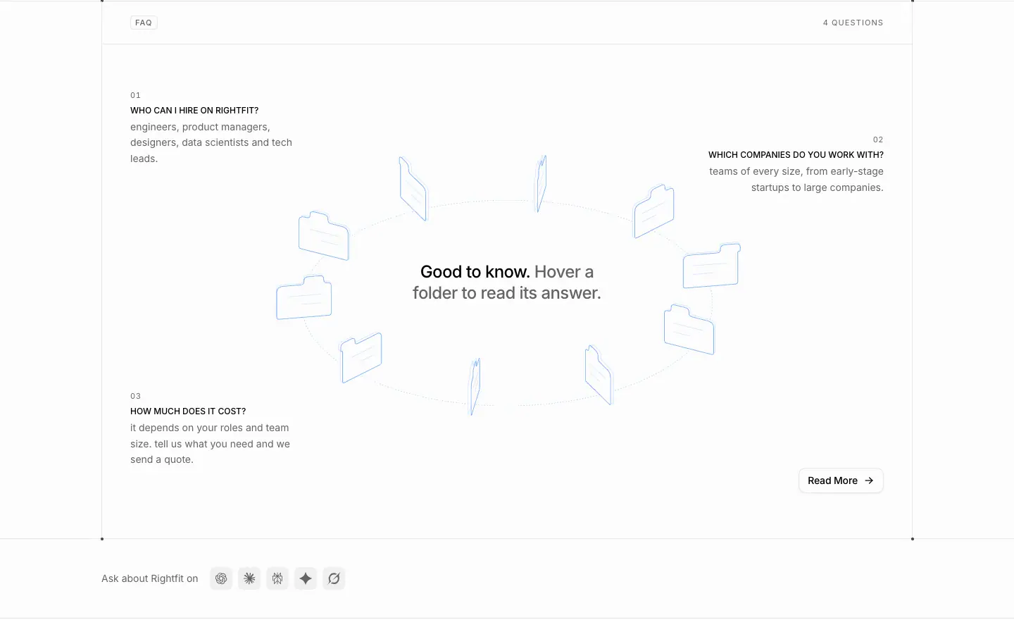
- "FAQ / 4 QUESTIONS", the folder ring. Questions: WHO CAN I HIRE ON RIGHTFIT? · WHICH COMPANIES DO YOU WORK WITH? · HOW MUCH DOES IT COST?
- Why: The cost question is answered on the page, which removes the main objection before the call.
05 · Footer
See _shared-header-footer.md.
Mobile

About · /about
- URL: https://www.rightfit.so/about
<title>: About | Rightfit- Meta: "Rightfit is the proof of work hiring platform. Learn why we built it, who is behind it, and how to reach us."
- Height: 3,575px. Data: data/about.json
Narrative arc. Who we are → the problem in human terms → what we do instead (animated) → the founder's voice → proof (teams + 15,000 community) → CTA.
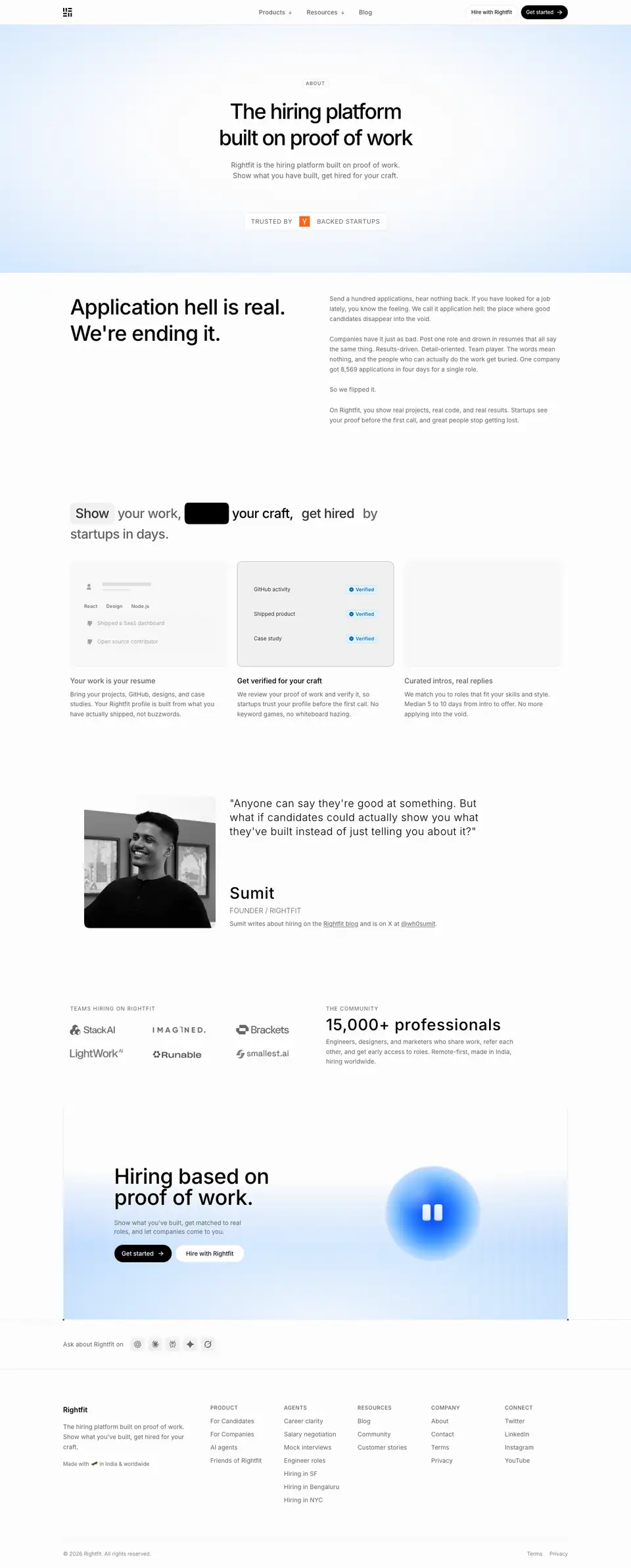
01 · Centered hero (y 0–622)
- Chip "ABOUT" at y=180. H1 "The hiring platform built on proof of work" 48/60 · 500 · -2.4px, centered, 768px wide. A 2-line lead. "TRUSTED BY [Y] BACKED STARTUPS" badge.
- Why: About pages usually start with a mission paragraph. This one restates the category, so every page reinforces the same term.
02 · Application hell (y 622–1080)
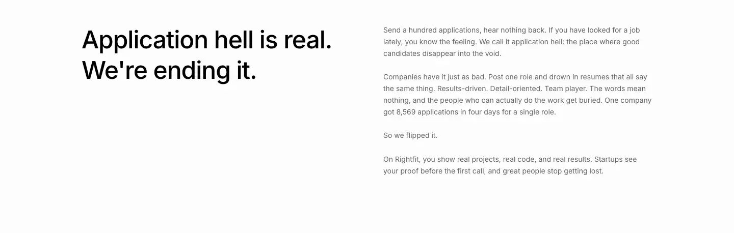
- Left: H2 "Application hell is real. We're ending it." 48/60 · 510 · -1.056px, 512px wide. Right: 4 short paragraphs (14/22.75 gray) with the number "8,569 applications in four days for a single role" and the turn "So we flipped it."
- Why: A named enemy ("application hell") and one shocking number create urgency in 30 seconds of reading.
03 · "Show your work" (y 1080–1700)
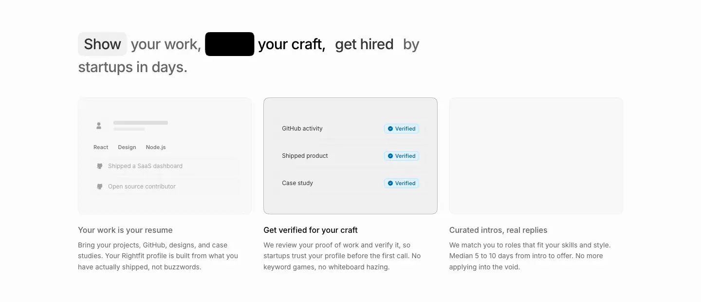
- A 30/45 · 500 line: "Show your work, prove your craft, get hired by startups in days." The key verbs sit in animated pill chips. One chip is inverted (black fill, white text) as the animation steps through the words.
- 3 cards with mini UI mocks and 16 · 510 titles: "Your work is your resume" (profile skeleton with React / Design / Node.js tags, "Shipped a SaaS dashboard", "Open source contributor"), "Get verified for your craft" (GitHub activity / Shipped product / Case study rows with blue "✓ Verified" / "Reviewing" chips), "Curated intros, real replies" ("Frontend Engineer at a YC startup", Remote · Full-time, "Intro call scheduled", "5 to 10 days to offer"). The descriptions are 14px gray, e.g. "Median 5 to 10 days from intro to offer."
- Why: Kinetic type turns the 3-step value prop into a sentence the eye follows word by word.
04 · Founder quote (y 1700–2240)
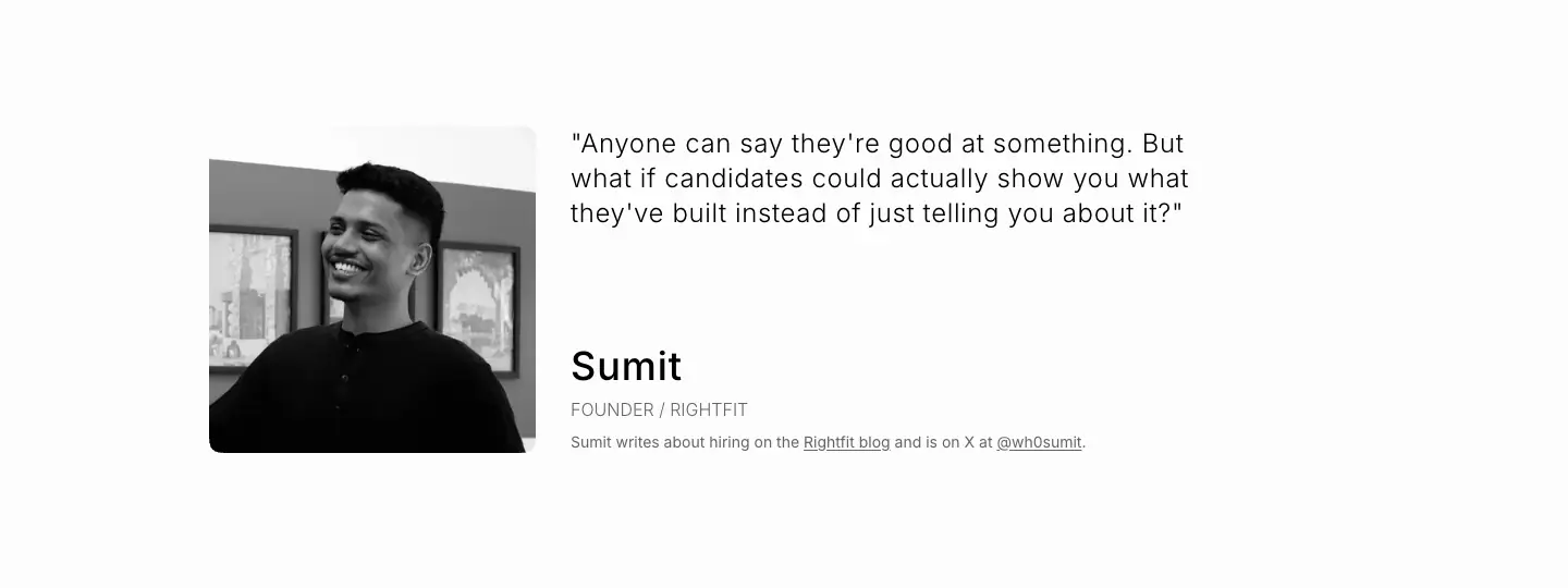
- A B/W portrait (≈150px, radius 8). Quote H4 24/32 · 300 · +0.6px. Name "Sumit" 36/40 · 510 · +0.9px. "FOUNDER / RIGHTFIT" 12px. "Sumit writes about hiring on the Rightfit blog and is on X at @wh0sumit."
- Why: The light weight + positive tracking makes the quote feel like a spoken voice. The founder is reachable, which builds trust for a young company.
05 · Logos + community (y 2240–2560)
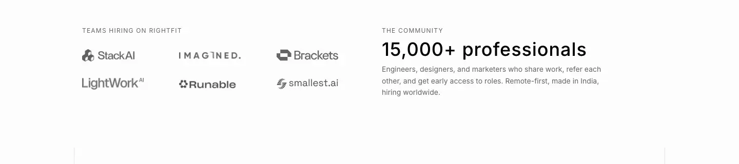
- Two columns: "TEAMS HIRING ON RIGHTFIT" with a logo grid, and "THE COMMUNITY" with "15,000+ professionals" (36/40) + a description.
06 · CTA, 07 · Footer
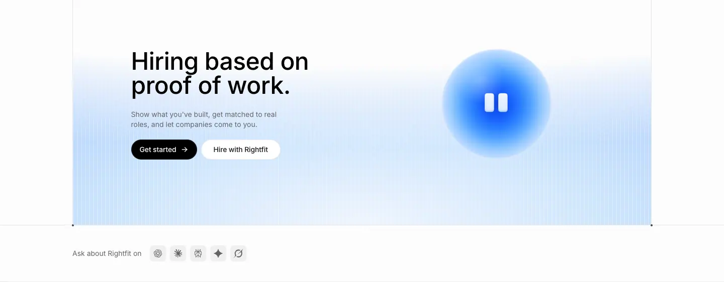
- The orb CTA band, the same as home.
AI agents · /agents
- URL: https://www.rightfit.so/agents
<title>: AI agents | Rightfit- Meta: "Four AI agents in your Rightfit dashboard. They plan your search, run mock interviews, sharpen your resume and back you up on offers."
- Height: 4,313px. Data: data/agents.json, data/agents.probe.json
Narrative arc. Name the idea (human-centered AI) → four agents as four illustrated jobs → meet one agent talking → the full capability matrix. It goes from feeling to detail.
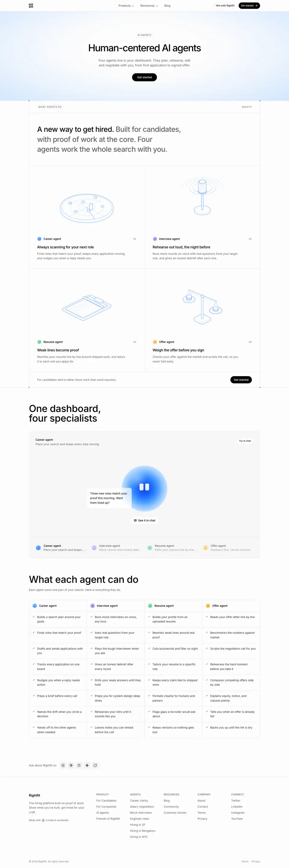
01 · Hero (y 0–465)
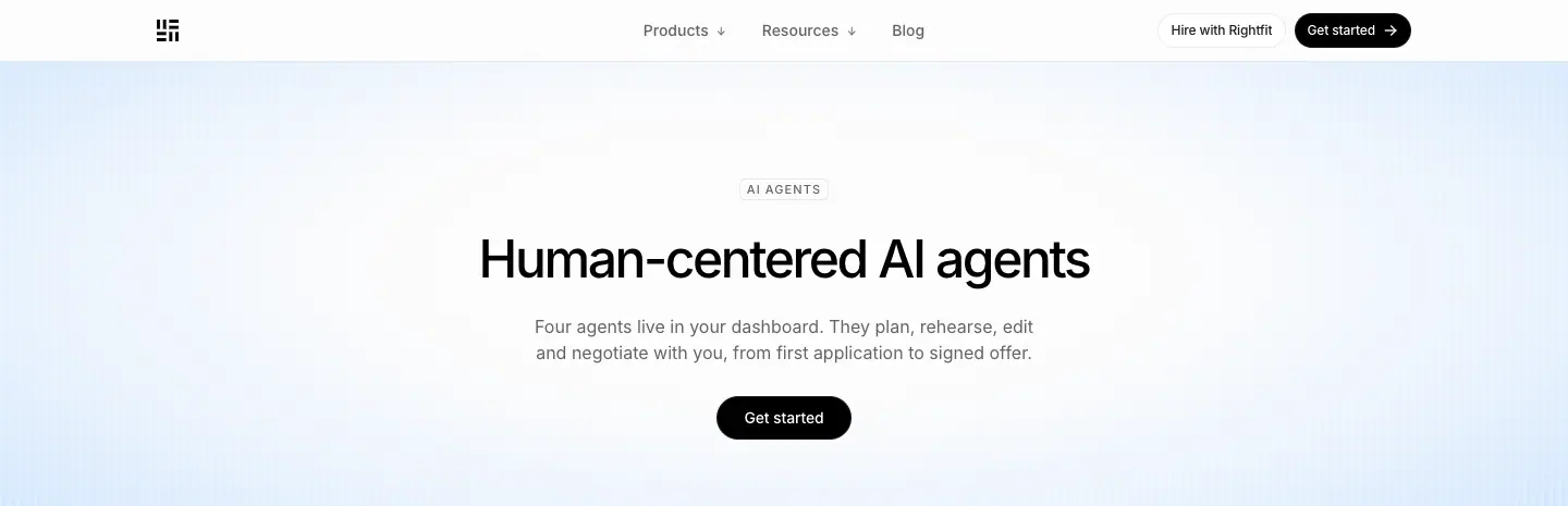
- Chip "AI AGENTS", H1 "Human-centered AI agents" 48/60 · 500 · -2.4px, centered at y=208. Lead (16/24 · 400, gray, y=288): "Four agents live in your dashboard. They plan, rehearse, edit and negotiate with you, from first application t…" (truncated in the capture). One black "Get started" pill at y=374.
- Why: "Human-centered" pre-empts the fear that AI replaces people in hiring.
02 · What agents do (y 465–1950)
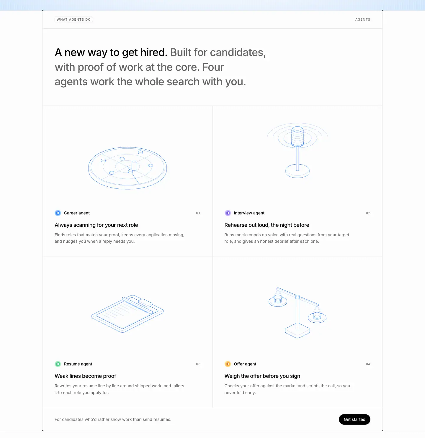
- Label row "WHAT AGENTS DO". H2 "A new way to get hired. Built for candidates, with proof of work at the core. Four agents work the whole search with you."
- 2 × 2 cells (576 wide), each with an iso drawing (radar dish, microphone, document tray, scale), an agent chip with a colored orb ("Career agent 01"), an 18/28 · 500 title ("Always scanning for your next role", "Rehearse out loud, the night before", "Weak lines become proof", "Weigh the offer before you sign") and a gray description.
- Footer row: "For candidates who'd rather show work than send resumes." + "Get started".
- Why: Each agent gets a job title and a single outcome. The numbering 01–04 implies an order of use.
03 · One dashboard, four specialists (y 1950–2799)
- H2 48/48 · 510 outside the label-row system (a bigger, simpler heading). A spotlight panel: the big blue orb, a speech bubble "Three new roles match your proof this morning. Want them lined up?", "See it in chat", and agent tabs (Career active; Interview, Resume, Offer dimmed).
- Why: The orb speaks, so the agent becomes a character with a voice, not a feature.
04 · What each agent can do (y 2799–3860)
- H2 "What each agent can do" + "Each agent owns one part of your search. Here is everything they do." A 4-column matrix with 8 ✓ rows per agent.
- Why: After the emotional pitch, a complete list for the rational reader. The ✓ rows make it scannable.
Colors on this page
- 4 orb colorways (blue / violet / green / amber); see 02 · Color.
- Mostly translucent white surfaces:
oklab(1 0 0 / .95) on 24 elements, /.85 on 5.
Agent and city landing pages · /agents/*
One template powers 7 SEO landing pages:
- Agent topics:
/agents/career-clarity, /agents/salary-negotiation, /agents/mock-interviews, /agents/engineer-roles
- Cities:
/agents/hiring-in-san-francisco, /agents/hiring-in-bengaluru, /agents/hiring-in-new-york
Two were captured:
| Career clarity (4,848px) |
Hiring in Bengaluru (5,501px) |
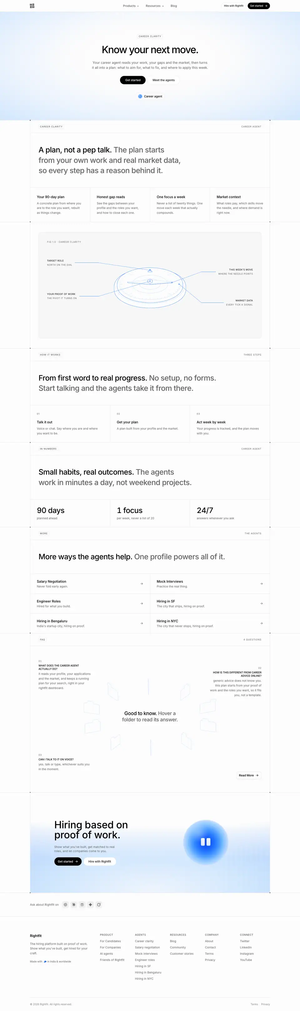 |
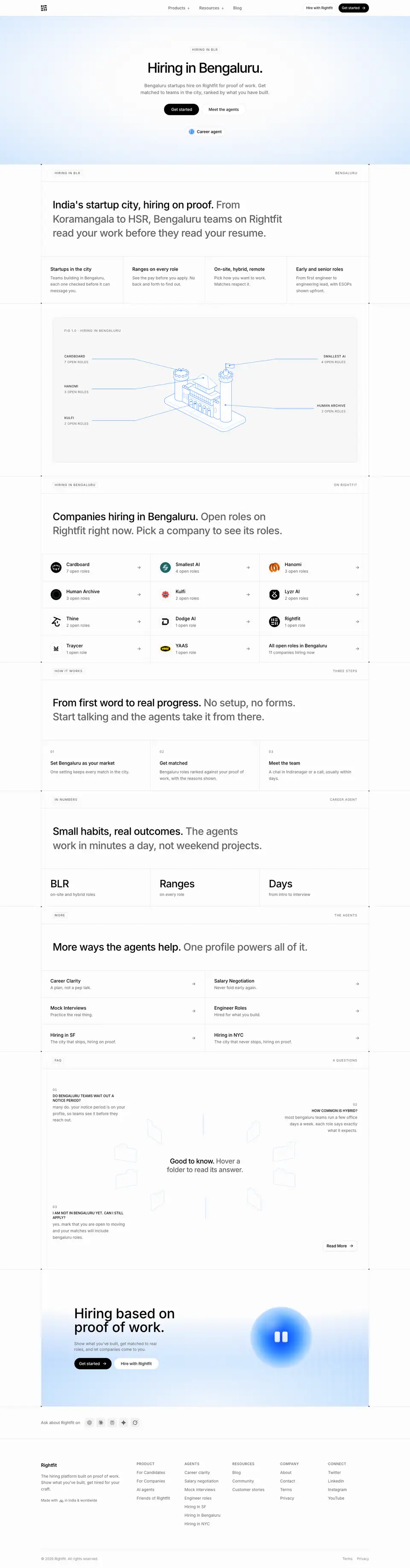 |
- Meta (career clarity): "Your career agent reads your work, your gaps and the market, then turns it all into a plan…"
- Meta (Bengaluru): "Bengaluru startups hire on Rightfit for proof of work. Get matched to teams in the city, ranked by what you have built."
- Data: data/agent-career-clarity.json, data/agent-hiring-bengaluru.json
Narrative arc (shared).
- Topic promise.
- FIG diagram of the topic.
- (city only) Local company directory.
- How it works.
- In numbers.
- Links to sibling pages.
- FAQ.
- Orb CTA.
The template works for both a "skill" and a "place" because the FIG and the stats change while the structure stays.
01 · Hero (y 0–541)
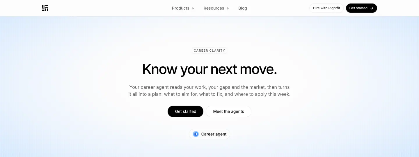
- Chip (y=164): "CAREER CLARITY" / "HIRING IN BLR". H1 48/60 · 500 · -2.4px: "Know your next move." / "Hiring in Bengaluru.".
- Lead 16/24 gray (y=288). Two pills: "Get started" (black) + "Meet the agents" (white). A small orb label "● Career agent" (14 · 500) at y=452.
- Why: Short, imperative H1s ending with a period sound confident and are easy to template ("Hiring in {City}.").
02 · Statement + FIG 1.0 (y 541–1635)
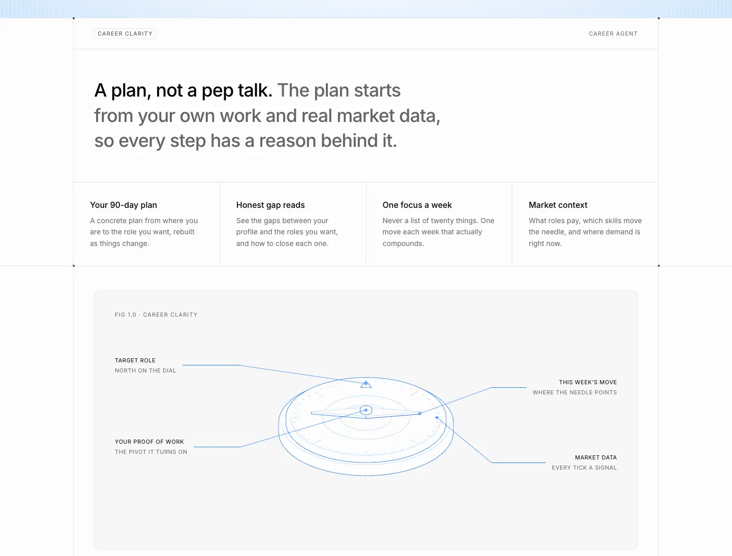
- Label row "CAREER CLARITY" / "CAREER AGENT". H2 "A plan, not a pep talk. The plan starts from your own work and real market data, so every step has a reason behind it."
- 4 columns: "Your 90-day plan", "Honest gap reads", "One focus a week", "Market context".
- FIG panel (1070 × 509, radius 20, padding 32 40 24): "FIG 1.0 · CAREER CLARITY". A dial with a needle and leader-line callouts: TARGET ROLE / NORTH ON THE DIAL, YOUR PROOF OF WORK / THE PIVOT IT TURNS ON, THIS WEEK'S MOVE / WHERE THE NEEDLE POINTS, MARKET DATA / EVERY TICK A SIGNAL.
- Bengaluru version: H2 "India's startup city, hiring on proof. From Koramangala to HSR, Bengaluru teams on Rightfit read your work before they read your resume." FIG 1.0 · HIRING IN BENGALURU shows isometric city blocks with company callouts (CARDBOARD 7 OPEN ROLES, HANOMI 3 OPEN ROLES, KULFI 2 OPEN ROLES).
- Why: Each callout has a two-level label (name + poetic gloss). It is the most "patent drawing" moment on the site.
03 · Company directory (city only, y 1635–2288)
- "Companies hiring in Bengaluru. Open roles on Rightfit right now. Pick a company to see its roles." A 3-column grid of rows: logo, name, "7 open roles", →. The last cell is "All open roles in Bengaluru".
- Why: Real, changing local data makes the page useful and indexable, not thin SEO content.
04 · How it works
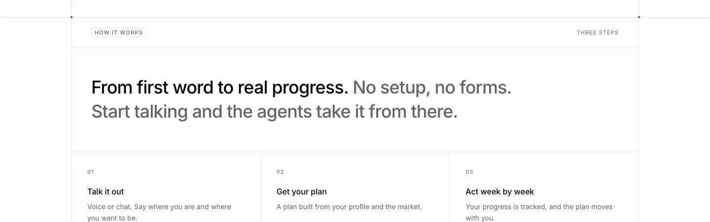
- "From first word to real progress. No setup, no forms. Start talking and the agents take it from there." 3 numbered steps.
05 · In numbers
- "Small habits, real outcomes. The agents work in minutes a day, not weekend projects." Stats 36/40 · 500: "90 days" · "1 focus" · "24/7" (career). The Bengaluru version: "BLR" · "Ranges" · "Days".
06 · More ways the agents help
- "More ways the agents help. One profile powers all of it." A 2-column link list of the 6 sibling pages with one-line glosses ("Never fold early again.", "Practice the real thing.", "Hired for what you build.", "The city that ships, hiring on proof.", "The city that never stops, hiring on proof.").
- Why: An internal link mesh between all landing pages, written like taglines.
07 · FAQ, 08 · CTA, footer
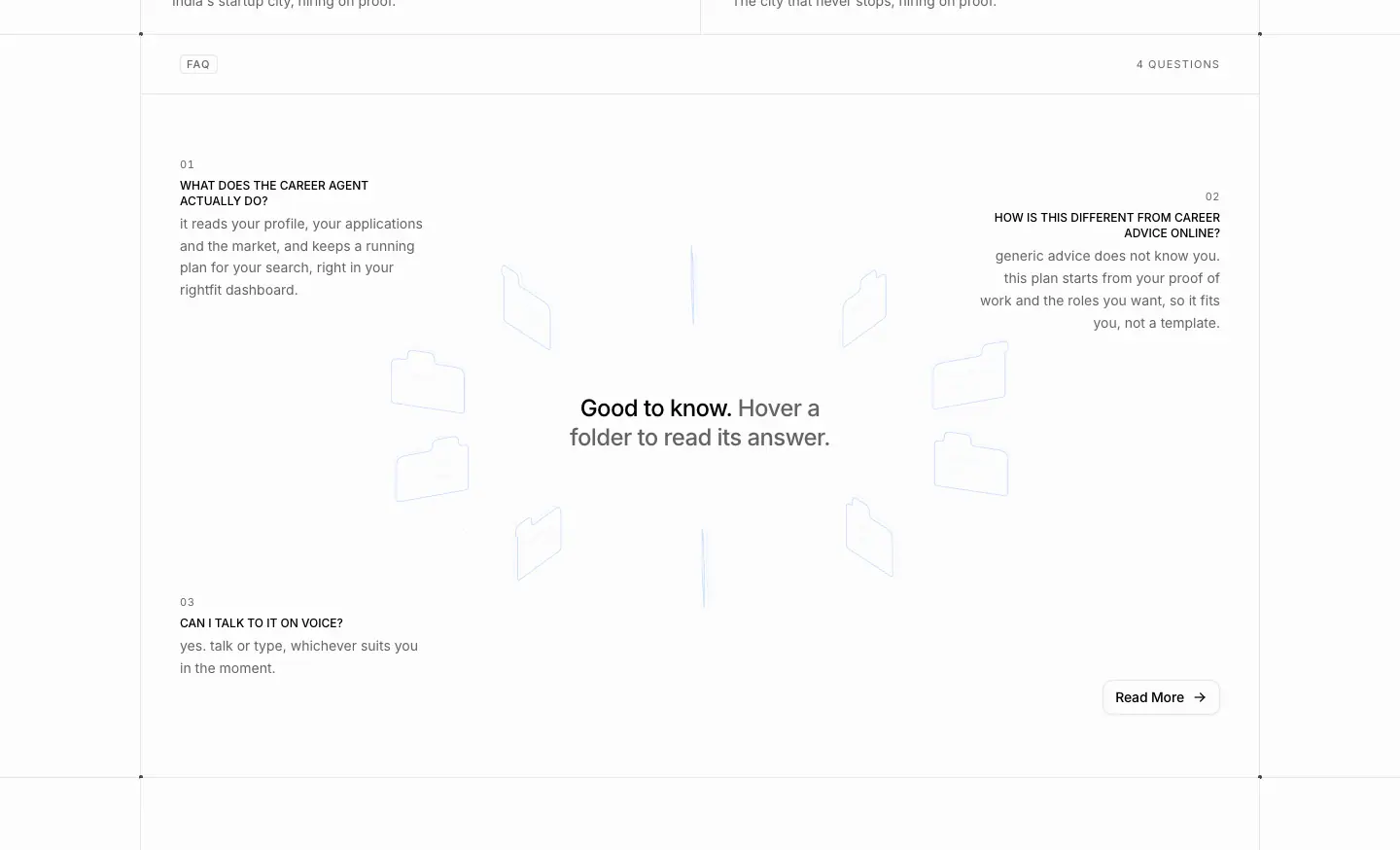
- The folder-ring FAQ with topic-specific questions ("WHAT DOES THE CAREER AGENT ACTUALLY DO?"), then the orb CTA.
Friends of Rightfit · /friends
- URL: https://www.rightfit.so/friends
<title>: Friends of Rightfit | Rightfit- Meta: "Introduce a company that is hiring, or a candidate worth hiring. Rightfit does the work and you earn a cut of every hire."
- Height: 6,662px. Data: data/friends.json
Narrative arc. The money promise → the arithmetic → scale → the steps → how small the effort is (one CC) → who does the work (agents) → join → FAQ → CTA. Every section lowers a different objection to referring.
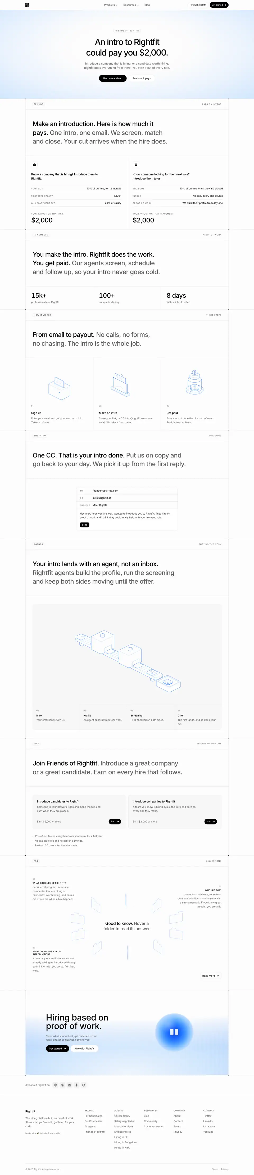
01 · Hero (y 0–540)
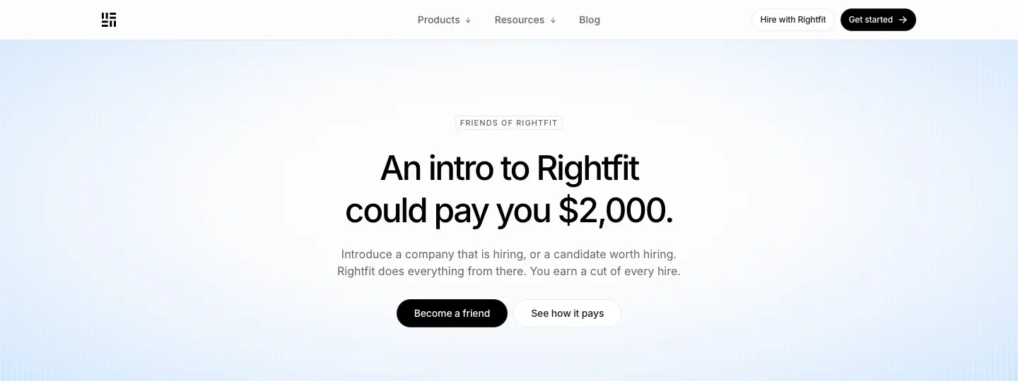
- Chip "FRIENDS OF RIGHTFIT". H1 "An intro to Rightfit could pay you $2,000." 48/60 · 500. Lead "Introduce a company that is hiring, or a candidate worth hiring. Rightfit does everything from there…" Two pills: "Become a friend" + "See how it pays".
- Why: A specific dollar amount in the H1 is the strongest hook a referral page can have.
02 · Payout calculator (y 540–1290)
- Label row "FRIENDS" / "EARN ON INTROS". H2 "Make an introduction. Here is how much it pays. One intro, one email. We screen, match and close. Your cut arrives when the hire does."
- Two cards with label/value tables (YOUR CUT · FIRST HIRE SALARY · OUR PLACEMENT FEE / INTROS · PROOF OF WORK), ending with "YOUR PAYOUT ON THAT HIRE" and $2,000 at 36/40.
- Why: The math proves the headline. Uppercase 11px labels make it read like a receipt.
03 · In numbers (y 1290–1740)
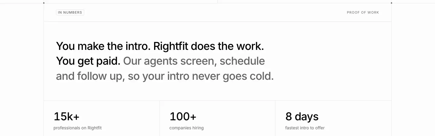
- "You make the intro. Rightfit does the work. You get paid." Stats: 15k+ · 100+ · 8 days.
04 · How it works (y 1740–2420)
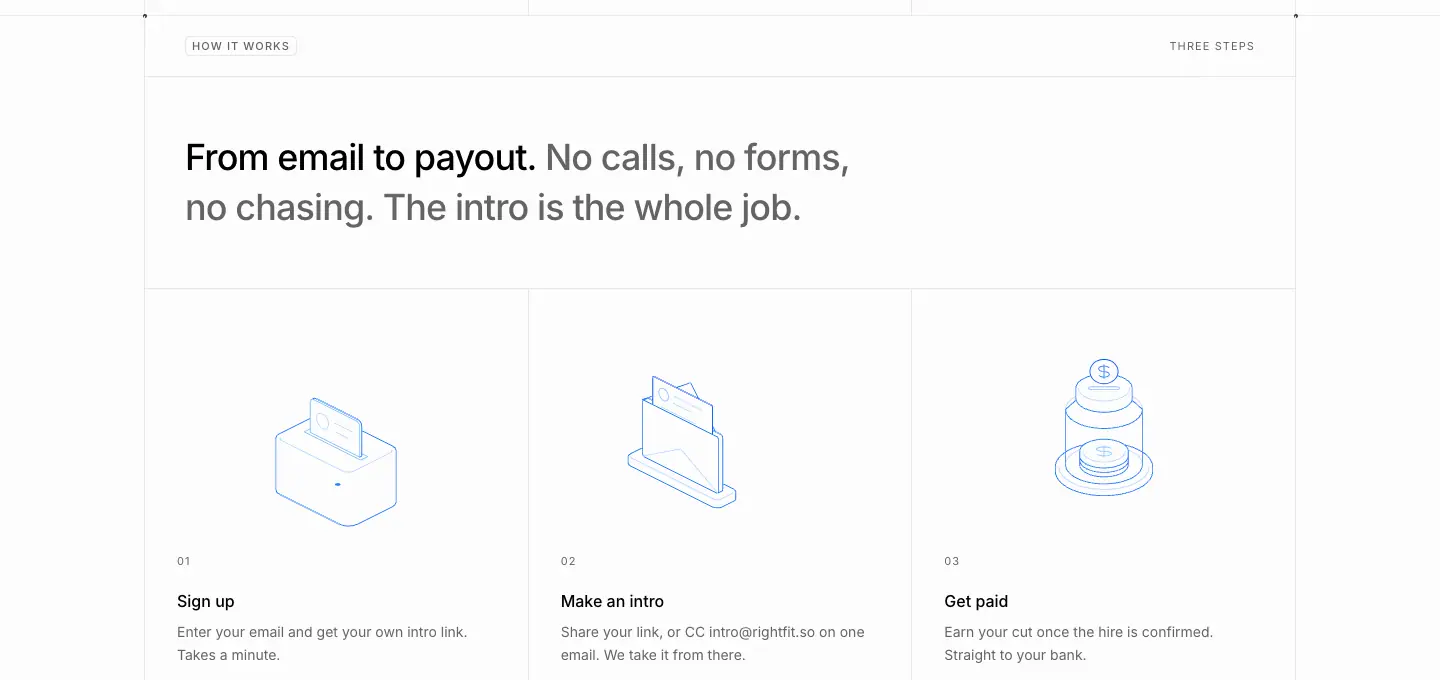
- "From email to payout. No calls, no forms, no chasing. The intro is the whole job." 3 iso steps: Sign up · Make an intro · Get paid.
05 · The intro (y 2420–3040)
- Label row "THE INTRO" / "ONE EMAIL". "One CC. That is your intro done. Put us on copy and go back to your day. We pick it up from the first reply." An email-composer mock (TO founder@startup.com · CC intro@rightfit.so · SUBJECT Meet Rightfit · "Send").
- Why: It shows the effort literally. The mock is the instruction.
06 · Agents do the work (y 3040–4150)
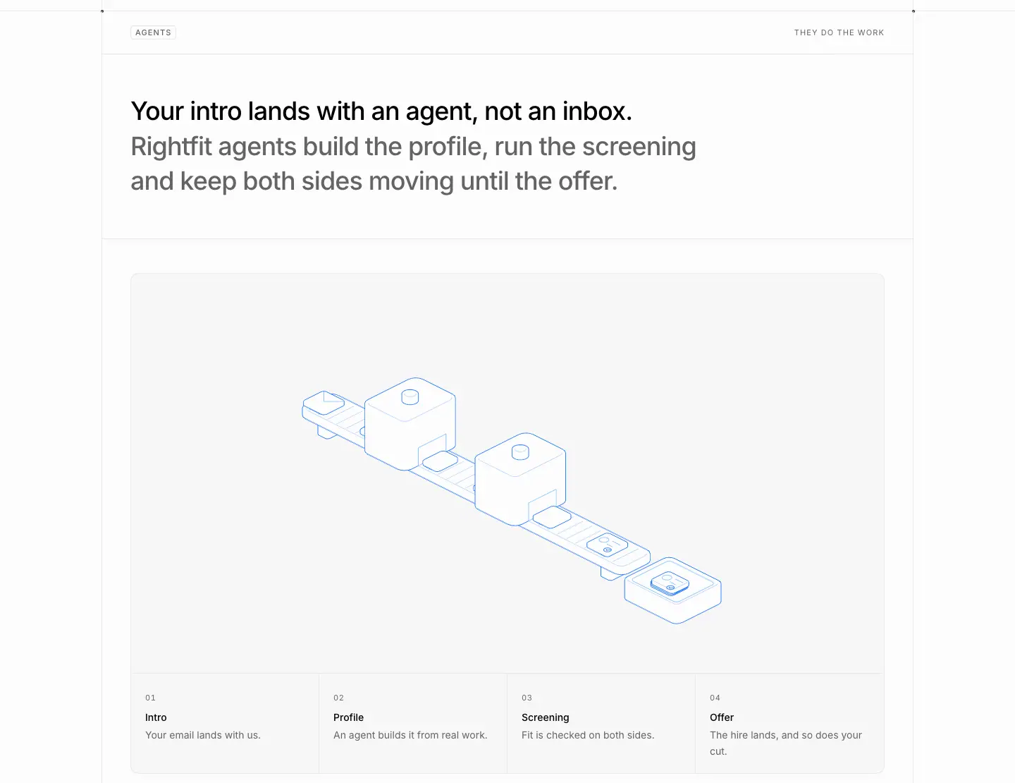
- Label row "AGENTS" / "THEY DO THE WORK". "Your intro lands with an agent, not an inbox. Rightfit agents build the profile, run the screening and keep both sides moving until the offer." A large iso pipeline drawing + 4 numbered steps: 01 Intro "Your email lands with us." · 02 Profile "An agent builds it from real work." · 03 Screening "Fit is checked on both sides." · 04 Offer "The hire lands, and so does your cut."
07 · Join (y 4150–4816)
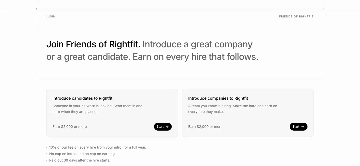
- "Join Friends of Rightfit. Introduce a great company or a great candidate. Earn on every hire that follows." Two form cards ("Introduce candidates to Rightfit", "Introduce companies to Rightfit") with an inline email field + a black arrow button, and a 3-bullet terms list.
08 · FAQ, 09 · CTA, 10 · Footer
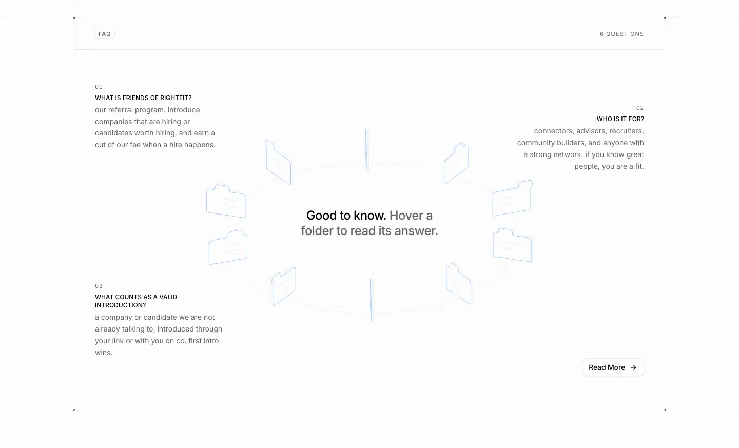
Testimonials · /testimonials
- URL: https://www.rightfit.so/testimonials
<title>: Testimonials | Rightfit- Meta: "Real stories from founders who hired through Rightfit and candidates who got hired…"
- Height: 2,536px. Data: data/testimonials.json
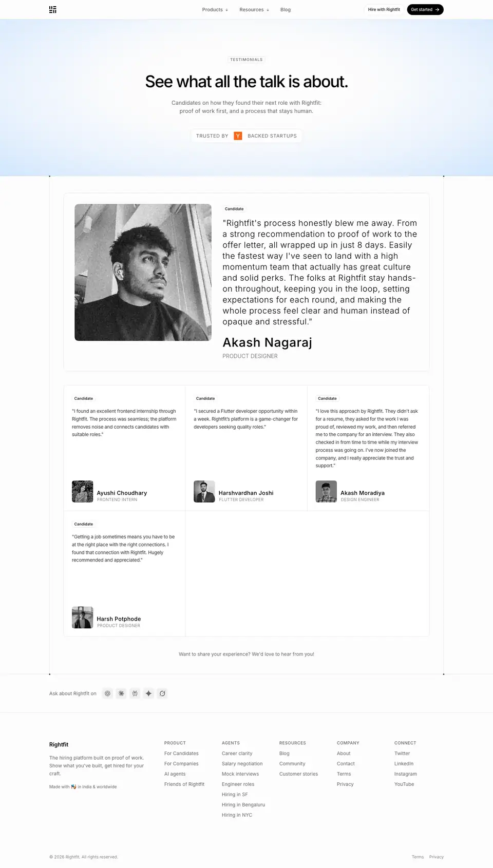
01 · Hero (y 0–560)
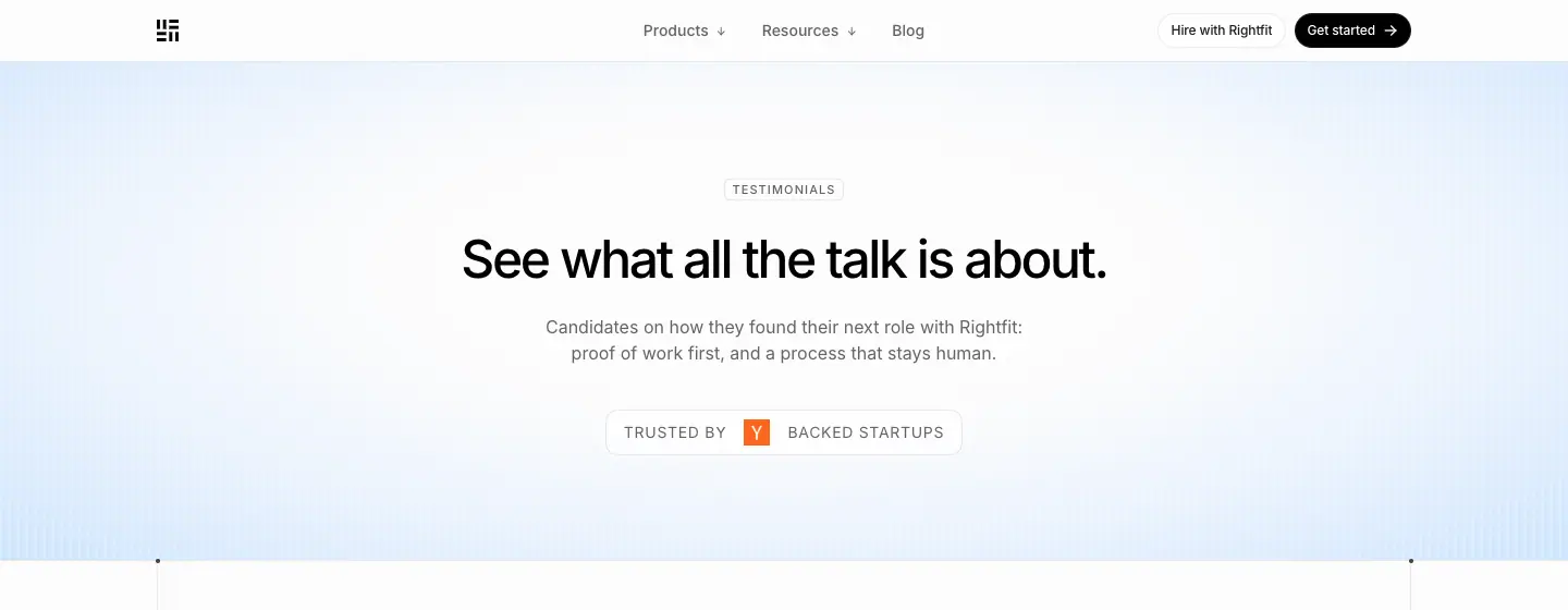
- Chip "TESTIMONIALS". H1 "See what all the talk is about." 48/60 · 500 · -2.4px. Lead "Candidates on how they found their next role with Rightfit: proof of work first, and a process…" + the "TRUSTED BY [Y] BACKED STARTUPS" line (14px, 0.7px tracking).
- Why: A casual, confident H1 instead of the generic "What our customers say".
02 · Featured quote (y 560–1180)
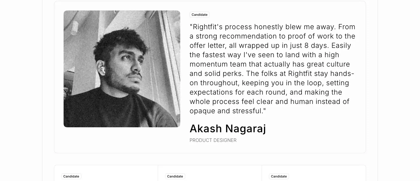
- A wide card (1070 × 522, radius 20, 1px border). Left: a large B/W portrait (≈200px, radius 12). Right: a "Candidate" chip (radius 16), the quote as H4 24/32 · 300 · +0.6px ("Rightfit's process honestly blew me away. From a strong recommendation to proof of work to the offer letter, all wrapped up in just 8 days…"), the name 36/40 · 510 · +0.9px ("Akash Nagaraj") and the role 12px · 300 · 0.3px uppercase ("PRODUCT DESIGNER").
- Why: The light weight and wide tracking make the quote feel spoken and long-form. The large name makes the person, not the brand, the headline.
03 · Quote grid (y 1180–2083)
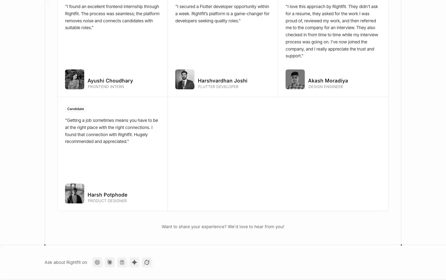
- A 3-column grid of short quotes (3 in the first row at y=1156, 1 in the second at y=1523), each with a "Candidate" chip, quote text, a 62 × 64 B/W photo (radius 12), the name, and the role 12 · 300 · 0.3px uppercase ("FRONTEND INTERN", "PRODUCT DESIGNER"). A closing line at y=1901: "Want to share your experience? We'd love to hear from you!"
Pattern notes
- All photos are black and white.
- Every quote names a speed or a feeling ("within a week", "in just 8 days", "human instead of opaque").
Customer stories · /customer-stories and /customer-stories/*
Index · /customer-stories
<title>: Customer stories | Rightfit · Height 1,737px · data- Meta: "How startups hire and candidates get hired with Rightfit: proof of work, candidate context, and screening made for each role."
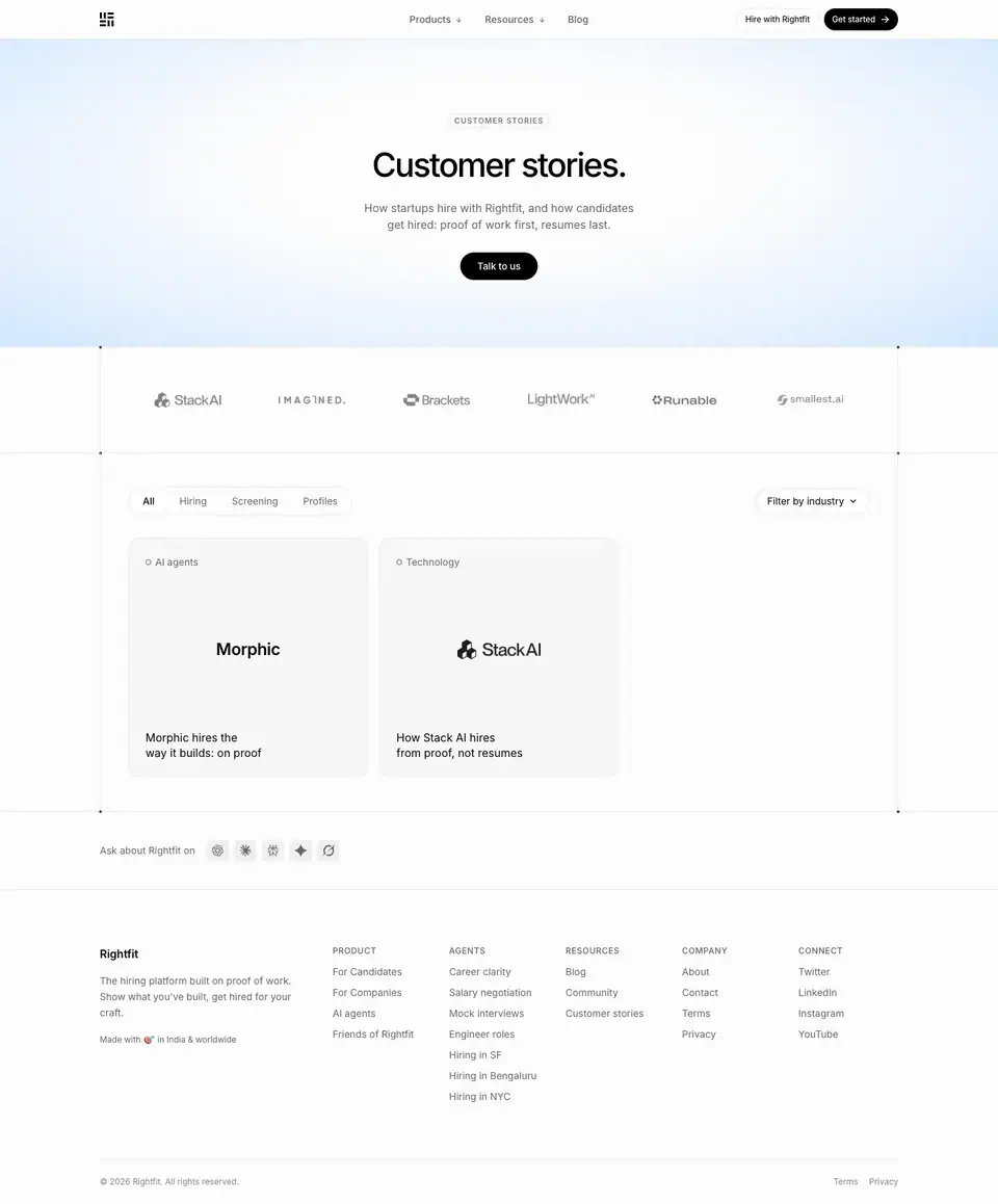
01 · Hero
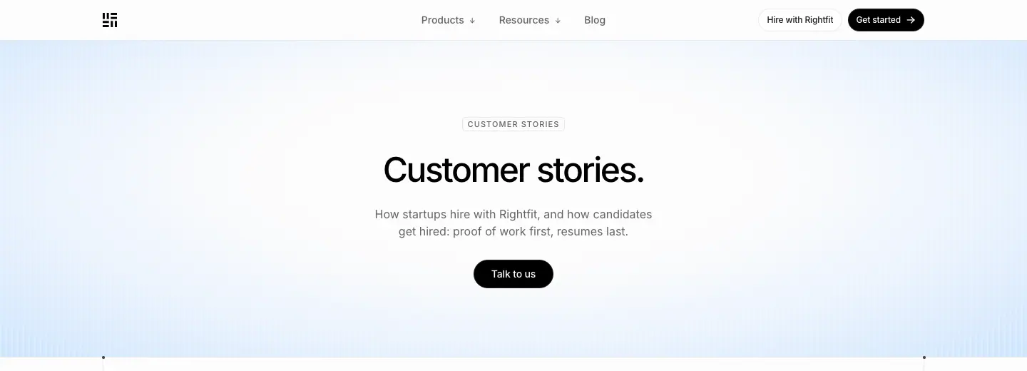
- Chip "CUSTOMER STORIES". H1 "Customer stories." (with a period) 48/60 · 500. Lead "How startups hire with Rightfit, and how candidates get hired: proof of work first, resumes last." One black "Talk to us" pill.
02 · Logo strip, filters, cards
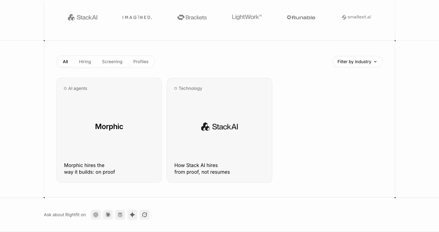
- A grayscale logo strip (Stack AI, Imagined, Brackets, LightWork, Runable, smallest.ai).
- A segmented filter: "All" (active, white pill) · Hiring · Screening · Profiles, plus a "Filter by industry ⌄" dropdown on the right.
- Story cards: 346 × 346, radius 32,
bg-muted/40, padding 24. A category dot label ("○ AI agents", "○ Technology"), the company logo or wordmark centered at 24 · 600, and the story title at the bottom ("Morphic hires the way it builds: on proof").
- Why: The logo is the card image, so there is no stock photo and every card looks consistent. Filters signal that more stories are coming.
Story template · /customer-stories/stack-ai, /customer-stories/morphic
| Stack AI |
Morphic |
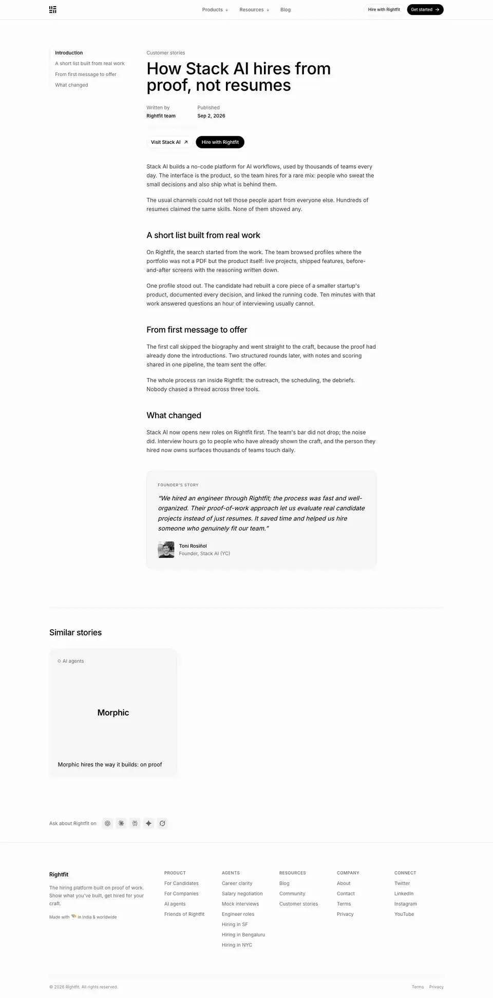 |
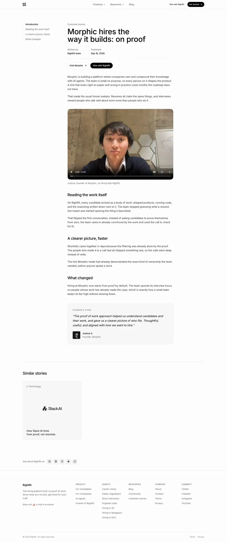 |
01 · Header
- Left rail (x=161): a table of contents at 14px. The current item is black ("Introduction"), the others gray ("A short list built from real work", "From first message to offer", "What changed").
- Content column at x=428 (≈576px wide): "Customer stories" breadcrumb, H1 48/48 · 510 · -0.576px ("How Stack AI hires from proof, not resumes"), meta "Written by / Rightfit team" and "Published / Sep 2, 2026" (14px gray labels + 14 · 500 values), then "Visit Stack AI ↗" (outline) + "Hire with Rightfit" (black).
- Why: The H1 repeats the brand's antithesis ("from proof, not resumes"), so every story also advertises the thesis.
02 · Body
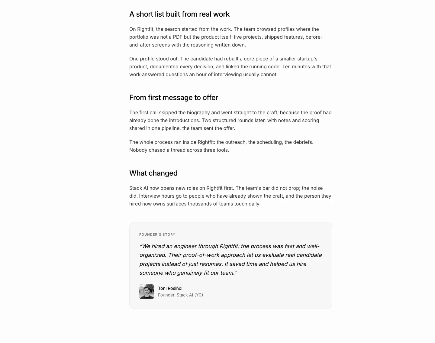
- Body 16/26 · 400 · black at 80%. H2s 24/32 · 500 · -0.6px ("A short list built from real work", "From first message to offer", "What changed").
- A founder quote block (
<blockquote> 18/29.25 · 400, italic, inside a tinted card with an avatar). The Morphic story embeds a founder video (16:9, rounded, native controls).
- Structure: context → problem → how Rightfit worked → what changed → quote. A classic case-study arc kept to about 4 short sections.
03 · Similar stories
- H2 "Similar stories" 24/32 at x=144 + a single 373 × 373 radius-32 story card.
Blog index · /blog ("Rightfit Journal")
- URL: https://www.rightfit.so/blog
<title>: Blog | Rightfit- Meta: "Thoughts on hiring, technology, and building Rightfit."
- Height: 2,504px. 12 posts. Data: data/blog.json
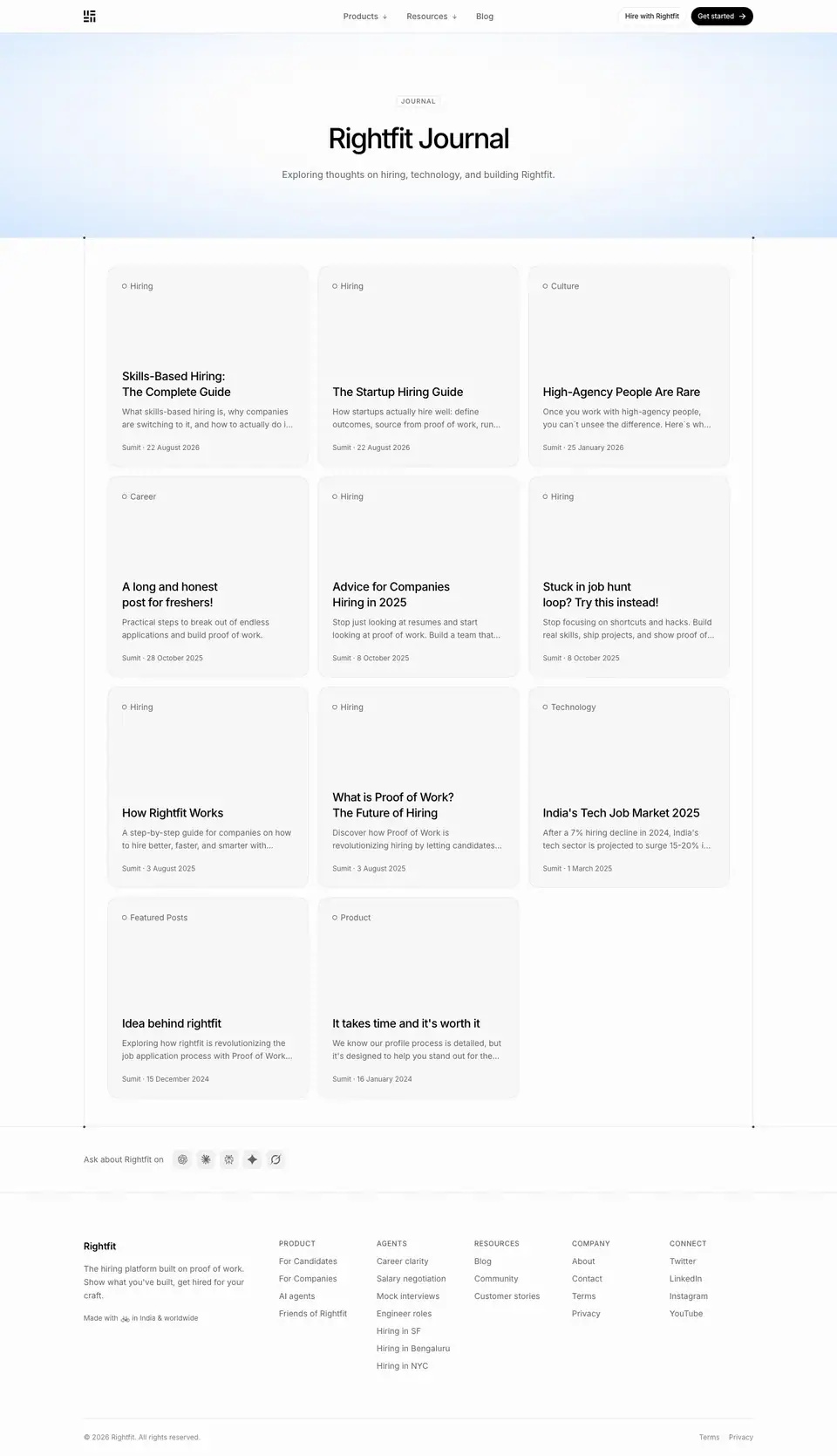
01 · Hero (y 0–410)
- Chip "JOURNAL". H1 "Rightfit Journal" 48/60 · 500 · -2.4px. Lead "Exploring thoughts on hiring, technology, and building Rightfit."
- Why: "Journal" sounds personal and founder-written, which fits the single-author blog.
02 · Card grid (y 410–2051)
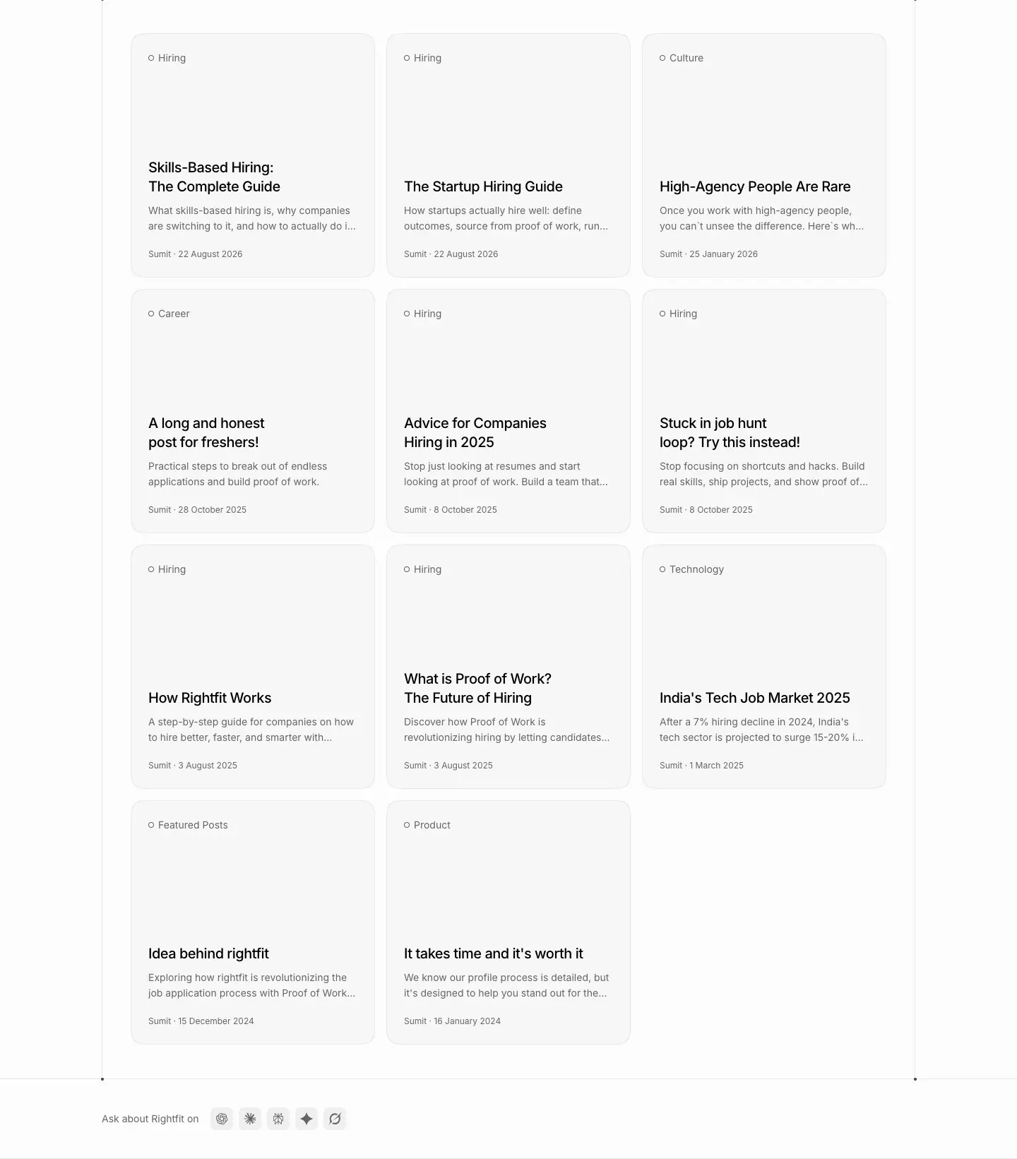
- 3 columns × 4 rows of 346 × 346 cards (radius 32,
bg-muted/40, 1px border, padding 24) inside the framed column.
- Each card: a category with a ring dot ("○ Hiring", "○ Culture", "○ Career", "○ Technology", "○ Featured Posts"; 14px gray), a large empty area, the title (20/27.5 · 500 · -0.5px, balanced on 2 lines), a 2-line gray excerpt with ellipsis, and "Sumit · 22 August 2026" (12px gray).
- No cover images.
- Why: Square cards with no images make every post equal and the page calm. The title is set large enough to act as the image.
Content strategy (from titles)
- Definitions and guides for search: "What is Proof of Work? The Future of Hiring", "Skills-Based Hiring: The Complete Guide", "The Startup Hiring Guide".
- Market pieces: "India's Tech Job Market 2025", "Advice for Companies Hiring in 2025".
- Founder voice: "Idea behind rightfit", "High-Agency People Are Rare", "A long and honest post for freshers!", "Stuck in job hunt loop? Try this instead!".
Blog post template · /blog/*
Captured: /blog/what-is-proof-of-work (5,955px) and /blog/high-agency-people (2,206px).
Data: post-proof-of-work.json, post-proof-of-work.probe.json, post-high-agency.json
| What is Proof of Work? |
High-Agency People Are Rare |
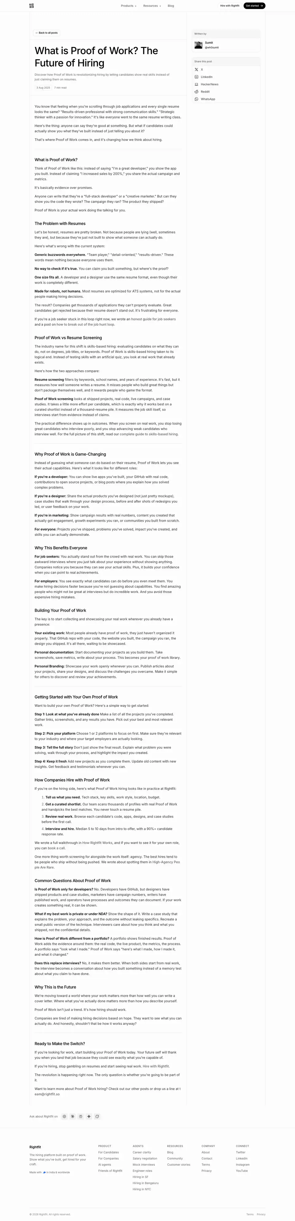 |
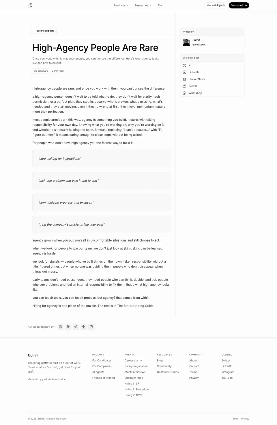 |
01 · Header (y 0–700)
- A two-column frame. The content column is ≈575px (x 144–720), with a 1px rule on its right. The sidebar is at x 937.
- "← Back to all posts": a small outline pill, 12 · 510.
- H1 48/60 · 510 · -1.056px (-0.022em), left-aligned, 2 lines ("What is Proof of Work? The Future of Hiring").
- Description 14px gray. Meta: date chip "3 Aug 2025" (12px, bordered) + "7 min read".
- Sidebar cards (radius 12, 1px border,
#f7f7f7 header strip): "Written by": a B/W avatar 40px + "Sumit" 14 · 510 + "@wh0sumit". "Share this post": X, LinkedIn, HackerNews, Reddit, WhatsApp as icon + 14 · 500 label rows.
- Why: The sidebar puts the author's face and handle next to every post, which makes it personal and shareable. HackerNews and Reddit in the share list show who the audience is.
02 · Body
- Body 16/26 · 400 · black at 80%. Paragraphs are 1–3 sentences.
- H2 20/25 · 510 · -0.5px. 11 H2s on the long post ("What is Proof of Work?", "The Problem with Resumes", "Proof of Work vs Resume Screening", "Why Proof of Work is Game-Changing", …, "Ready to Make the Switch?").
- Bold lead-ins at 16/26 · 600 ("Generic buzzwords everywhere.") start list items. A 1px rule separates the intro from the body.
- The short post (High-Agency) sets 4 lowercase pull-statements in tinted boxes: "stop waiting for instructions", "pick one problem and own it end to end", "communicate progress, not excuses", "treat the company's problems like your own".
- Why: Small H2s (20px) keep long guides from feeling like a stack of headlines, and they read like a document, not a landing page.
Pattern notes
- No hero image, no inline illustrations. Words only.
- The post page ends with the standard ask-AI row and footer, not an orb CTA. The reading context is respected.
Changelog · /changelog
- URL: https://www.rightfit.so/changelog
<title>: Changelog | Rightfit- Meta: "New features, improvements, and fixes shipped to Rightfit."
- Height: 7,830px. 8 entries on one page, with no per-entry URLs. Data: data/changelog.json, data/changelog.probe.json

01 · Header + first entry
- H1 "Changelog" 48/48 · 600 · -1.2px at x=144, y=128. Lead 18/28 · 400 ·
#646464. No chip, no glow.
- Entry layout: a 2-column grid. The left meta column (x=144, ≈320px) holds a version chip ("Version 1.7.0":
#f6f6f6, radius 16, height 22, 12 · 500) and the date ("27 August 2026", 12 · 500 gray). The right content column (x=464, 576px wide) holds:
- H2 24/30 · 600 · black at 90% ("Make your profile yours")
- 2 lead paragraphs 16/26 gray
- "What you can do:" (16 · 600) + a bulleted list
- A closing sentence
- A media plate (576 × 324 or 576 × 576, radius 16,
#f0f0f0, layered shadow): an app screenshot on painterly artwork, or a video (easy-application.mp4)
- Collapsible "Improvements" and "Fixes" rows with chevrons, separated by rules
Entries captured
| Version |
Date |
Title |
| 1.7.0 |
27 August 2026 |
Make your profile yours |
| 1.6.0 |
16 August 2026 |
The jobs board is here |
| 1.5.0 |
15 August 2026 |
Apply in one click |
| 1.4.0 |
15 August 2026 |
Build your profile faster |
| 1.3.0 |
14 August 2026 |
Quality of life upgrades |
| 1.2.0 |
13 August 2026 |
Public wiki profiles |
| 1.1.0 |
30 July 2026 |
Profile visibility controls |
| 1.0.0 |
18 July 2026 |
Faster invites |
Semantic minor versions, one per shipped feature, 8 releases in 6 weeks. The cadence itself is a "we ship" signal.
Section crops
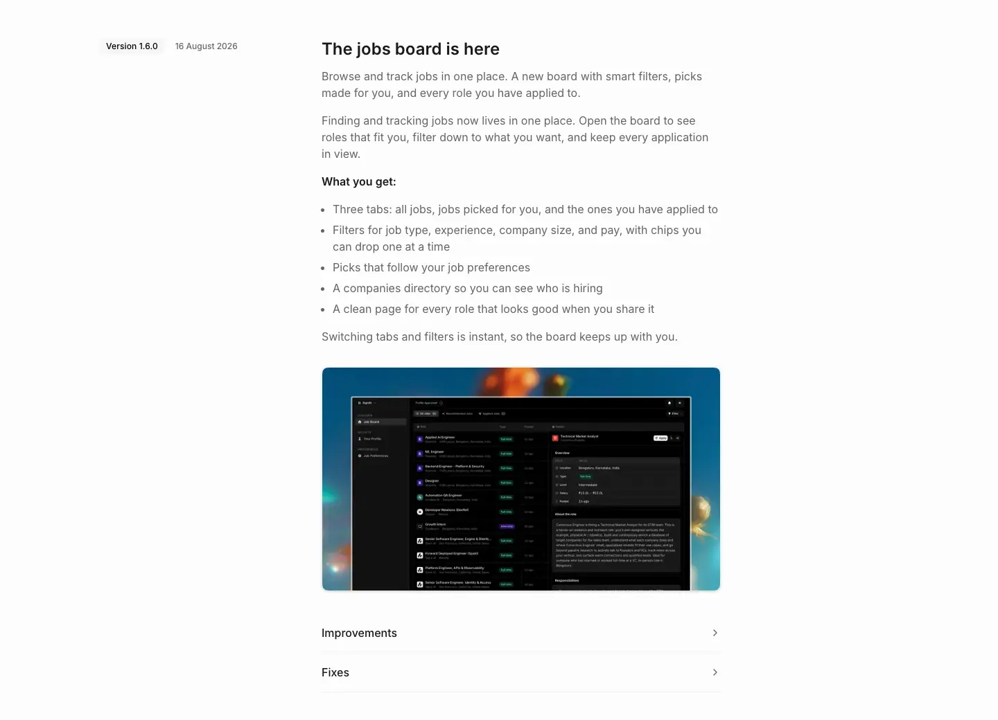
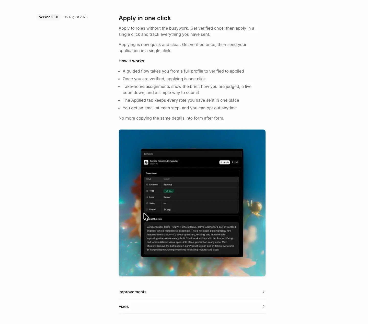
Why it is designed this way
- Benefit titles, not feature names: "Make your profile yours", "Apply in one click".
- A fixed structure (what → why → "What you can do:" list → media → improvements/fixes) makes every release scannable.
- Dark screenshots on art turn each release into a small launch poster, while the page itself stays plain.
- Improvements and fixes are collapsed, so the story stays first and the detail is still there for power users.
Mobile

- The meta column moves above the entry. Plates go full width.
Open roles · /openroles and /openroles/*
Directory · /openroles
<title>: Open roles | Rightfit · Height 1,870px · 38 role pages in the sitemap · data- Meta: "Open roles at startups hiring on Rightfit. Search by role, location or company, and apply with proof of work."
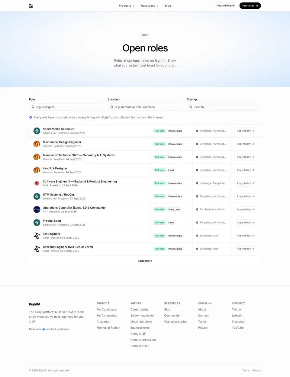
01 · Hero
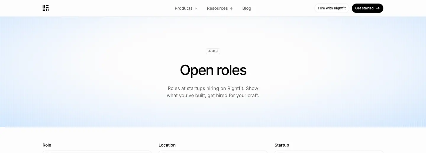
- Chip "JOBS". H1 "Open roles" 48/60 · 500. Lead "Roles at startups hiring on Rightfit. Show what you've built, get hired for your craft."
02 · Filters + list
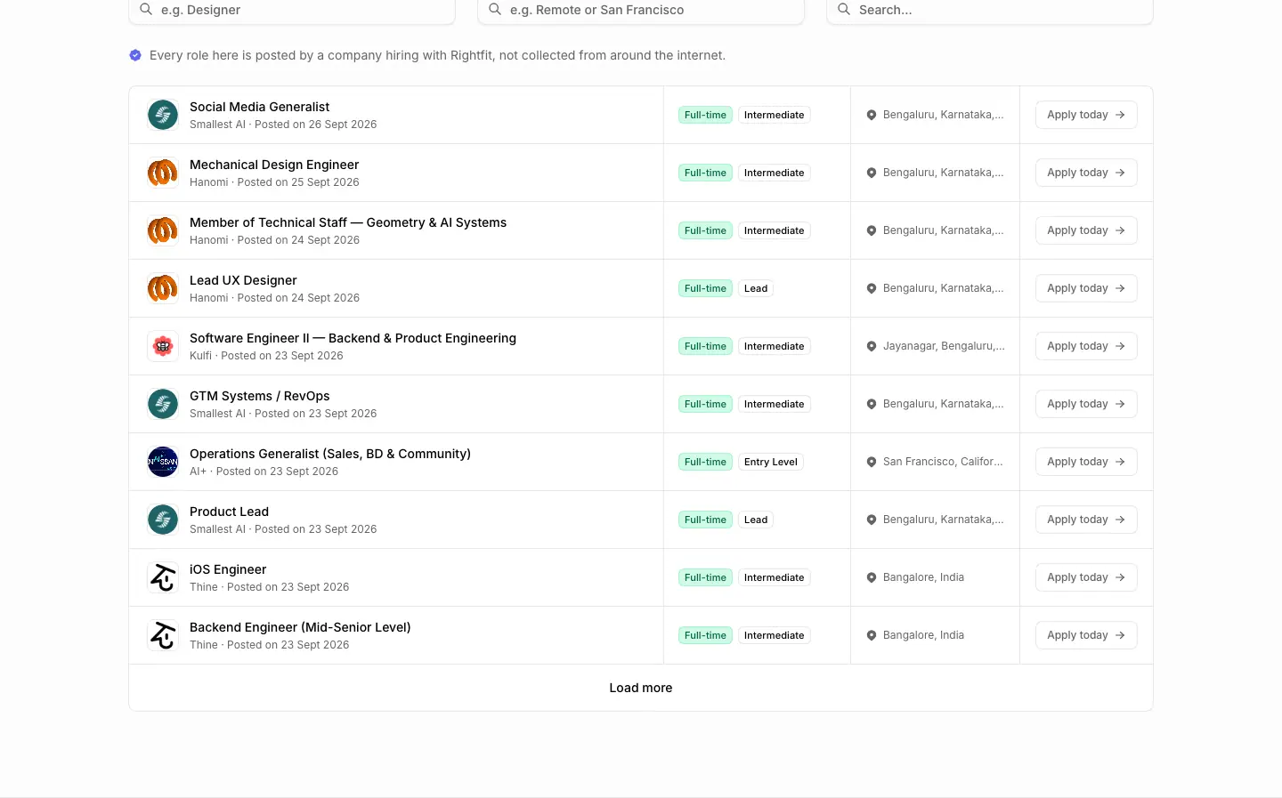
- 3 search inputs in a row (Role · Location · Startup, 14 · 500 labels). Inputs are 368 × 36, radius 16, with a leading icon and placeholders "e.g. Designer", "e.g. Bangalore or San Francisco".
- A note: "Every role here is posted by a company hiring with Rightfit, not collected from around the internet." (14px gray, with an icon).
- 10 rows per page. Each row: company logo (36px, radius 8, bordered) · role (14 · 500, e.g. "Social Media Generalist") · "Smallest AI · Posted on 26 Sept 2026" (12px gray) · status chip "Full-time" (emerald) · level chip "Intermediate" (outline) · location (12px, pin icon) · "Apply today →" (115 × 32 outline, radius 12). Then "Load more".
- Why: The anti-scraping note is a trust differentiator against job aggregators. Chips make the list scannable without opening rows.
Job page template · /openroles/{uuid}
Captured: Backend Engineer at Cardboard (2,450px), Growth Operator at Cardboard (2,550px) · data, probe
| Backend Engineer |
Growth Operator |
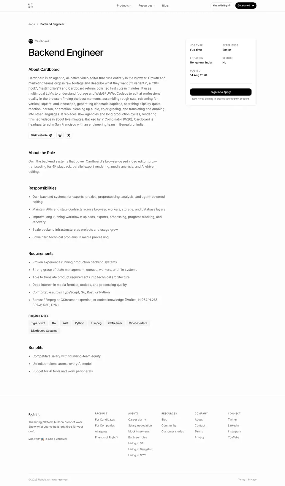 |
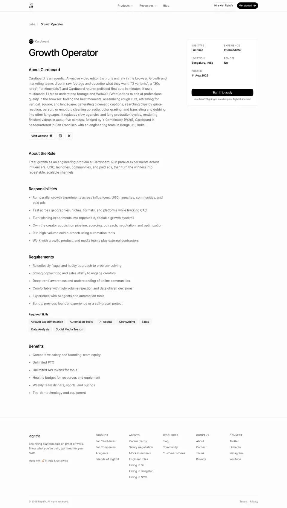 |
01 · Header + side card
- Breadcrumb "Jobs › Backend Engineer" (14px). Company favicon (24px, round) + "Cardboard". H1 48/48 · 500 · -2.4px.
- H2 "About Cardboard" 20/28 · 500. Description 16/24 gray. "Visit website ↗" outline pill plus X / LinkedIn icon buttons (36 × 36, radius 20).
- Fact card at x=961 (360 × 335, white, radius 16, padding 24). Labels 12 · 500 uppercase in
#838383 (JOB TYPE, EXPERIENCE, LOCATION, REMOTE, POSTED). Values 14 · 500 black (Full-time, Senior, Bengaluru, India, No, 14 Aug 2026). "Sign in to apply" (black, 310 × 36). Note "New here? Signing in creates your Rightfit account." (12px gray).
- Why: All decision facts are in one glanceable card. The one CTA doubles as sign-up, so applying is the acquisition funnel.
02 · Body
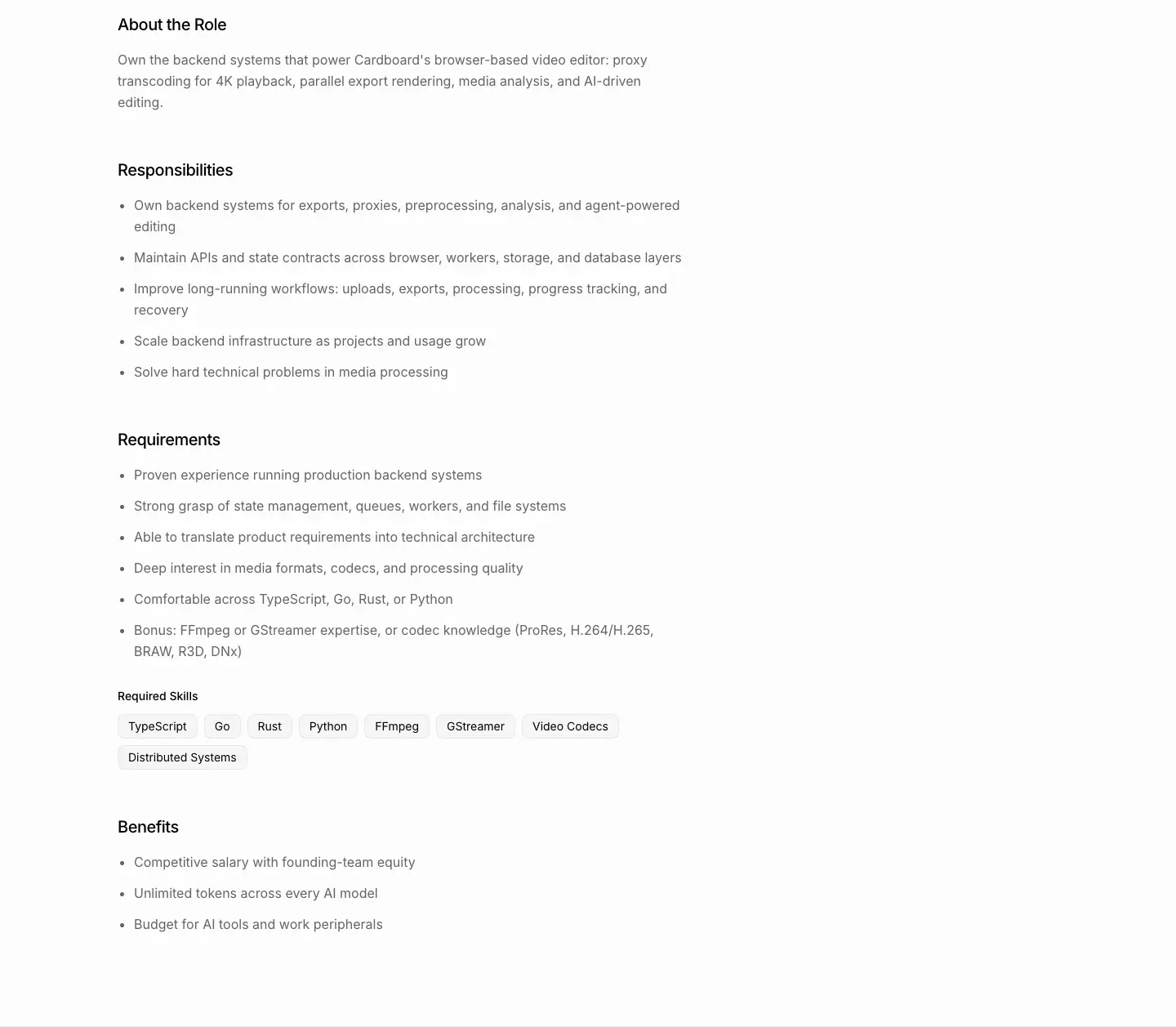
- H2s: About the Role · Responsibilities · Requirements · Benefits (20/28 · 500). Bulleted lists at 14–16px.
- "Required Skills": tag chips (
#f6f6f6, 1px border, radius 16, padding 4px 12px: TypeScript, Go, Rust, Python, FFmpeg …).
- Why: A standard job-description order, so candidates find what they need where they expect it. Skill chips mirror the product's "proof" tags.
SEO notes
- Each role is an indexable page with a structured meta description: "On-site Full-Time role at Cardboard, Bengaluru, India. Skills: TypeScript, Go, Rust. Apply on Rightfit."
- 38 role URLs in
sitemap.xml, all with lastmod 2026-11-20 (regenerated daily).
Contact · /contact
- URL: https://www.rightfit.so/contact
<title>: Contact | Rightfit- Meta: "Talk to the Rightfit team. Book a 30-minute call or email us, and we will get back to you within 24 hours."
- Height: 1,466px. Data: data/contact.json, data/contact.probe.json
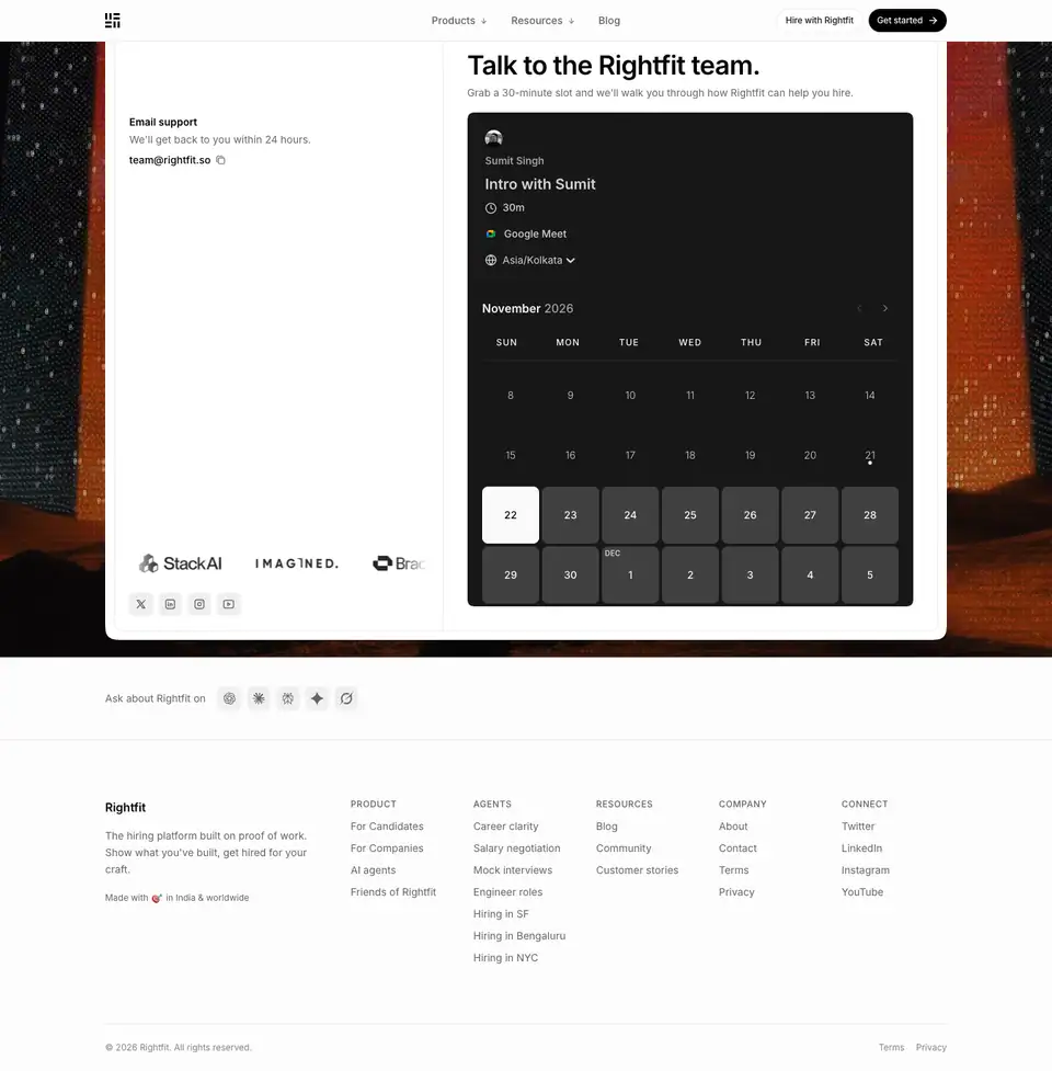
01 · Split panel on an image backdrop
- Backdrop: a full-bleed
<img> (1440 × 900, Next image w=1920 q=75) of abstract textured forms in saturated orange-red on near-black.
- Panel: white, radius 28, with a 1px inner frame. Two columns divided by a 1px rule.
- Left: "Email support" (14 · 600) + "We'll get back to you within 24 hours." (14px gray) + "team@rightfit.so" (14 · 500) with a copy icon. At the bottom: a logo marquee (
marquee-x, 20s linear infinite, logos 112 × 28 grayscale) and 4 social icon buttons (32 × 32, radius 12, #f0f0f0).
- Right: H1 "Talk to the Rightfit team." 36/40 · 590 · -0.792px + "Grab a 30-minute slot and we'll walk you through how Rightfit can help you hire." Then a Cal.com inline embed in dark theme (
theme=dark, month view, the host's name and avatar, 30m, Google Meet, Asia/Kolkata).
- Why:
- The page has one job: book or email. The dramatic backdrop is the only full-bleed photo on the site, and it signals a change of mode from reading to talking.
- The dark calendar is a third-party embed. The brand frames it rather than restyling it.
- The marquee keeps social proof visible even on a utility page.
02 · Footer
Standard (see _shared-header-footer.md).
Legal · /legal/privacy and /legal/terms
Captured: /legal/privacy (7,364px). /legal/terms uses the same template (listed in Public pages). Data: data/legal-privacy.json

01 · Header
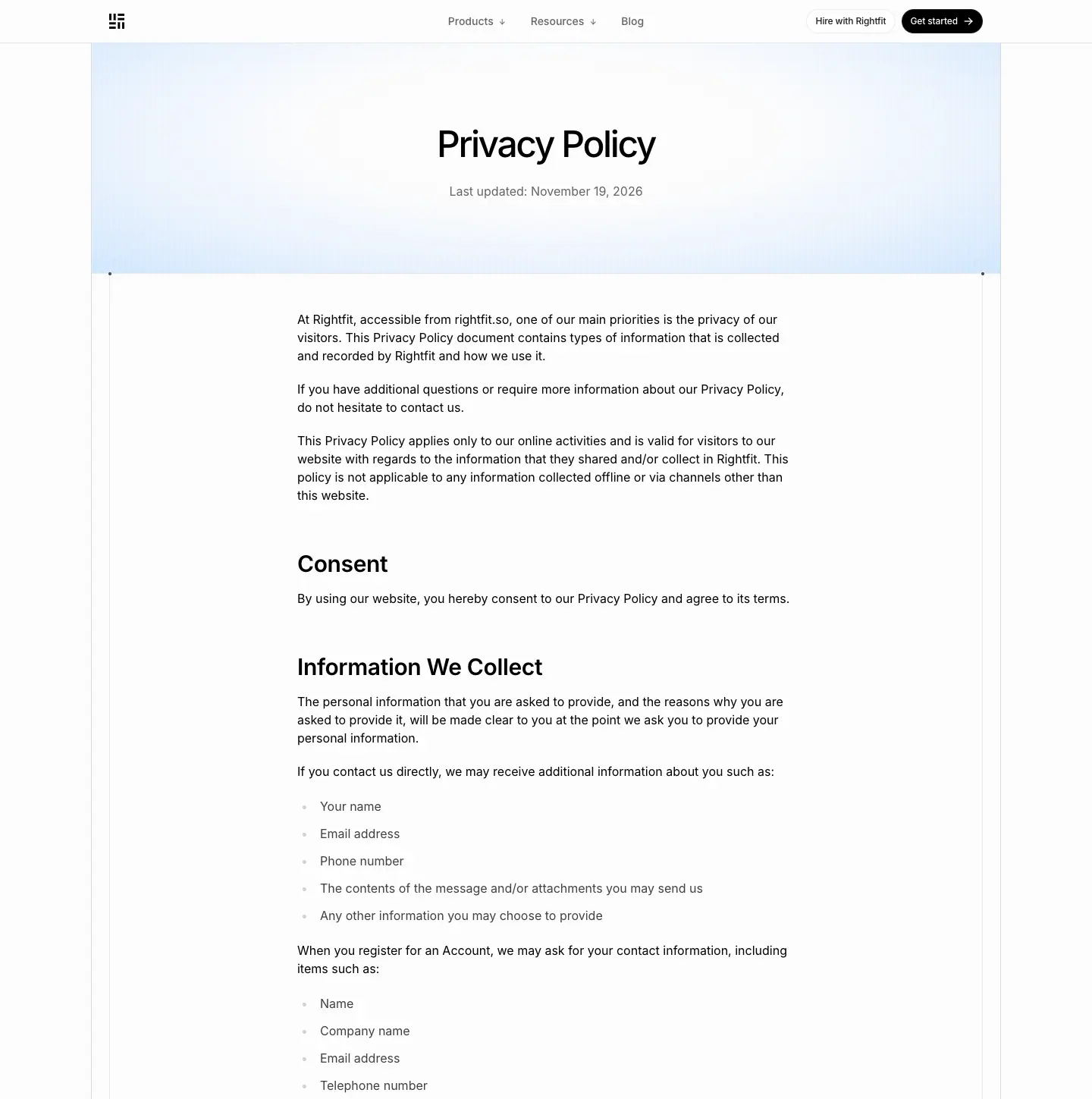
- H1 "Privacy Policy" 48/60 · 500 · -2.4px, centered at y=160, over the blue scanline glow. "Last updated: November 19, 2026" 16px gray, centered.
- Why: Even legal pages keep the brand sky, so they feel like part of the same site.
02 · Body
- A single column at x=392 (≈656px wide) inside the framed column.
- H2 30/36 · 600 · -0.36px (12 H2s: Consent, Information We Collect, How We Use Your Information, Google Account Data, Profile Views and Invite Links, Log Files, Cookies and Web Beacons, Advertising Partners Privacy Policies, Third Party Privacy Policies, CCPA Privacy Rights, GDPR Data Protection Rights, Children's Information).
- Body 16/28 · 400 (the loosest line-height on the site, for dense legal text). Lists with gray bullet markers.
- Why: Bigger H2s (30px, weight 600) than in blog posts, because people search legal pages for a section rather than read them top to bottom.